#TransformTuesday: 29 September

Here is this week's selection of rebrands from around the world. For more from #TransformTuesday, follow @Transformsays on Twitter.
Ben's Original
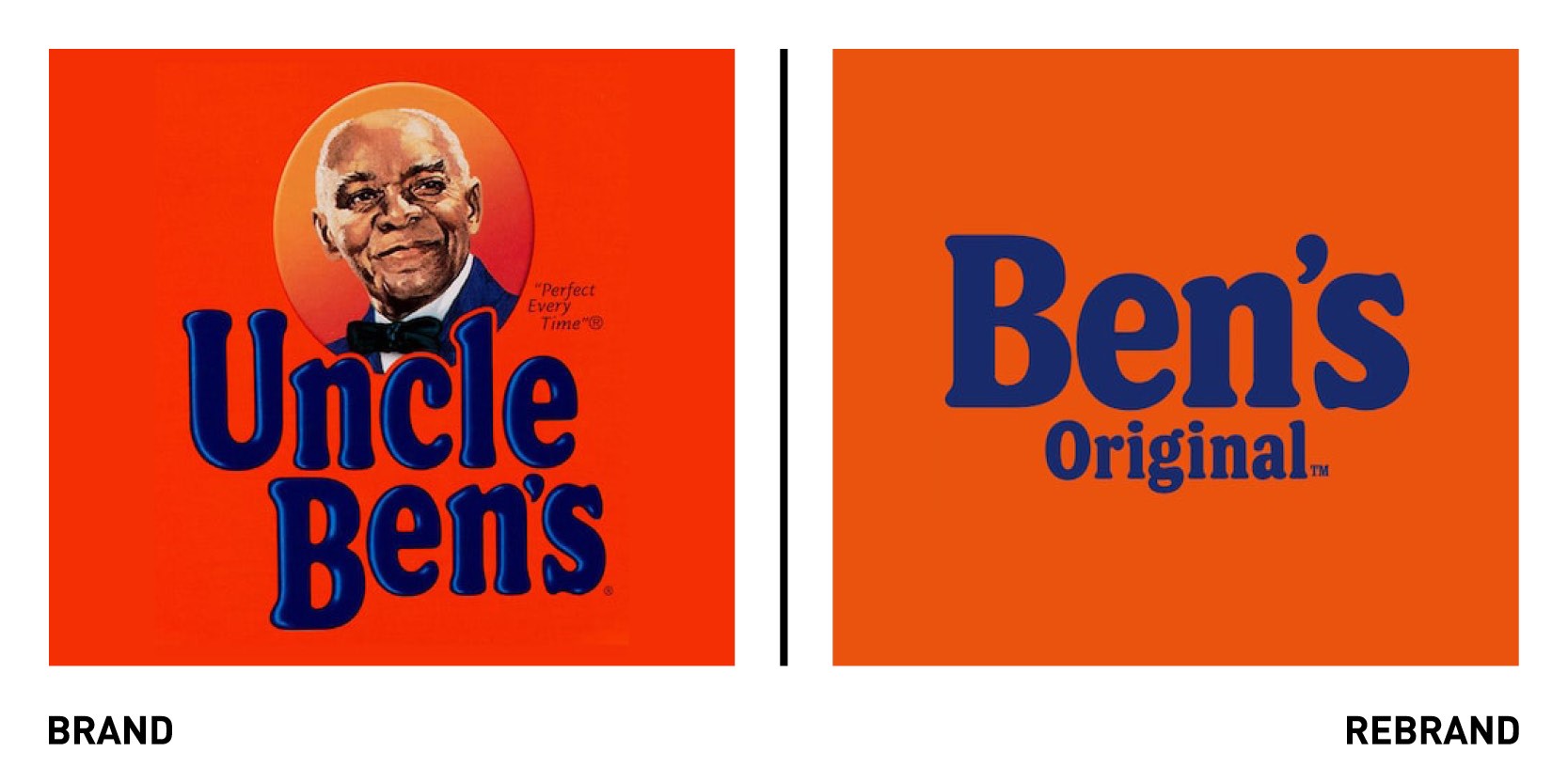
Iconic rice brand Uncle Ben, part of Mars food, has undergone a rebrand, changing its name to Ben Original, signaling the brand’s ambition to create a more inclusive future while maintain its commitment to producing some of the world’s best rice. Following criticism that the name and image of an African American in a bow tie man promoted racial stereotyping and evokes servitude, the rice brand also decided to drop the image to create a more equitable iconography. The rebrand also includes the new purpose of creating ‘opportunities that offer everyone a seat at the table,’ emphasising the brand’s goal of creating a more inclusive future. Alongside the rebrand Ben’s Original will also commit to a community outreach programme ensuring undeserved communities have access to nutritious meals, while helping chefs of all races and backgrounds gain education opportunities so their voices can be heard. In addition, in Greenville, Mississippi (headquarter of production) Mars Food will invest in the local community to address issues that have plagued this region for generations, focusing on enhancing educational opportunities for more than 7,500 area students and increasing access to fresh foods.
“Over the last several weeks, we have listened to thousands of consumers, our own Associates and other stakeholders from around the world. We understand the inequities that were associated with the name and face of the previous brand, and as we announced in June, we have committed to change,” says Fiona Dawson, Global President Mars Food, Multisales and Global Customers.
Fairtrade Foundation
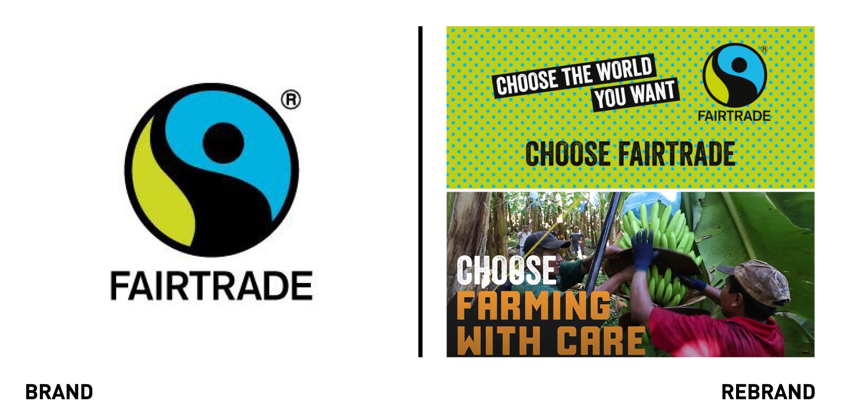
The Fairtrade Foundation, an independent non-profit organisation that promotes fairer trading conditions and empowers farmers and workers to combat poverty, refreshed its brand identity with the aim of capturing the hearts of mainstream Britain by conveying the incredible breadth and scale its movement has across the world. To do so, Fairtrade worked with global brand agency 2050 London and Humankind research, a research organisation focused on charity and social good.
The rebrand drives home the message that one should not just choose Fairtrade to ensure farmers get a fair wage, but one should also choose it to empower global communities that protect the environment and care for wildlife. A new positive, can-do narrative was developed as part of the new brand to open people’s eyes to the strength of the global Fairtrade community. Over the next five years, impact stories will be told through dynamic graphics, vibrant colours and moving photography to reaffirm Fairtrade’s leading position as people powered engine of change.
“The Fairtrade brand needed an idea and tone that felt bold, spontaneous and participatory to provoke millions more to join in and co-create. ‘Choose the world you want’ invites us to use Fairtrade’s scale and integrity to change things,” says Adam Morrison, managing director of 2050 London.
“The empowering feel of the new strategy really shone through in the response we saw from consumers and reinvigorates a brand that is already well loved. Consumer feedback such as, ‘They do far more for the world than I thought’ showed how ‘Choose the world you want’ helps to demonstrate the far-reaching positive impact of choosing Fairtrade,” says founding partner at Humankind Tom Silverman.
Grolsch
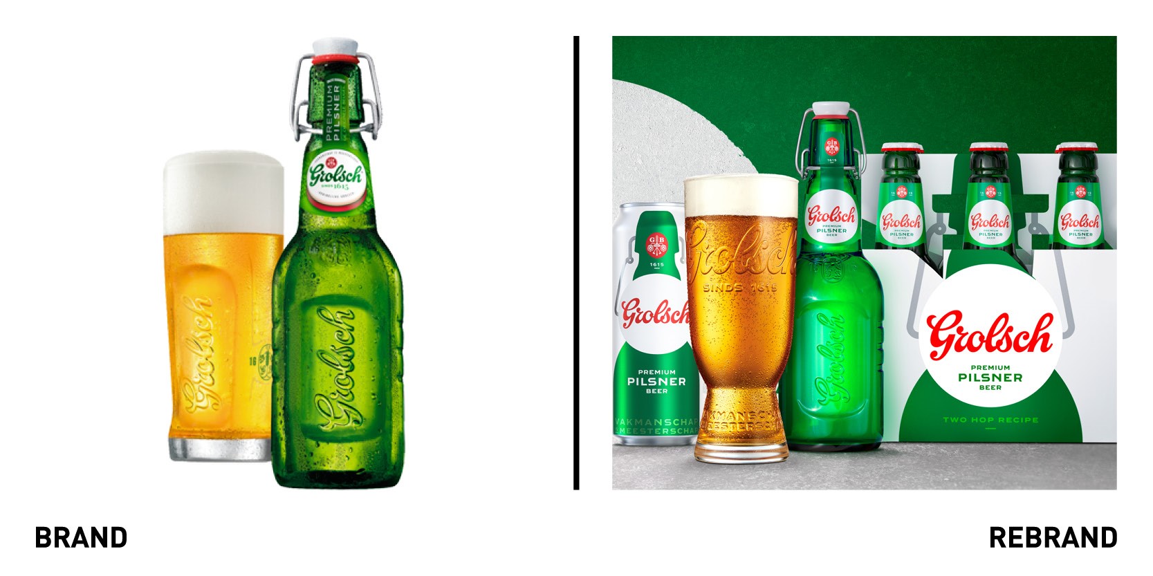
Dutch Grolsch premium pilsner returns to the UK market with a new brand identity and packaging that focuses on Grolschs provenance, now ‘Double-brewed, for double the flavour’ at at its home in Enschede, the Netherlands. The double-brew process produces a 4% beer - answering a need from UK consumers for a product that delivers great refreshment at a slightly lower ABV, whilst retaining its distinctive depth of flavour. The new visual brand design showcases Grolsch’s modern and distinctive style while staying true to its heritage as the original Dutch premium pilsner. The redesign elevates the swing-top as the central icon of the brand placing its silhouette at the hear of the identity and using it to drive distinction. The logotype was carefully redrawn to capture the craftmanship of the brand’s original hand-painted signs, returned to its original red colour and placed within a white disc. One of the brand’s earliest advertising lines, ‘Vakmanschap is Meesterschap’ (meaning ‘Craftsmanship is Mastery’) returns to the pack alongside the 1615 date, itself a reminder of Grolsch’s long brewing heritage. Grolsch’s also uses plastic-free packaging to replace plastic shrink-wrap and six-pack rings.
Hotel Ercilla de Bilbao

Hotel Ercilla de Bilbao, in the north coast of Spain, relaunched today as part of the Marriott Autograph Collection, unveiling a refurbishment and extensive rebrand led by London-based design agency 0120 (formerly known as Evolve). The re-design of the identity and interior seeks to bring the history and core values of the brand to the forefront once more. With its 50th anniversary approaching the hotel is bringing back the purpose and passion of its earlier days. The new design repositions it as an iconic Bilbao destination, drawing on the hotels fascinating archive of photography, the vintage style of its 1970s heyday and the unique character of the contemporary Bilbao and the Basque country. The logo and typography reflect the Basque sensibilities of passion and a certain spikiness. The type is strong but very elegant in its usage. The rebrand includes wayfinding and signage, handmade from high quality materials that have echoes of the past. Printed collateral, from in-room stationery to bar menus, also reflects attention to detail and craftmanship.
“0120 brought a passion for the city and an in-depth understanding of Ercilla’s history and narrative to the project. With the refurbishment and rebrand we have perfectly captured what Ercilla has always been about. The new brand identity conveys the flavour, the passion and the soul of the hotel,” says Iñaki Etxeguren, general manager of Ercilla de Bilbao.
National Aids Trust
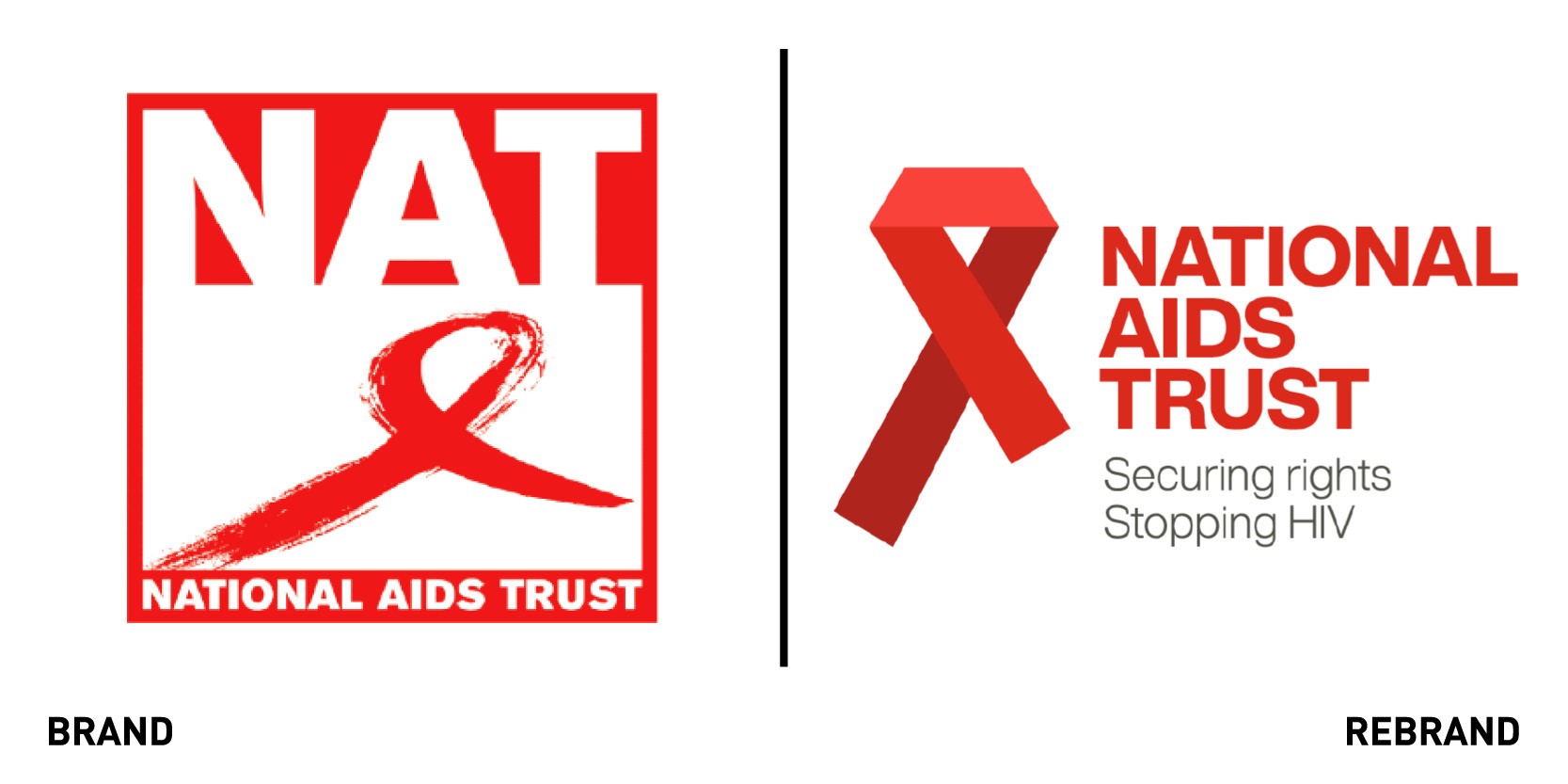
National AIDS Trust, an HIV charity working to prevent new HIV infections and end stigma around it, worked with Brighton-based retail design consultancy Sherlock Studio to create a new brand identity. While the new brand retains the colour red and ‘crossed ribbon’ emblem, which have become part of the prevailing visual language around HIV, the ribbon was redrawn to gibe it a more distinctive and ownable form, enabling the charity to stand out in the sector. The ribbon was also made into straight sections, which were included in the toolkit as flexible devices for future use, such as on posters around cities. The photography is people-centred to emphasizes the core, human aspect of the charity’s work.
“Sherlock has been excellent to work with and everyone at National AIDS Trust has found the whole process rewarding and enjoyable. Right from Sherlock’s first pitch they presented us with engaging and eye-catching concepts which showed they really understood our brand and where we wanted to go,” says chief executive of National AIDS Trust Deborah Gold.
TENA
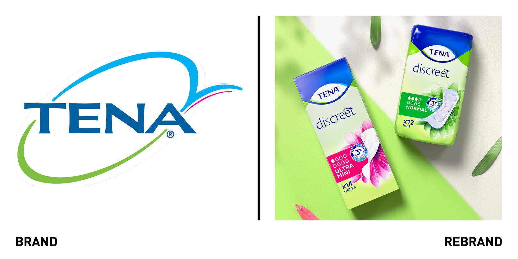
In collaboration with global agency Bulletproof, Swedish-based brand of Essity specialising with urinary or faecal incontinence TENA, underwent a taboo-busting rebrand, which led to the creation of a distinctive global master brand design. The new brand seeks to counter the outdated notion that incontinence should be embarrassing or stop people living the life they want. Essity wanted to achieve a stronger Masterbrand identity and packaging that would support its ambitious growth plans, while unifying the different range of products targeting specific audiences. The new design concept ‘Reassuring Performance,’ helps turn the ‘clinical’ approach to the brand’s look around focusing instead on empowering visual language, which takes its cues from the world of lingerie, and de-stigmatises incontinence. This sense of liberation from stigma and freedom is further emphasised by the flowing lines of blue holding shape, something which also bring consistency to the range of products across the brand.


