#TransformTuesday: 27 October

Here is this week's selection of rebrands from around the world. For more from #TransformTuesday, follow @Transformsays on Twitter.
Ann Summers
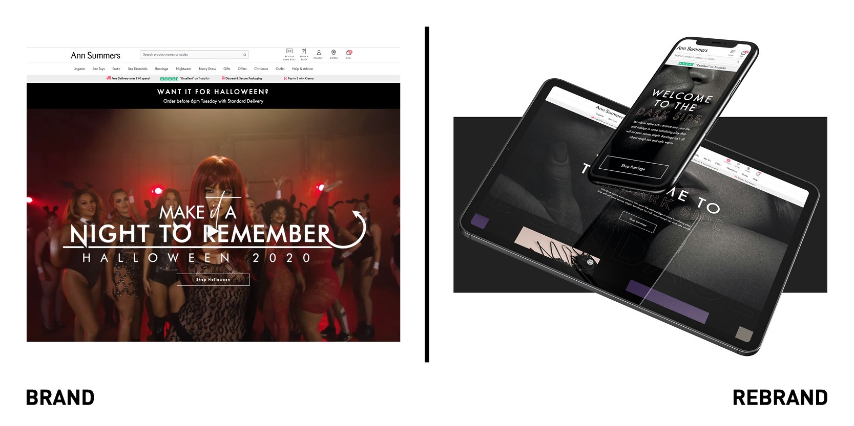
Multi-channel retailer specialising in sex toys and lingerie Ann Summers has re-launched its e-commerce website with international digital agency Dept Agency with a bold, image-led design that celebrates the diversity of its products and customers. Since its first store opened in 1970 Ann Summers has been advocating for sexual liberation, breaking down taboos surrounding female sexuality and fighting against image preconceptions. The new website is designed to appeal to a diverse audience with different tastes and preferences, reflecting the brand’s mission of being for everybody. With playful messages and seductive colours, the brand has used design to d ivied its product lines to effectively engage specific audiences, such as those who are interested in bondage.
“The lifestyle videos and photography celebrate diversity across adult age groups, body shapes, skin colours and types of relationships. We didn’t play it safe with the design; a light and dark mode interface was created to alter the mood as the user enters a more risque section. The entire brand experience changes. It’s surprising, provocative, exciting and really sets the stage for the products,” says Adam Bee, head of design at Dept.
Bristol Creative Industries
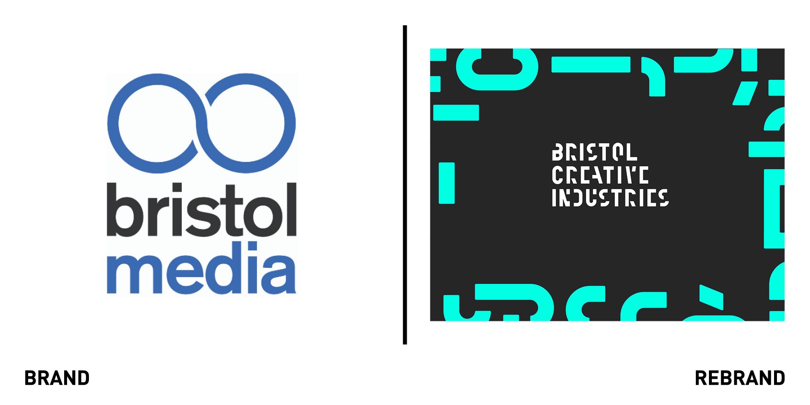
Creative agency Mr B & Friends rebranded Bristol Media as it relaunched under Bristol Creative Industries, a contemporary new name which better reflects the breadth and ambition of the creative sector in the region. Between hosting networking and keynote events, and sharing the latest newest and through leadership from members, Bristol Media has been an essential part of the fabric of the creative community in the region. However, with the major transformation the creative sector in Bristol has undergone in recent years, and a much more diverse make up of companies, the name of no longer fully reflected the breadth of its membership. Therefore ‘Bristol Creative Industries’ was introduced as a more inclusive name that would include all sectors. Besides the new name, the new identity shows that the region is a force to be reckoned with when it comes to competing with other creative strongholds for work. The different shapes reflect the diversity of the local creative industries, working together to amplify Bristol’s creative reputation.
“The new brand is distinctive, contemporary and memorable. Working as a community enables us to achieve more and the new identity, which shows elements coming together, reflects that,” says Chris Thurling, chair of BCI.
Hello Fresh
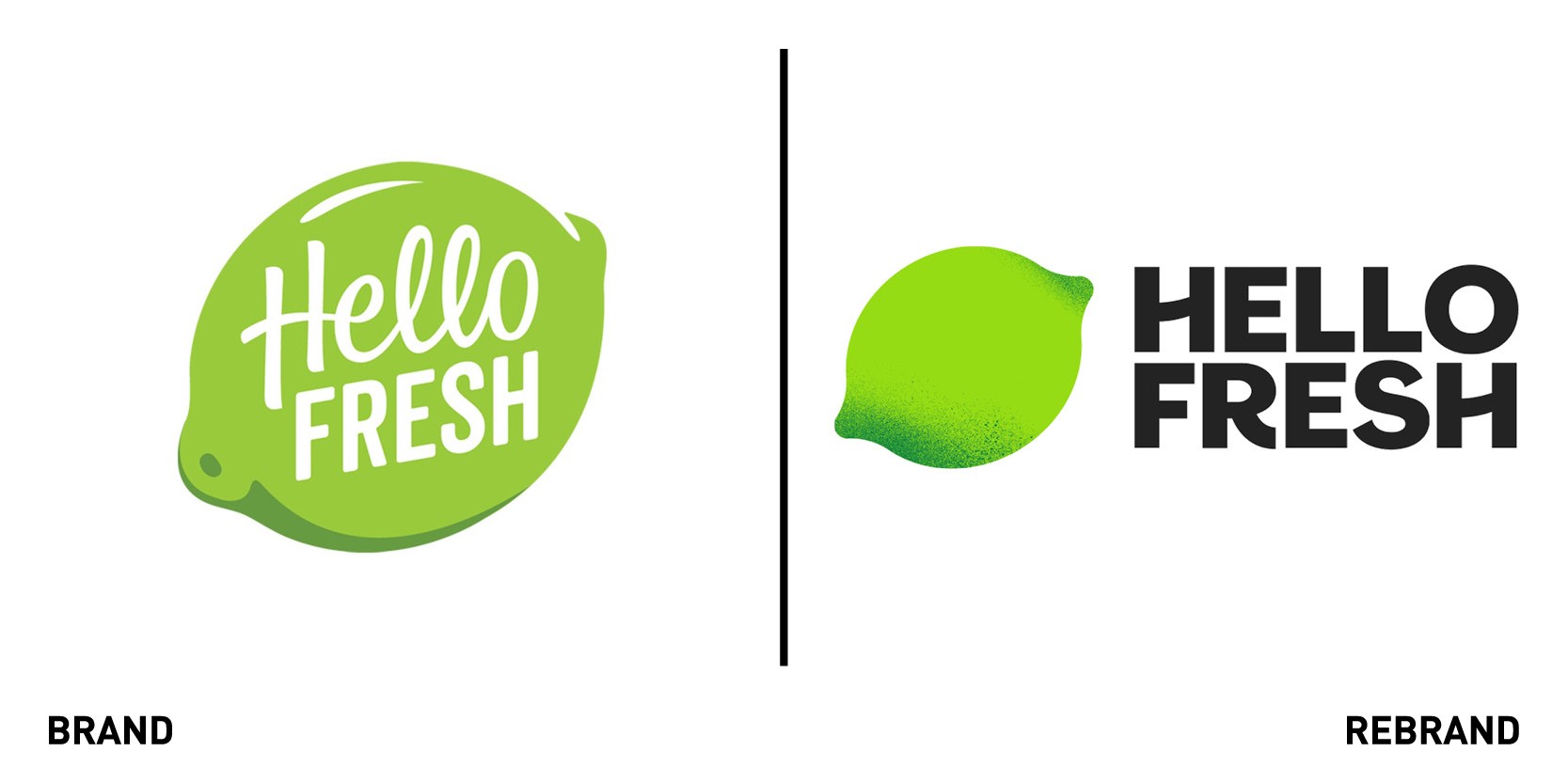
Global food box delivery brand HelloFresh worked with DesignStudio to create a new look and identity that will unify them across their 13 markets worldwide. To communicate the concept of different ingredients and ideas coming together in one box, Design Studio established a toolkit and brand formula that allows for the company to create their own assets across all touchpoints from an app, on web and across all comms, right to the box itself. The new identity was inspired by the simple step-by-step process of the HelloFresh food box kits, becoming a grid system that fits everything together. While the lime logo stays, it has been simplified and softened. A vibrant colour palette, together with photography that shows real kitchens instead of perfect studio meals adds an authentic tone to the brand. DesignStudio also created a set of illustrations, tags and stickers used in both communications, recipe cards and packaging, which allows HelloFresh to combine dietary information, food quality and box type in a fun and clear way. The new identity celebrates the achievement of home cooking, framing it as a doable and enjoyable challenge.
"This work is a great demonstration of how we can use holistic thinking to solve seemingly unrelated problems. A system that creates efficiency in the warehouse whilst enhancing the experience of cooking a meal,” says Eric NG, creative director at DesignStudio.
Mobvista
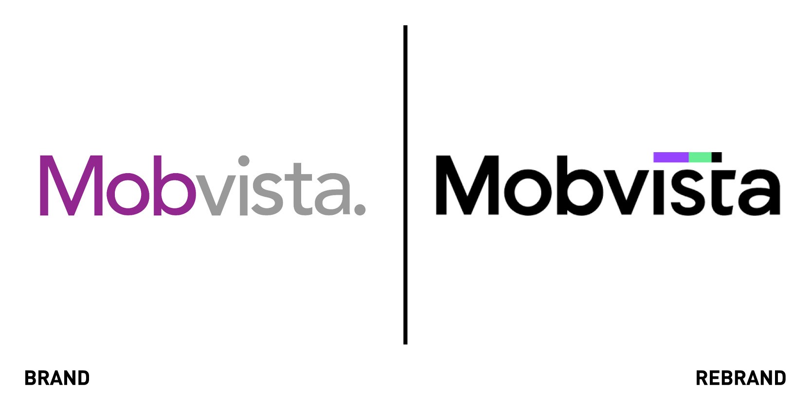
Technology platform Mobvista worked with global branding agency FutureBrand to reimagine its brand identity following a period of sustained innovation and business growth. The aim was to imagine a new, comprehensive identity and unified brand experience for Mobvista, refreshing the existing brand with a new vitality and a more modern and leading personality. To do so, FutureBrand adopted the ‘one family, many faces’ approach to create a balance of visual endorsements between Mobvista and its subsidiaries. The result is a unified and flexible visual identity for the family of brands, which retains the individualities of each sub-brand. The logo is scientific and humanised to highlight the brand’s core competitiveness and personality. Mobvista wanted to highlight the customer-centric nature of its brand, which is seen in the different brand assets, such as the roving dot of the ;I’ in the logo that moves across the brand name to form the letter ‘t’ reflecting the ways in which the company’s technology connects people from west to east. The new colour scheme of purple and green not only represents the vibrancy of the company and the teams but also sets Mobvista aside from other tech companies, which usually adopt less catchy colours.
“In order to unify Mobvista with its subsidiaries, we needed to strike a fine balance between telling the story of the customer-centric warm nature of the brand and the professionalism of the tech industry. Mobvista provides considered solutions for its customers and we wanted this caring nature to be reflected throughout the visual language. We redesigned its colour palette to include bright purples and the colour green to reflect its positivity and human-centricity,” says Sam Yan, creative director of Greater China from FutureBrand.
RTL Exclusive
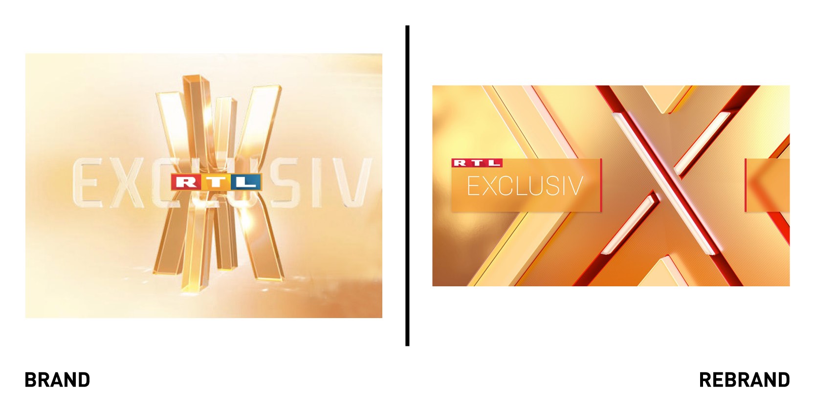
The largest commercial broadcaster in Germany, RTL Deutschland redesigned all of its seven information programmes with the help of Amsterdam-based creative agency CapeRock. The new image of the information programmes defines the third design-world of RTL Deutschland alongside sport and entertainment. The rebrand offers a new look of contemporary information world in which programme brand, studio, content and presenter form an even stronger unit than before. The presenter also becomes a mediator, retaining most of the audience’s attention. The new brand family of magazines and news maintains a visual link to the main brand RTL, while also being unique in its own way; the three-dimensional ‘X logos’ stand out individually yet are clearly recognisable as one whole unit. They deliver a strong, distinctive image that works equally well on-air, online and offline, while offering the viewer an effortless orientation in an increasingly complex digital world. The three-dimensional X-logos are also moved in the centre of the studios and used as a strong key-image on the virtual panorama monitors.
Resuscitation Council UK

Resuscitation Council UK worked with design agency IE Brand to launch a rebrand that would reposition the charity for a wider audience, without compromising its long-standing reputation for their expertise. The charity, which aims to teach all of society the skills to save a life by delivering training, developing guidelines and influencing policy, recognised that their messaging lacked clarity and cut-through, and that popular campaigns were too detached from the parent brand. By conducting detailed research, IE Brand discovered that the public had barely heard of the brand, while its main logo of a heart with an electrical lighting bolt running through it was triggering misplaced anxiety about the risk of harming people by operating a defibrillators incorrectly. The brand’s new tone of voice, messaging and visual identity are carefully crafted to reflect the charity’s personality as passionate, accessible and expert. At the heart of the new identity lie a series of clinically accurate ECG patterns which represent everything from normal heart rhythms through to abnormal variations that contribute to sudden cardiac arrest and the use of a defibrillator. This theme also runs through the new logo, based around a heart and line motif and a clear, elegant, and modern typeface. The new identity is more approachable and inviting, able to switch from being clinician-facing for formal documents like reports and manuals, to being public-facing for a national life saving campaign.


