#TransformTuesday: 25 August

Here is this week's selection of rebrands from around the world. For more from #TransformTuesday, follow @Transformsays on Twitter.
Afterpay
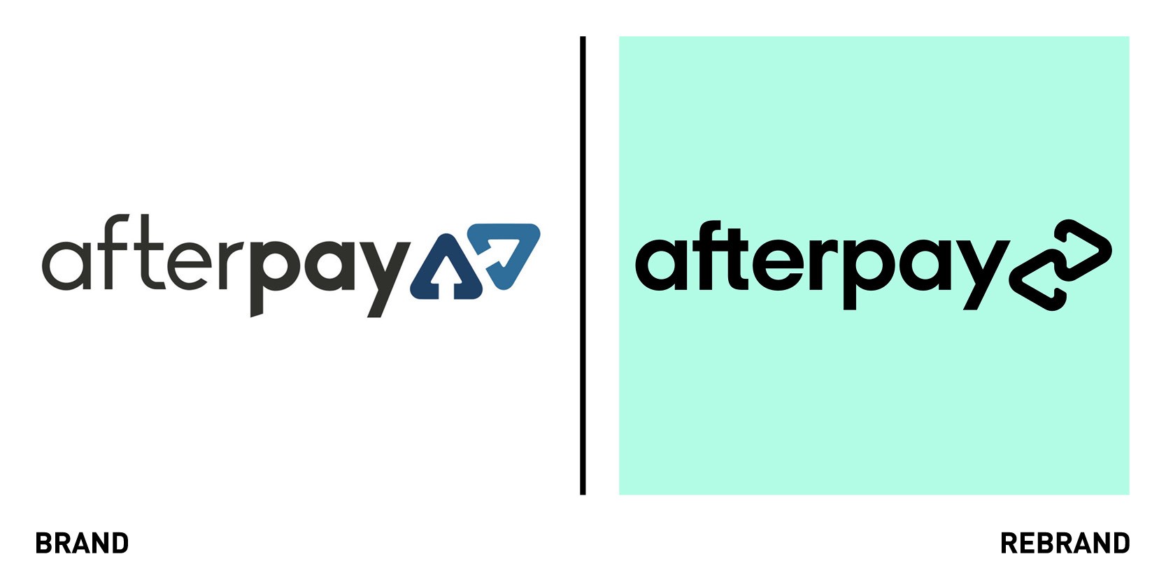
New York-based design studio Yummy Colours worked with Australian fintech ‘buy now, pay later’ platform Afterpay to create a new brand identity. The new logo retains the balance of the previous symbol by combining the existing two triangles into a new, continuous shape, which creates an interconnectedness. This how Afterpay acts as a link between the company, merchants and customers and the way in which relationship among all parties is continually strengthened every time they interact with one another. For the rebrand, Yummy Colours, in collaboration with Pantone, also created a bespoke signature colour, the Afterpay Bondi Mint.
“Colour is one of the easiest and most effective ways to highlight to a consumer the unique qualities and promise behind the brand because the colour a brand chooses to present themselves is the most tangible representation of who they are,” explains Laurie Pressman, vice-president at Pantone Color Institute. “Bondi Mint boldly anchors Afterpay’s visual language, distinguishing the brand within the landscape of Buy Now Pay Later companies, and rooting it in youthful, forward-thinking Australian culture with human connection at the core,”
The new typeface, Italian Plate No2 Expanded, is bold and modern with a balanced geometry and soft angles to express friendliness. It works as functional typography across digital platforms and print materials.
Holsten
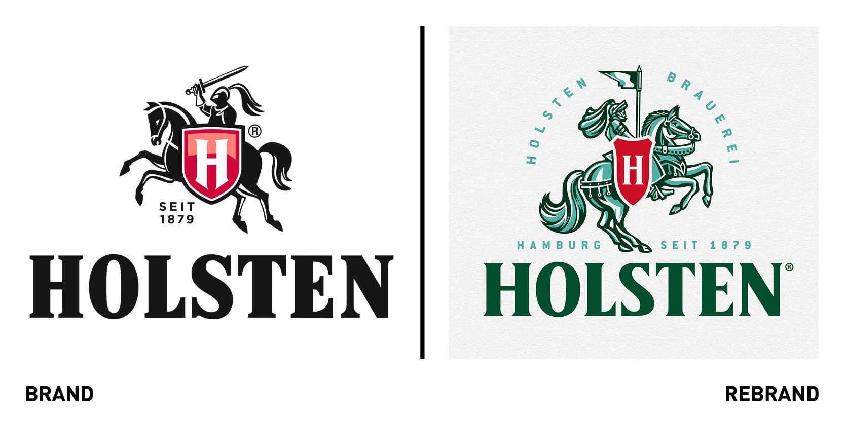
Creative agency Design Bridge London unveiled a new visual identity and packaging design for Hamburg’s iconic beer Holsten that would refresh the brand for the current market without alienating it’s existing consumer base. The rebrand draws on Carlsberg Germany’s home city to reconnect Holsten with its hardworking roots, injecting a new sense of craft into the visual identity that balances modernity with heritage. Noticing that the impact of the knight had been lost to an over-polished, mass-produced design approach, Design Bridge re-imagined the key brand asset, recrafting it so it had authentic historical details. The knight now proudly rides forwards becoming a beacon of leadership. The new logo also includes a light and refreshing teal into the colour palette which references the oxidised copper of the knight statue that sits on top of Holsten’s historic brewery tower. Most of the new visual identity has been crafted by hand to evoke the merchant work ethic that built the port city.
Design Bridge also developed a new bespoke wordmark influenced by Hamburg’s rich architecture, new packaging and new brand assets, including glassware, beer lenses and coasters.
“Over the years Holsten has proven its strong and enduring presence in the Hamburg beer market, as well outside of the city borders. By collaborating with Design Bridge we have succeeded in creating a refreshed visual identity that brings a sense of pride back into our brand. Balancing a new level of the craft and detail that is connected to our heritage, the brand world also feels bold, keeping Holsten relevant in the ever-changing beer sector,” says senior brand manager at Holsten, Svenja Wohlers.
Kinedu

Kinedu, a paid early childhood development app known for providing science-based educational materials to new parents worked with independent agency Burns Group to rebrand their identity to help differentiate themselves in a saturated market of free parenting resources. Kinedu need a strong brand foundation to launch into a new phase of growth serving the changing needs of early childhood providers, while keeping the child at the centre. Burns Group created a new positioning for Kinedu that focused on the fact that its differentiator lies in its ability to guide first-time mums through their easy-to-understand how-to videos. This led to the creation of a new brand tagline ‘Play Together, Grow Together,’ which directly taps into the insight about how mums develop and grow alongside their child and are eager of guidance. The abstract ‘K’ in the new wordmark, which is inspired by the classic wooden alphabet blocks, helps communicate the brand’s offering of discovery through play while emphasising their expertise and approachability.
“New moms are hungry to learn so they can nurture their growing child. With so much information available, it can be overwhelming for parents to bridge the gap between “standard developmental milestones” and their real life, unique child. That’s where Kinedu comes in. The new brand positions Kinedu as a mom’s nurturing, actionable and realistic ally,” says Meghan Dailey, associate CD at Burns Group.
The new brand concept and visual identity that Burns Group developed are anchored in our core purpose - to improve the beginning of every small child’s story – so we can show parents that it’s not about checking off a list of milestones, but rather about nurturing the little daily changes that end up building a strong foundation for the rest of a child’s life,” adds CMO of Kinedu Laura Artigas.
Plastic Free Fridays
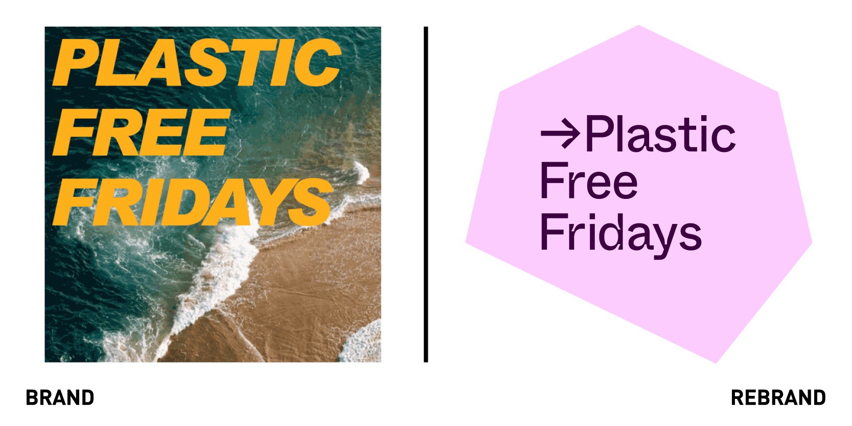
London-based digital-first design studio So Far So Good has unveiled its debut campaign with a redesign and social media campaign for LA-based grassroots movement Plastic Free Fridays, revamping its brand logo, website and online asset. With many aware of the issues caused by single-use plastic crisis but few directly affected by them, Plastic Free Fridays needed to tap into the social conscience of its followers and foster a movement that would change behaviour on a wide scale. To do so, So Far So Good leveraged social storytelling, through Instagram stories and animated gifs, and entertainment tactics to educate people and provide tangible solutions to the plastic crisis. It also uses kinetic typography to boos engagement on social channels. The rebrand also includes the colour pink to enable to cause to stand out in a sector saturated with palettes of blues and greens.
“Just over a year after our initial launch we are thrilled to have worked alongside So Far So Good to create a brand look that is as fresh and bold as our thinking. We look forward to a future geared towards progress, collective action and making the world a better place,” says co-founder and chief visionary at Plastic Free Fridays Sierra Quitiquit.
Playtika
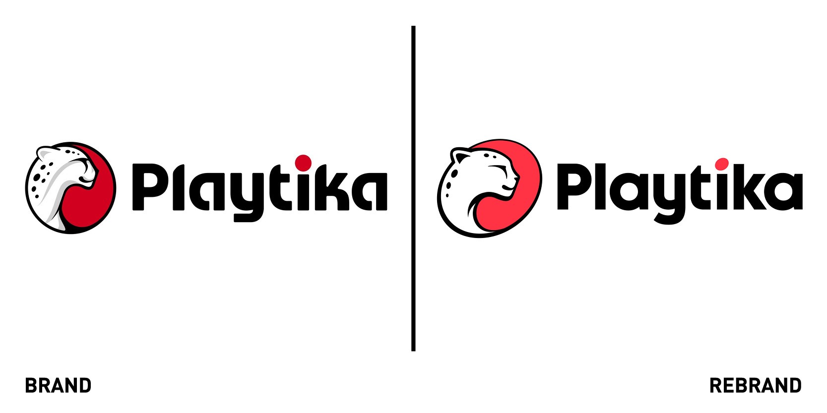
Israel-based gaming company Playtika unveiled a new brand identity, including new logo, colour palette, typography and photography. The new logo, which is a development of the previous cheetah icon is simplified design yet it appears bolder, with the circle becoming a slanted ellipses shape to emphasise the movement of the brand. These are also found in other brand assets, adding to the sense of evolution and taking inspiration from the fast-moving footprints of cheetahs. Adding to the bold look of the cheetah is the colour palette, which centres around a bright red, with the addition of black and white shades to add visual interest across brand assets. The icons, taken from simplified versions of existing game graphics, bring a sense of playful rebellion and confidence to the brand, representing the vibrant world of gaming, in addition to creativity and fun.


