#TransformTuesday: 20 October

Here is this week's selection of rebrands from around the world. For more from #TransformTuesday, follow @Transformsays on Twitter.
Glasgow Gin
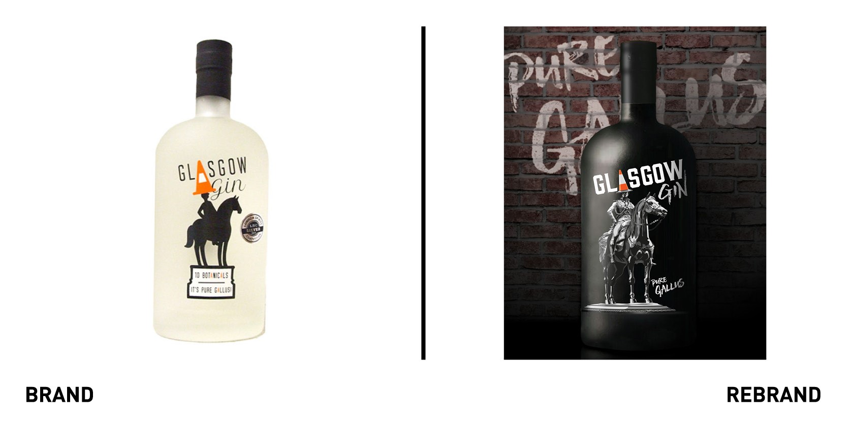
Spirits brand Glasgow Gin worked with drinks specialist creative agency Pocket Rocket Creative to launch with a vibrant and eye-catching new identity. The rebrand also includes a redesign in the iconic statue on the logo. Hand crafted by Gleann Mor Spirits Company, the branding features a newly commissioned version of Glasgow’s iconic Duke of Wellington statue, complete with traffic cone. The launch will be supported by a full social media campaign which will see the Duke’s famous steed, Copenhagen, brought to life in a series of animations. The new identity encapsulate the fun, fresh and fruity Glaswegian gin, as bold and cheecky as the city that inspired it.
“Just like the city that inspired it, Glasgow Gin is fun, playful and vibrant, so we wanted the new look to reflect this unique personality. The Duke and his famous cone are instantly recognisable all over the world, and we think the relaunched bottle represents the true spirit of the city more than ever. The new branding gives us a bolder and stronger presence, and perfectly encapsulates the gallus modern spirit inside,” says Karin Mair, co-founder of Gleann Mor.
Lixir
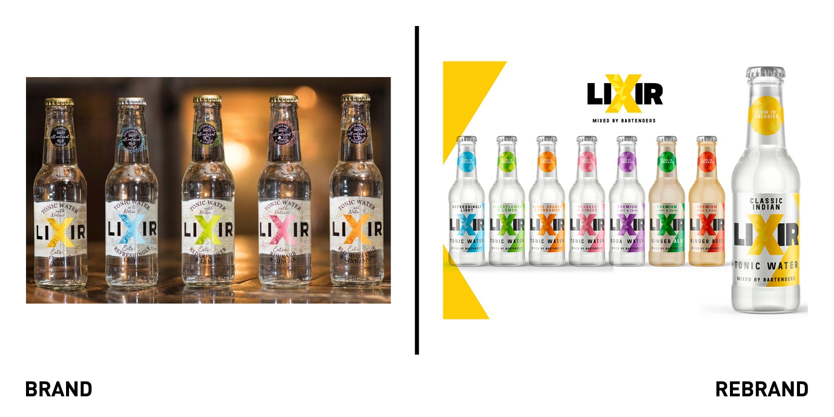
Tonics and mixers brand Lixir Drinks worked with London-based brand communications agency We Launch to create a new and edgier brand identity to appeal to a younger, socially switched-on audience. Although the previous brand embedded a premium look and feel, it lacked shelf-standout and on-pack hierarchy was confusing, with individual flavours and product names getting completely lost. With the iconic Lixir ‘X’ at its core, which was refreshed to be chunkier, We Launch developed a bold graphic system that jumps out on-pack but it also easily identifiable across social media and other digital channels. The new strapline ‘Mixed by Bartender’s included on the front of new pack design conveys Lixir’s compelling back story to consumers. The packs retain a familiar colour palette which customers will recognise across the portfolio.
Oberlo
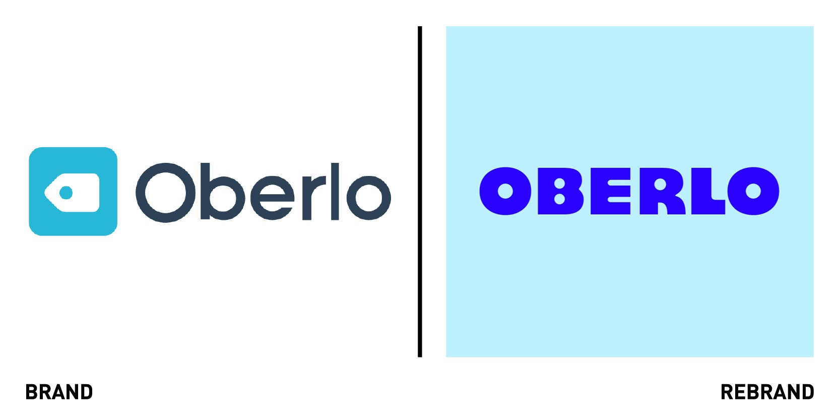
Design agency DesignStudio rebranded Oberlo, Shopify’s siter company that encourages the next generation if entrepreneurs to take control of their future and create the lifestyle that suits them. DesignSutdio created the new identity around four values that embody the mindset an Oberlo entrepreneur must have: start something, stay real, be relentless, raise the bar. These also became cornerstones from how the brand should operate, behave and work for its users: work hard and always be hungry for better. The visual and verbal language captures the DIY attitude of the entrepreneur and is also informed by the values, without being too glossy or unrealistic, but rather showing the sweat, and real talk. Illustrators Guy Field and Appear Offline created scrappy, rebellious and irreverent illustrations that subvert traditional business tropes, giving everything a ‘work in progress’ feel.
“Working with Oberlo we were struck by their distinct and honest view of the real world of entrepreneurialism, no romanticised ideals of overnight success stories but a self-made, rebellious energy embracing both failure and success as halves of the same whole. We wanted this make-it-yourself spirit to run throughout the strategy and creative expression – creating a brand with honest immediacy and a little bit of grit,” says Alex Johns, director at Design Studio.
Sada
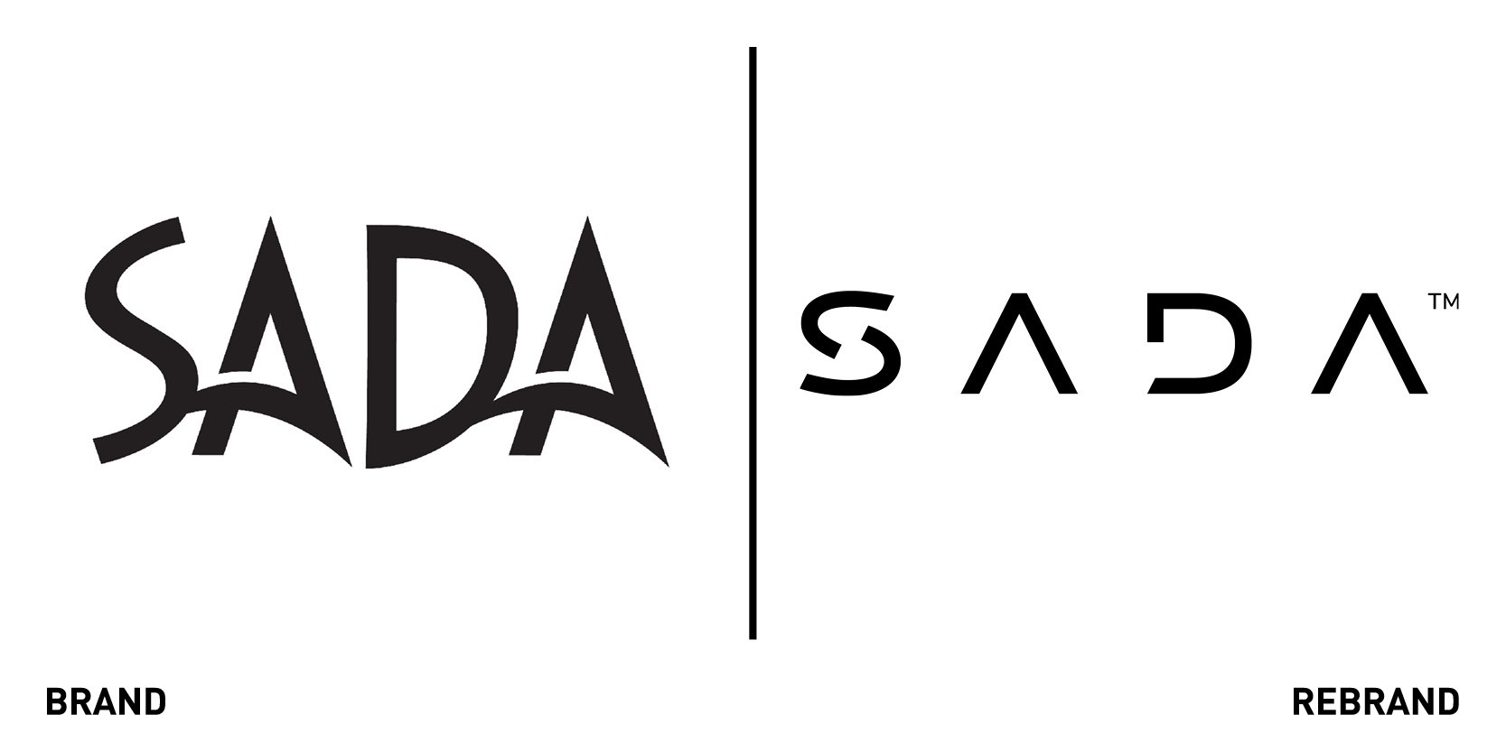
To mark its 20th anniversary, global technology consultancy SADA worked with global branding agency Siegel+Gale to create a new corporate brand, including a redesigned logo and revised brand positioning, which embodies SADA’s use of technology to create meaningful societal and business change. These include support for programmes focused on diversity, inclusion and development of the next generation of cloud engineers. The new strapline ‘Together, we’re all in,’ conveys SADA’s core mission and its fearless approach to finding the best way forward through concrete solutions. The brand purpose focused around three pillars: bold, dynamic and nonstop, all of which reflect how the consultancy delivers to each other every day.
“The previous brand expression didn’t reflect the stature and the growth of SADA’S business. SADA’S culture is a critical ingredient in how it delivers meaningful results for its clients, so the new brand captures that spirit while ensuring it has the elasticity and longevity to grow as the company evolves,” says Matthias Mencke, group creative director at Siegel+Gale.
“This process was about much more than developing new logos, typography and imagery. It was about distilling our ‘brand voice.’ We want the world to know that SADA is an organization that cares about its people and the communities in which we work. We value diversity and inclusion. We pride ourselves on continuous innovation, strong partnerships and service excellence,” says Narine Galstian, CMO of SADA.
Sleek MakeUP
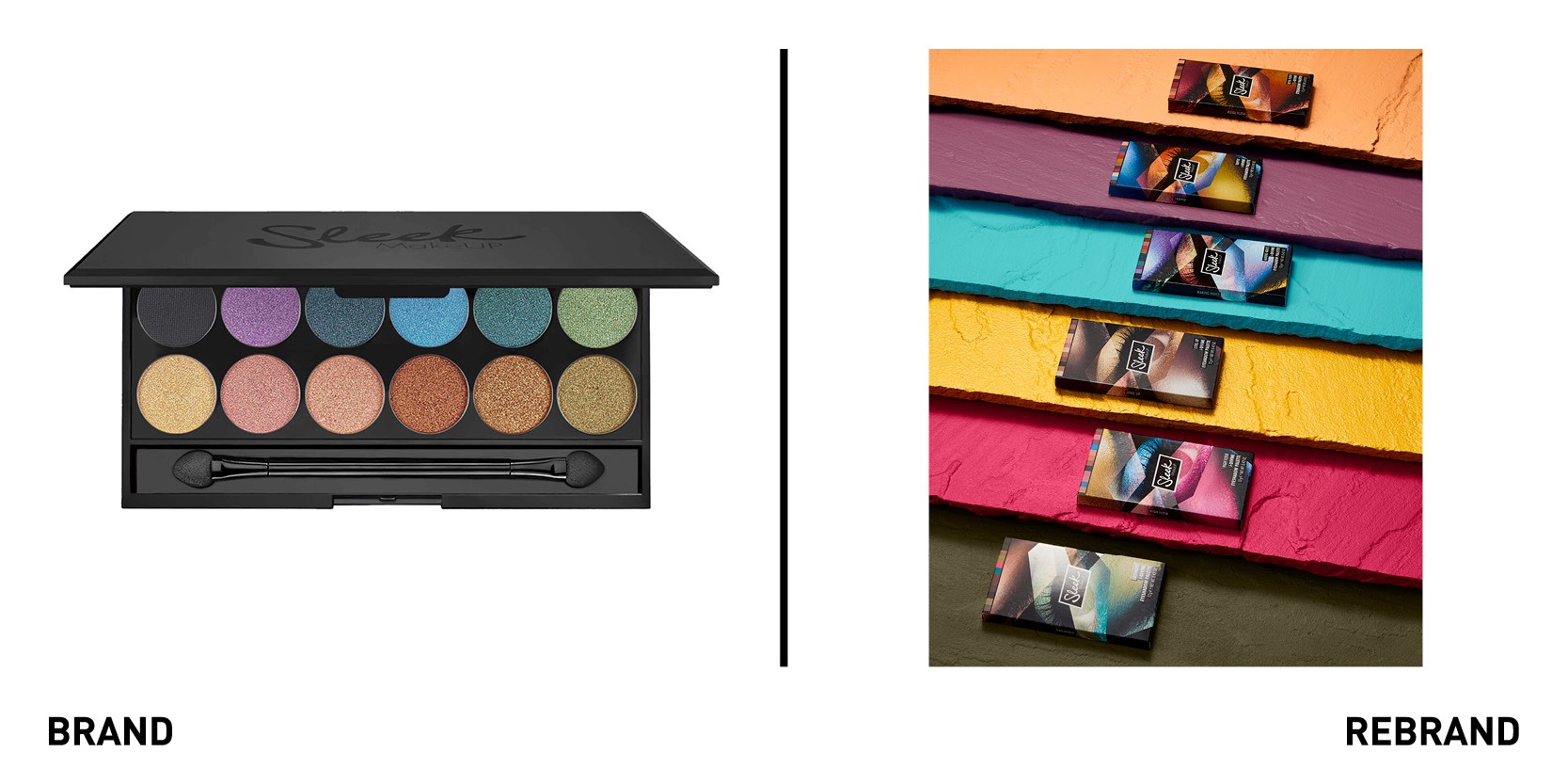
Cosmetic brand owned by Walgreens Boots Alliance Sleek MakeUP has rebranded its range with a bold new packaging designed by brand agency Free The Birds. The rebrand further emphasises Sleek MakeUP’s inclusive values, reflected through the highly pigmented range to cater for all skin tones. Free The Bird’s work was informed by Sleek’s ‘work it your own way’ brand manifesto, leading to a design that champions the rights for everyone to be proud of who they are. The goal was to align the brand’s packaging to an overarching brand visual identity to drive standout and appeal at point of purchase while also harmonising the look of the global product assortment. The result was the use of big type to send out the message that Sleek’s makeup provides a powerful form of self-expression. For the visual element, the agency was inspired by sharp-lined and angular Brutalist and other modern architecture in London.
Vintner

Creative agency Saboteur created a full rebrand and name change, from The Vintner to Vintner, for the London wine merchant as it transitions to a more consumer-facing brand intent on doubling its business within two years. The rebrand helped shift the focus away from the B2B focus with on and off-trade clients to a more B2C brand with a broader appeal, reflected through the strapline ‘wine for all and all for wine.’ The vibrant and bold brand identity with a bright colour palette of oranges and pinks appeals to a younger target audience.
“We’ve helped move Vintner away from a declining trade sector to a become a consumer first brand with a positioning, narrative, logo, tone-of-voice and set of brand guidelines which ensures they stand out from every other wine merchant. No stuffy cork shots. No over-used vineyard landscapes. But a relevant, playful and vibrant way of representing everything they do in a truly inclusive way,” says Paul Cardwell from Saboteur.


