#TransformTuesday: 15 September

Here is this week's selection of rebrands from around the world. For more from #TransformTuesday, follow @Transformsays on Twitter.
Benriach
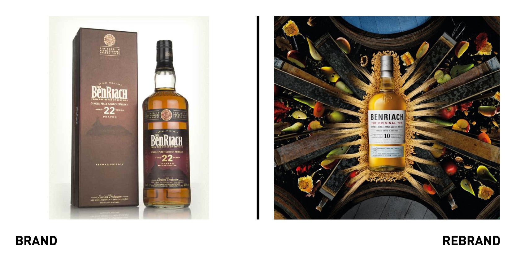
Global malt production company Benriach Distillery, located in Scotland’s Speyside, worked with Master Blender Dr. Rachel Barrie and her team, to create a distinctive flavour-forward portfolio of Single Malts, together with a new look inspired by the distillery’s creative heritage. Displaying the diversity and versatility of Benriach’s Orchard fruit-laden style, the new range spans the full spectrum of whisky flavour. The packaging takes inspiration from the first Benriach Single Malt released two decades ago, with the portfolio’s colour palette inspired by Speyside’s natural environment in which the distillery sits. In addition to Benriach The Original Ten, the core range will feature a new recipe for Benriach’s sherried twelve year old whisky.
“The new range perfectly marries tradition and innovation that is central to Benriach’s story. Inspired by the 1994 bottling of the Original Ten, with its fruit-laden complexity and smooth, rounded taste, the new range re-imagines the 1898 origins of Benriach, brought to life in the 21st century through fusing distilling styles with extraordinary casks,” says Benriach Master Blender, Dr Rachel Barrie.
For the first time in its 120+ years of history, Benriach is also expected to unveil its first official visitor centre to the public later this year, allowing visitors from around the world to explore this Speyside whisky gem.
Jollibee
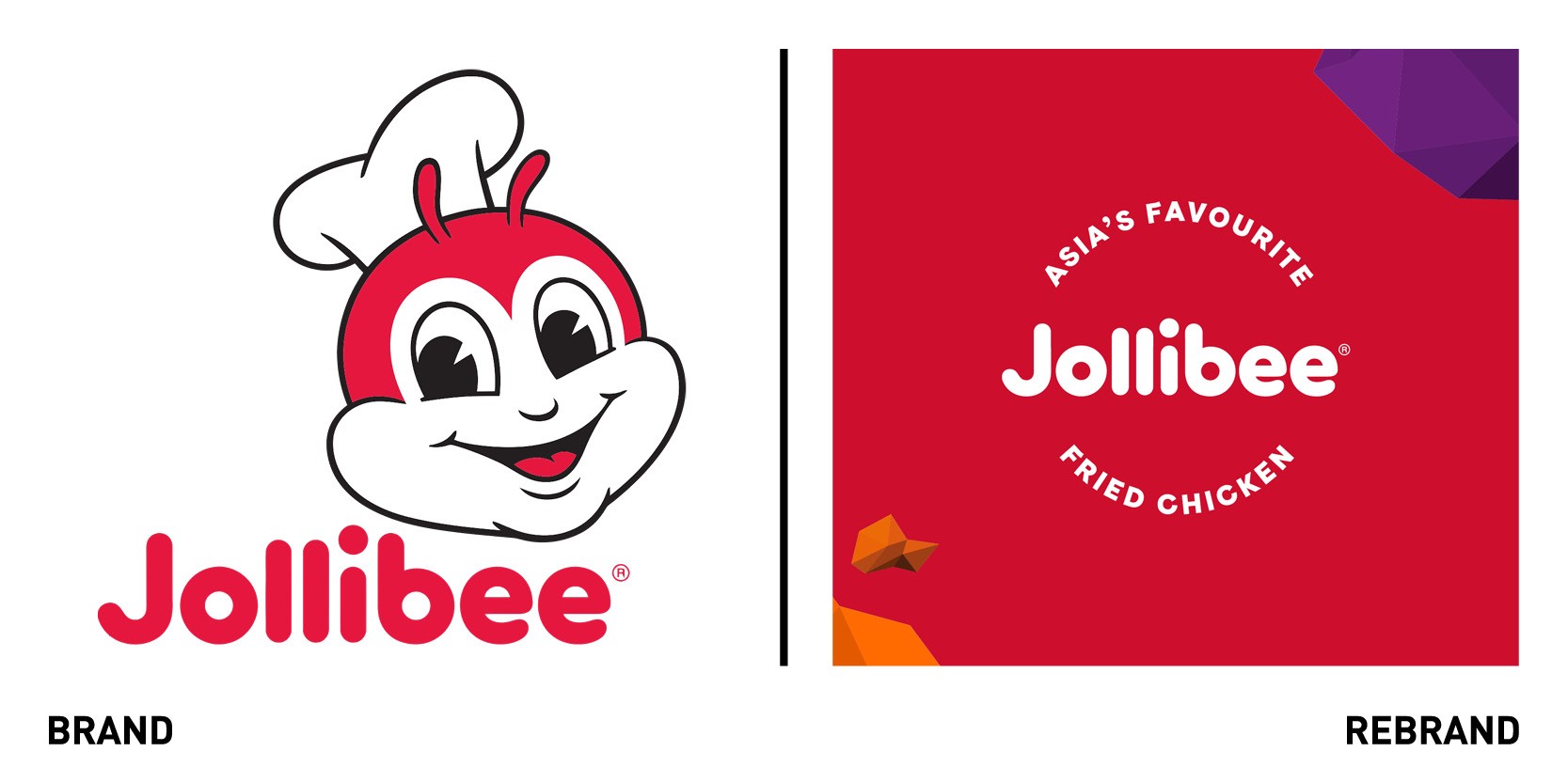
London-based creative consultancy ico Design worked with Filipino multinational fast-food chain specialised in fried chicken Jollibee to rebrand it for the British market, attracting UK fast-food fanatics ahead of launching its newest restaurant in Liverpool. ico Design introduced a new colour palette, focusing on orange, one of the brand’s secondary colours, and introduced a purple inspired by traditional Filipino textiles, to celebrate the brand’s heritage. This ode is further emphasised with the graphic shapes used in the visuals, which reference both the islands of the Philippines `1and the shapes of fried chicken. The in-store interiors incorporate popular Filipino phrases and the brand’s greatest triumphs, such as being Asia’s favourite fried chicken.
“Jollibee approached us to help elevate its brand and introduce it to local audiences. Our strategy was to develop a new and strong attitude that celebrates the brand’s Asian heritage while demonstrating a Western restaurant concept. The art direction of photography gives an Asian twist to a familiar Western style, which will help to engage British customers,” says Vivek Bhatia, creative director and partner at ico Design.
Kirsty's
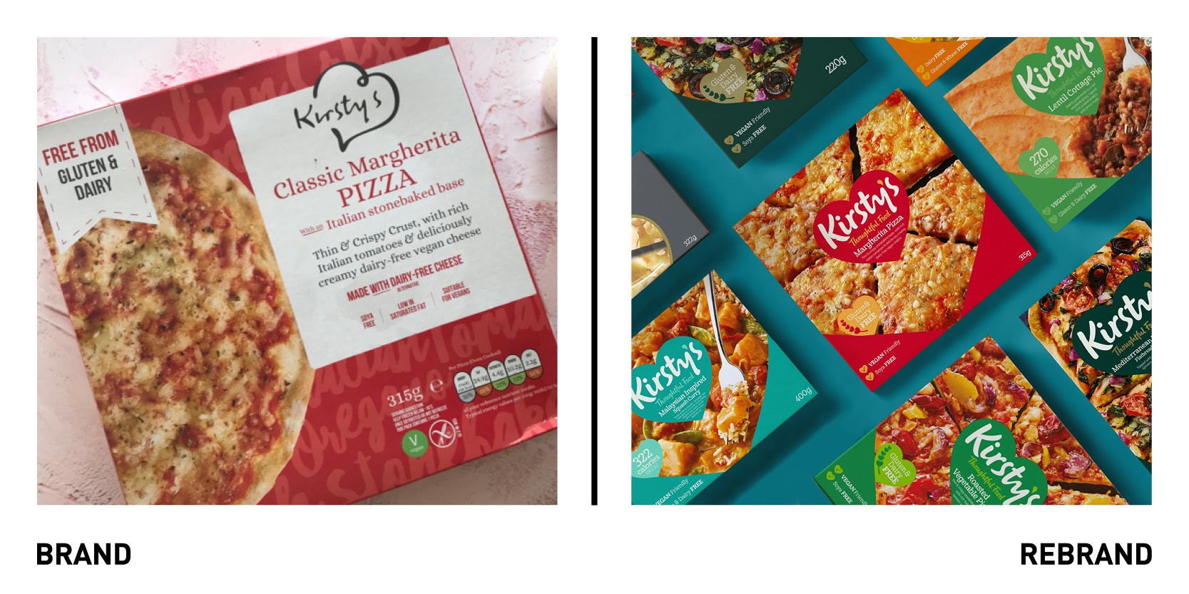
Yorkshire based ‘free-from’ food brand Kristy’s is aiming to take top spot in the sector with a new rebrand, including a fresh package and logo design to help showcase the ‘well-being and positive health’ credentials. Kirsty’s sought to use the rebrand to appeal to a wider audience and attract new consumers, helping ‘free-from’ food to become more mainstream and eventually become the number one child and frozen ‘free from’ brand in the UK. In a category often associated with compromising taste, the new brand helps broaden appeal through its use of bold and bright colours, which communicate flavour, and delicious-looking product photography.
“Making sure our packaging works hard on shelf is crucial in extending our appeal. Not only do we have multiple categories and different target audiences but as it’s my name on the pack, the design choices feel very personal to me. I can honestly say I spent more time looking at colours on this project than when I was choosing my living room wallpaper,” says Kirst Henshaw, found and managing director of Kirsty’s.
Mylo
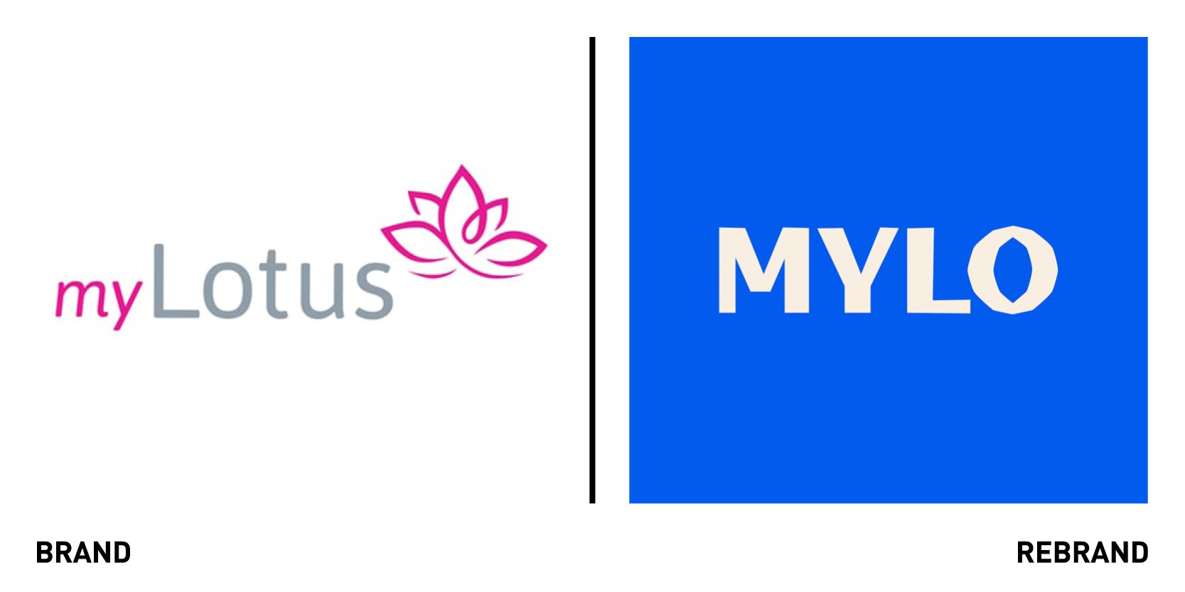
Fertility technology company myLotus relaunches as Mylo, after a rebrand by Ragged Edge, which helped recognise the hardships men and women experience when going through the fertility journey. The rebrand speaks honestly and empathetically about the challenges around getting pregnant, showing how a brave approach to brand strategy can change the dialogue around a subject like conception. The key word at the heart of the brand is real. The rebrand needed to deliver clinical smarts, to reflect its lab-quality ovulation tracker, which offers women precise knowledge about their own bodies, while also showing emotional intelligence to acknowledge the difficulties in the process. The tone of voice offers real talk, being informative but not over scientific, while the photography shows real men and women. The colour palette is made up of skin tones, and complemented by a bright blue that delivers a sense of energy while rooting it in the category.
“Getting pregnant is not always a matter of time, it’s more a matter of timing. Mylo gets real about conception. Real information, real empathy, for real women and men facing the realities of trying to have a baby,” says Max Ottignon, co-founder of Ragged Edge.
The name change allowed the brand to feel more contemporary and non-gender specific, which is essential for the brand to expand its remit and product offer in the future.
The Athletic
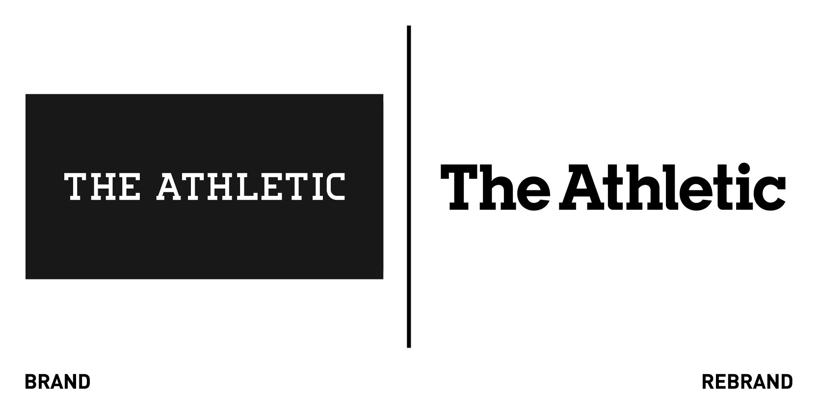
Subscription-based digital sports media company The Athletic worked with New York-based global design studio Gretel to create a new brand identity, which highlights the value of the subscription-based model and shows off the company’s updated purpose matching the quality of its storytelling. Together, the two refined the brand’s purpose: to immerse fans in the power of sport. To do so Gretel held workshops with stakeholders across the company, including journalists for the publication and long-time readers of Athletic, to unveil what makes the brand unique. The visual identity was designed to connect fans to the sports, teams and players they love. Using the original logo as starting point, the rebrand expands to include the inline throughout the identity, evoking a sense of continuous connection. The new wordmark, which uses slab characters, conveys the idea of a modern brand with a nostalgic spirit. The colour palette now consists of neutral and nuanced warm greys, while a secondary one complements any team colour, giving readers a change to feel more deeply connected to the content and the platform.
“The Athletic’s new identity captures the brand’s sense of care, rigor and optimism as a strategic foundation, ultimately creating a powerful and distinct brand on top of an already superior product,” says Daniel Edmundson, strategy director at Gretel.


