#TransformTuesday: 13 October

Here is this week's selection of rebrands from around the world. For more from #TransformTuesday, follow @Transformsays on Twitter.
Bowel Research UK
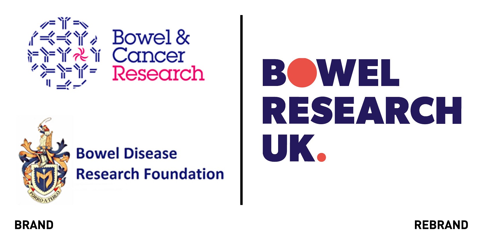
Charity, health and education brand agency IE Brand worked on the rebrand of Bowel Research UK, formed from two bowel research charities, Bowel & Cancer Research and Bowel Disease Research Foundation. The new charity, aims to raise the profile of these condition, break down taboos and fund scientific research into treatments. In terms of renaming, Bowel’ and ‘research’ were both essential ‘hygiene words,’ and whilst the word ‘cancer’ was recognised as being useful and relevant, it was moved out of the name and into the charity’s new strapline ‘Let’s end bowel cancer and bowel disease.’ Seeking to appeal beyond the charity’s existing clinical and academic audience and highlight the need for more life-changing research, IE Brand created a warm, empathetic and well-placed messaging and visual identity, to capture both the heart and the mind. The visual identity breaks the taboos around bowels, bums and poo, through its ‘colon; graphic that can be used as a background for type or a holding device of supporting photography. The theme is perpetuated with circles, which represent a cross section of the large and small intestines, and can be animated on digital platforms, depicting wave-like muscle contractions in the gut.
Real Handful Trail mix
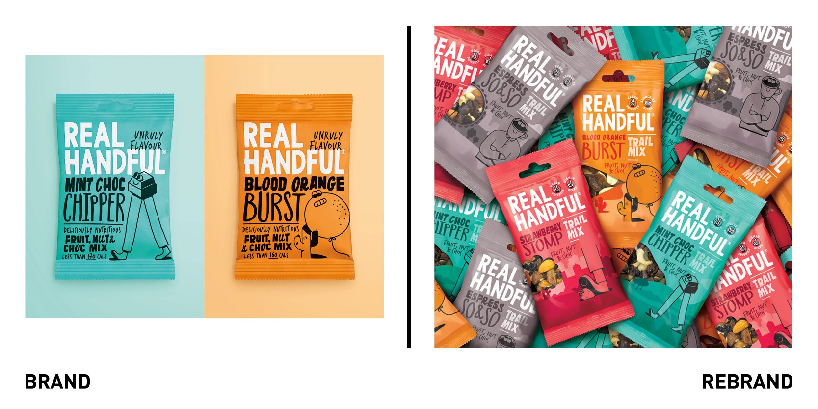
Healthier snacking start-up Real Handful worked with Brandon consultancy to create a new packaging and design for its trail mix and protein bars that would evolve the brand identity and messaging on pack to encourage purchase and enable future growth. While the brand’s bold packaging had served Real Handful well in terms of establishing the brand personality and gaining distribution, it had rapidly become clear that introducing Real Handful’s ‘Trail Mix; inspired snacks to new consumers required clearer communications of the snack’s nutritional benefits. This idea led to ‘All Hail the Trail,’ a widely popular snack format in the US and Australasia but less so in UK, which allows for it to be a distinct format for Real Handful. Real Handful hand icon was included on packaging to highlight benefits and nutritional claims such as ‘vegan friendly,’ and ‘gluten free’ on the front of the pack, which were easy for consumers to see at first glance on shelf. Brandon also incorporated a window into the backdrop’s design on the trail mix and added a product shot to the bars in ‘Real Handful’ way to dial up flavour cues and appetite appeal. The added landscape backdrops from the mountains to the beach and desert, hints at the outdoors and the origin of the trail mix, helping to establish a connection and ownability of the category, and providing a platform for the brand world to exist off pack.
“Throughout the project we were keen to dial up the product benefits while ensuring that the heart and soul of the brand wasn’t lost; which isn’t easy on such a small pack format! All Hail the Trail is truly authentic to both product and brand with its bold and celebratory personality.
One Crans Montana
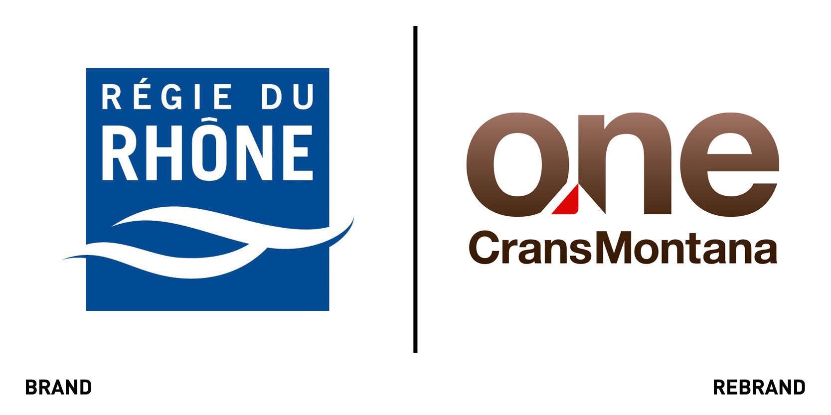
Premier real estate agency in the Swiss mountain resort of Crans-Montana has rebranded as One Crans Montana. The company manages the sales and purchase, management and rental of real estate in the resort and more recently if expanded its remit into private concierge service for those staying in the buildings. To mirror this one-stop shop provided by the new concierge service, it partnered with London-based brand agency Designhouse to create a rebrand. The new strapline ‘Expect more’ references the first-class service and experience provided by One Crans Montana employees. The subtle mountain reference created through the ‘cut’ in the lettering and the typography in the logo pay tribute to the brand’s Swiss location and heritage. The mountain cut, which allows for customisation using colours from both primary and secondary palettes to represent different services, was used to create snowflake patterns, introduced to provide a flexible graphic device overlaying imagery.
Unzer

Design agency SomeOne in London created a new brand identity for one of the fastest-growing fintech service providers in Germany, Unzer, formerly known as Heidelpay Group. As the business in the group came together as a single provider, SomeOne in London helped brand and name the business to support its introduction to the international market, while staying true to its Central European heritage. Indeed the new name, Unzer, is derived from ‘Unser’ in German, meaning ‘Our;’ it is short, memorable and ‘techy, and also easily pronounced. To develop Unzer’s ‘character,’ which is essential for tech brands to set themselves apar in a well regulated sector, SomeOne focused on the shamelessly bold and bright hot pink colour palette, reflecting an identity built for a vibrant and integrated economy. The tone is fresh, open and smart, epitomised by all elements of design, from photography, to typography to UI/UX. The design agency also collaborated with The Mill to produce moving assets for the stack representing the endless flow of payments Unzer provides for merchants to do business.
“It’s vital to create visually distinctive identities in heavily regulated markets to be emotionally front of mind amongst heavy international competition. This is a bold new start for such an exciting business. We began working together just before COVID-19 struck and, somewhat befitting a digital platform, 95% of this project was completed remotely,” says David Law, founder of SomeOne.
World Triathlon
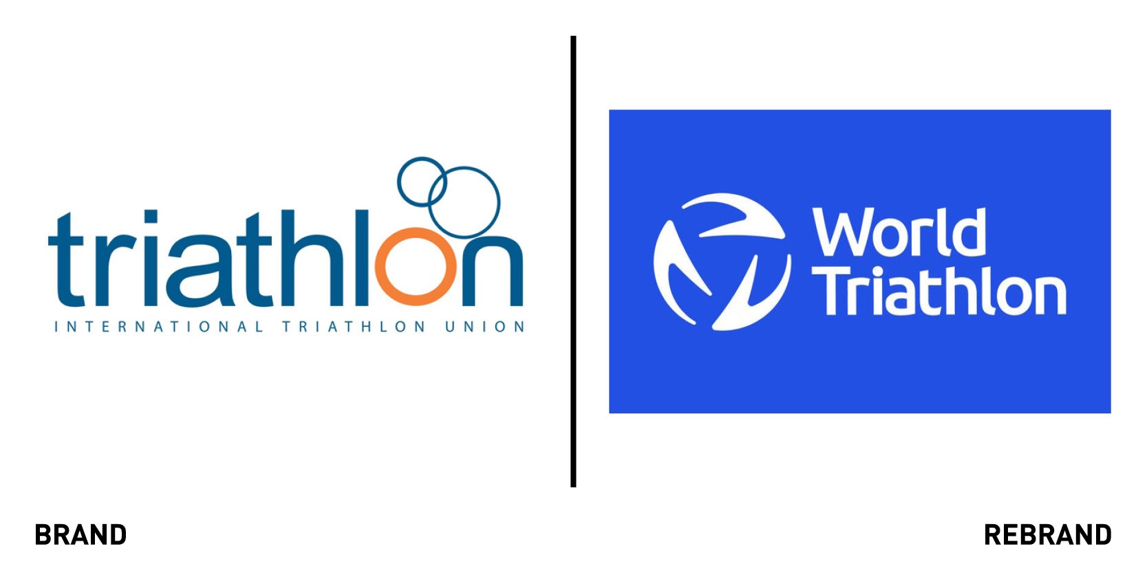
World Triathlon, the global governing body leading the sport of triathlon and uniting the multi-sport movement, worked with RBL brand agency to create a redesign that strikes a positive note for global sport. Central to the rebrand was a clear articulation of World Triathlon’s brand strategy, aligned with the organisation’s agreed strategic objectives. Careful consultation gave the diverse Board the confidence to embrace a powerful new brand narrative that invites athletes at every level to ‘be your extraordinary’. With the brand strategy agreed, RBL then focused on creating a new identity system, which celebrates the dynamic balance at the heart of the sport that combines the disciplines of swim, bike and run with the human mind, body and soul and the natural elements of earth, air and water. This helped create an identity that seeks to reach beyond elite athletes to attract new participants, a brand that is relevant, dynamic and distinct.
“With a much stronger emotional appeal that celebrates both elite athletes and first-time triers, World Triathlon is now more confident and compelling as the global body leading and uniting the multi-sport movement for the benefit of all,” says Rebecca Battman, founder and managing director at RBL brand agency.


