#TransformTuesday: 10 March

Here's this week's selection of rebrands from around the world, from organic chocolate to lubricant brands to hyperloop transports. For more from #TransformTuesday, follow @Transformsays
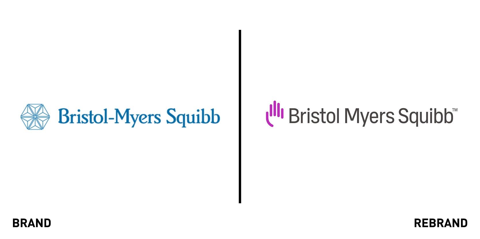
Bristol Myers Squibb
For the first time in 30 years biopharma company Bristol Myers Squibb has launched a new corporate brand, following its merger with biotech company Celgene. The new visual identity, created by Siegel+Gale features the updated strapline , 'transforming patients’ lives through science and highlights the company’s focus on discovering, developing and delivering innovative medicines for patients. Its new positioning is at the nexus of pioneering science and patient-focused products. According to Siegel+Gale, both the typography and the new logo were created to symbolise a blend of humanity and science. The hand device in the logo represents the personal touch that employees, researchers and medical providers bring to their work and the universal symbol of humanity, healing and caretaking. The upright and rounded letters “create an open, friendly feeling. It’s a robust font that works well in display, print and digital applications. When combined with the brand’s new voice, you can feel the human touch,” says Rafael Medina, creative director at Siegel+Gale.
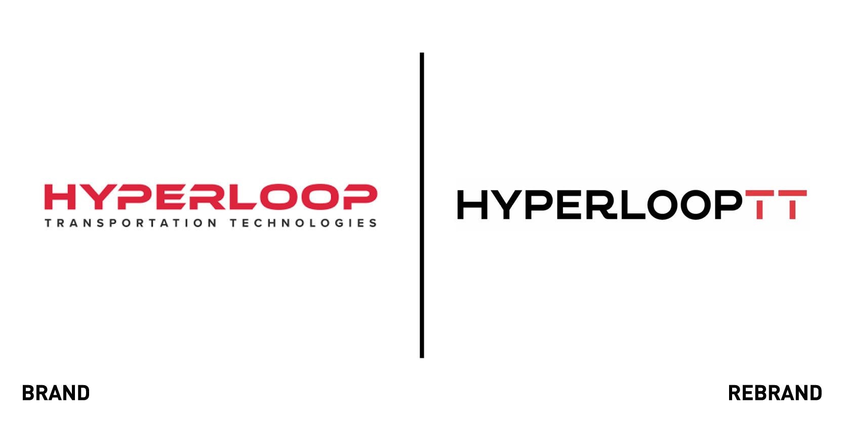
Hyperloop Transportation Technologies (TT)
Hyperloop Transportation Technologies (TT), a research company developing frictionless electromagnetic levitation technology, collaborated with Saffron Brand Consultants to unveil a new brand identity, a key step in the company’s path to implementing the world’s first Hyperloop transport system. As the company further develops the project, the brand will play an important role in shaping the public’s understanding of the system, which aims humanising mobility and how that will affect people’s lives, while at the same time reflecting the credibility of technology. To convey this, Saffron created a distinctive bright red and silver wordmark and symbol to differentiate HyperloopTT from competitors. While the bright red of the TT immediately stands out, the silver gives a sense of sleekness and high speed that is associated with this kind of technological advancement. Other elements of the visual identity like the website, video clips and merchandise emphasise not Hyperloop TT’s speed as much as the freedom that comes with it using the word ‘more’ which further emphasises the way in which the system is purposefully built to benefit humans. The brand promises ‘More time, choice, freedom, space, living, flexibility’ through it’s transport innovation.
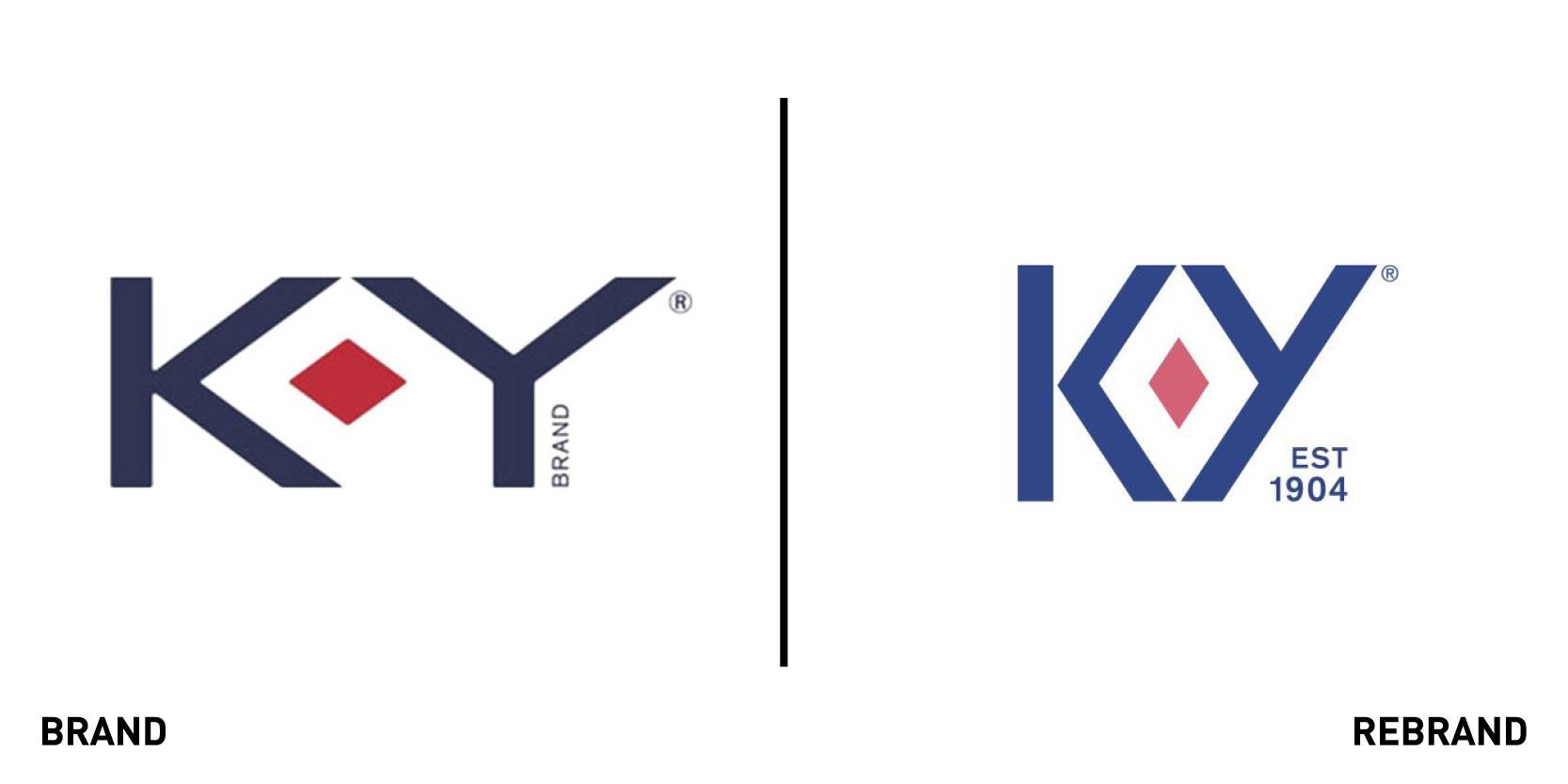
K-Y
Ahead of International Women’s Day, lubricant brand K-Y, makers of the eponymous K-Y Jelly worked with New-York based agency Design Bridge to reveal a new visual identity focused on female sexual empowerment. Though subtle at first glance, the rebrand is full of meaning. The new logo emphasises the ruby, which is a celebration of the vulva and a symbol of passion and enjoyment, by placing it at the heart of the ‘K’ and ‘Y’ to create another outer diamond. This reflects the brand’s mission of empowering women “to have better sex, always” and “feel good about [it], not judged for.” The focus on normalising female pleasure reflects the brand’s traditional positioning, which began in 1904 as one of the first lubricants aimed specifically at women. The rebrand, which according to Design Bridge “champions equality in the bedroom” also includes a custom-made typography for the packaging and straplines such as ‘turn up the heat’ and ‘thrills and chills,’ alongside a refined colour palette that improve the navigation of different products.
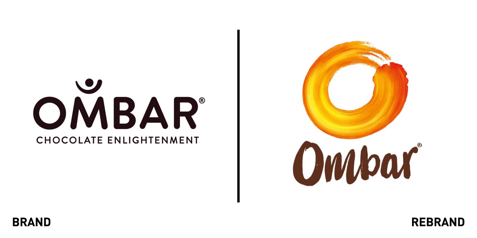
Ombar
Organic chocolate brand Ombar, part of Mood Foods Ltd, worked with design company Ocean Branding to introduce a new identity to make it appear more ‘natural’ for consumers. The agency worked on a brand that would immediately convey to consumers all the natural benefits of the Ombar, which includes natural antioxidants and dairy-free, refined sugar-free chocolate. To do so, Ocean Branding removed the original logotype and replacing it with ‘keep it raw’ in bight colours indicative of different flavours and included foiling on the inside to add “a touch of elegance.” The typeface looks hand drawn, indicating that the chocolate is made with special care. This harks back to the founders promise to spend several weeks a year in Ecuador ensuring they have the best beans possible. “Ocean’s outstanding work has given my brand real momentum. Their repositioning and packaging design has led to appraisals not only from consumers but global costumers too. We now have a brand that sits comfortably in both the multiples and uber-healthy organic stores, across a number of countries,” says Richard Turner, managing director of Mood Foods Ltd.
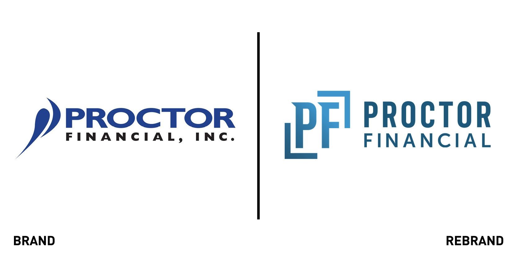
Proctor Financial
After more than a decade Proctor Financial, which specialises in insurance programs for financial institutions, has unveiled a new brand aimed at reigniting its visual identity to reflects its focus on innovation. The new brand includes an updated logo, strapline, font and colour palette. According to Proctor Financial, the modernised logo, in which a bold ‘PF’ is framed by two arrows, “incorporates design elements that represent the company values” such as integrity, reflected through the balance and symmetry of the design, and collaboration, reflected by the two graphic elements and gradients of blue that blend together.
The emphasis on innovation is seen through the change in the strapline which went from ‘Value through partnership,’ to, ‘Where partnership meets innovation,’ paying homage to the past while pointing towards a stronger future. Amanda Bowers, vice president of marketing at Proctor Financial says, “All brands are rooted in story. Proctor’s rich history has been one of products and services that have adapted and evolved over time. This brand evolution is a reflection of that adaptation. We are an organisation that has invested heavily in talent."


