#NewBrandMonday: 9 November
Here are this week's selection of newly launched brands from around the world. For more from #NewBrandMonday, follow @Transformsays on Twitter.
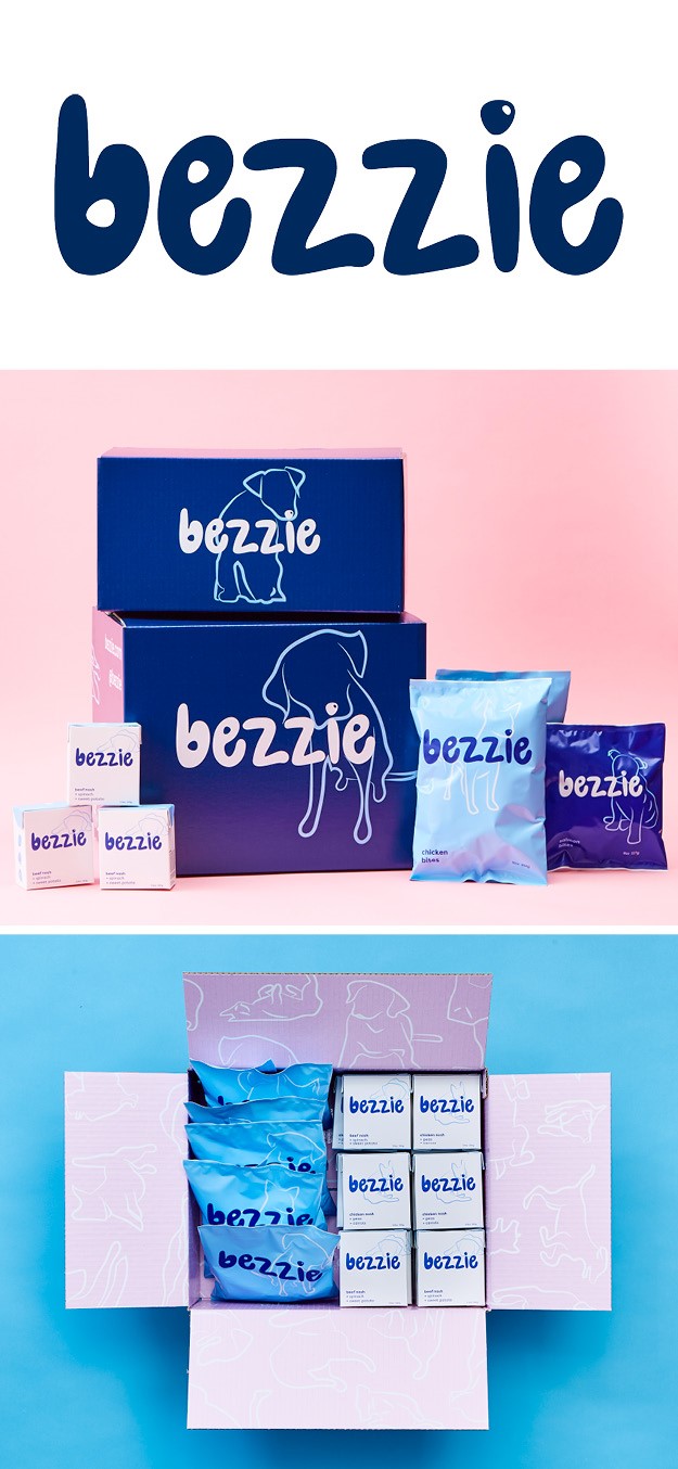
Bezzie
MMM Consumer Brands, in partnership with brand transformation agency Burns Group launched Bezzie, a subscription-based holistic lifestyle brand for pet owners that caters their products to each individual’s pet’s needs. With lockdown created a surge in animal adoptions and purchases, for those in need of companionship, MMM Consumer Brands saw an opportunity to leverage their skills to create a new brand for this growing segment of pet-owners, many of whom are millennial and Gen Z+ consumers who frequently subscribe to DTC brands. The driving force behind the brand was a strong set of ‘commandments’ Burns Group developed around the brand’s voice, persona and vision that enabled its rapid development. The name itself, a British term referring to a person’s best or closest friend, reflects the idea that the pet is usually the most-loved member of the household. The logo is playful, incorporating a pet nose shape as the dot in the letter ‘i’ while the lowercase font is friendly and comforting, just like four-legged pets. The premium packaging includes practical products, like stashers fo wet and fresh food storage, a placemat for sophisticated doggy dining and a collapsible bow for eating at home and on the-the-go.
“In a sea of sameness within the pet care industry, we wanted to ensure that our new offering gave consumers a breath of fresh air when looking for the products that work best for their most-beloved family members,” says Audrey Fisher, global lead at Bezzie. “We’ve been diligently tracking changes in consumer behaviour throughout COVID, so when the client team came to us in early April with the challenge of developing and launching a new pet lifestyle brand within months, we jumped at the chance to turn budding new behaviours into permanent ones,” adds Jo McKinney, CEO of Burns Group.
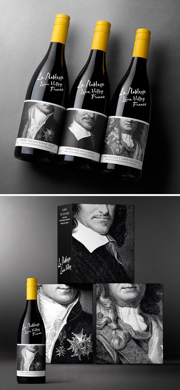
La Noblesse
Drinks design specialist Denomination launched a new brand identity for Loire Valley’s La Noblesse, owned by Fourth Wave, which sought to entice consumers to drink wines from the under-represented region. The new brand presents a serious wine in a modern, light-hearted and disruptive way without compromising its important aristocratic heritage or quality. It stands out from the crowd, with its distinctive and disruptive identity while still being respectful to its origins and not resorting to depicting the ubiquitous châteaux that are so common on French labels. The chateaux were replaced with playfully cropped images of members of the nobility, and the brand name has a chalk-pen effect reminiscien tof the way bottles are priced-up in French wine shops.
“It’s unmistakeably French and high-quality, but with stacks of attitude to open it up to new demographics and make it more relevant to modern consumers. The engraving style and subject matter lend the project a degree of seriousness. But there’s an approachability, too, thanks to the chalk-pen branding. And humour is achieved with the ‘off with their heads’ cropping and yellow capsules,” says CEO of Denomination Rowena Curlewis. “We believe it’s time for the Loire Valley to stand up and be counted as a wine region. It has such strong consumer awareness as a place to visit, but just lacked that same awareness for its wines,” adds Nicholas Crampton, director of Fourth Wave Wine.
“With strong content strategy for each social channel, thumb stopping content, regular updates and robust ORM we have been able to grow page followers, page engagement and even drive sales through social media,” says Ankita Sinha, digital marketing specialist at Moving Brands.
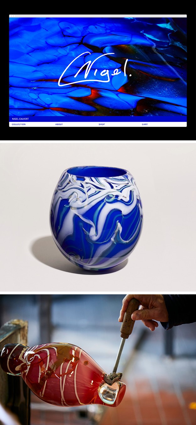
Nigel Calvert
Creative agency Studio Blackburn designed a new brand identity, packaging and website for glass artist Nigel Calvert. The goal was to create a brand identity that would reflect the uniqueness of each blown glass piece, using Nigel’s signature as his logo and close-up imagery of his glass pieces as backgrounds for the website and packaging items. In this way, the identity could be intrinsic to his work. The single approach colour of cobalt blue pops, which pops up against the colours of the glass, is used throughout the identity alongside the robust typeface of GT Zirkon that matches the quirks in the glass objects. The white packaging boxes and tape provide a contrast to the glasses, allowing the pieces to shine through as they are unpacked. The brand launch comes at a time when hand-made objects are experiencing a huge surge in popularity.
“It seems that there is a resurgence of craft that perhaps is borne out of a backlash to the dominance of digital technology in recent years. I’d like to believe that people still crave the human and bespoke touch that a well conceived and crafted product can provide,” says Paul Blackburn, head of Studio Blackburn.
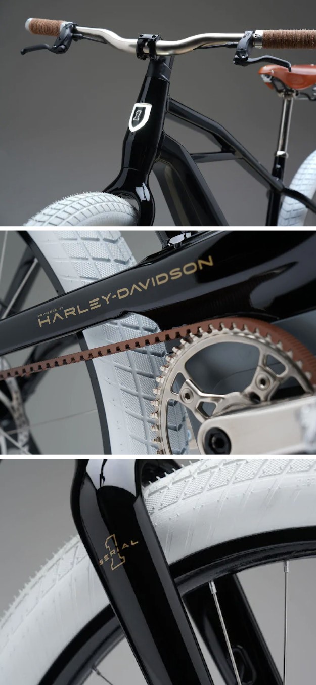
Serial 1 Cycle
Iconic motorcycle manufacturer Harley-Davidson launched Serial 1 Cycle Company, its in-house premium electric bicycle brand. The brand takes its name from the very first motorcycle ever built by Harley-Davidson in 1903 ‘Serial Number One.' The first bike prototype has been styled after that original 1903 Serial Number One motorcycle from Harley-Davidson. It combines Harley-Davidson's world class product development capability and leadership in two-wheel electric propulsion with the agility of a start up brand dedicate exclusively to the e-bike and its customers. The decision was made to structure the e-bike business into a new entity that could focus exclusively on delivering an optimal e-bike product and experience. The brand will debut its first bikes in March of next year.
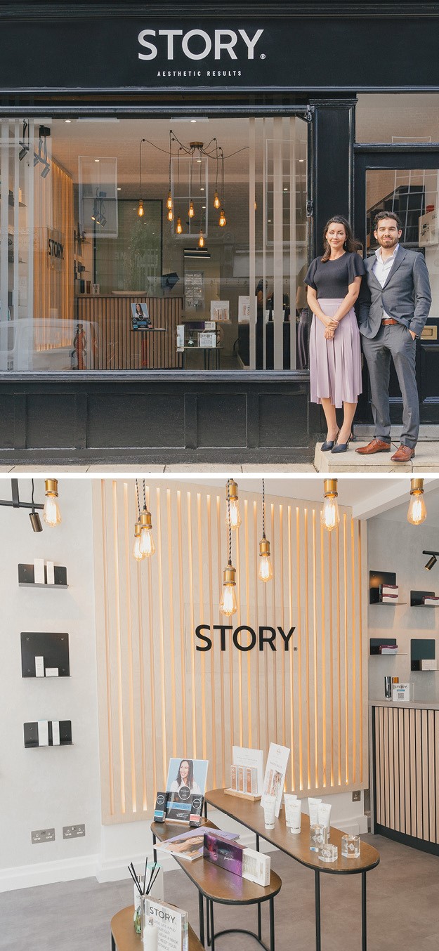
Story
Branding agency Biles Hendry created a brand identity for Story, a new accessible high street offering in aesthetics treatments from the Harley Academy, some of the industry’s leading experts. The majority of treatment centres in the UK today remain clinical in feel, but Story bucks this trend, reflecting the fact that these treatments are a very normal part of millions of people’s beauty regimes, such as going to the gym or the hair dresser. Story’s environment is a relaxed and welcoming space, completely different from the one of a dentist or doctor’s practice. The brand is inviting and accessible, like a retail store, where clients can browse products with staff advising them on skincare curated by the aesthetic treatment doctors.
“Because they are so good at what they do, after all they teach everyone else, they don’t have to force the clinical idea home. Think cutting edge treatments, accessible on the high-street, in a friendly, welcoming environment, carried out responsibly by the leading experts in the field,” says Biles Hendry client service director Anneliese Hendry. “Our treatments are not there to define our clients, but to help them write their story the way they want it to be told. We want our clients to find the expression of themselves that makes them happy. It’s not about perfection, it’s about happiness,” adds Alex Godsell, Story CEO