#NewBrandMonday: 7 December
Here are this week's selection of newly launched brands from around the world. For more from #NewBrandMonday, follow @Transformsays on Twitter.
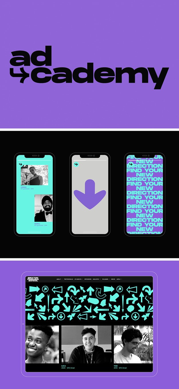
AD-Cademy
Employment inclusion project Brixton Finish School created the AD-Cademy, a free 8-week virtual course for 18-25 year olds across the UK, which will equip participants with knowledge and employability to enter the advertising, marketing and digital industries. Mother Design created a brand identity for the course which lives both within the BFS brand world using the green and purple colours but also has its own assets and is iconic to stand alone. The brand celebrates the vast variety of career directions the students will have revealed to them throughout the course. AD-Cademy brand also celebrates digital visual vernaculars, like swiping and scrolling, in addition to the use of the return key in the logo, which encompasses the world the course lives within in a youthful and modern way. Other visuals like arrows executed in different styles and graphics play on the ethos of helping give people direction.
The curriculum and course strategy were designed by Lachlan Williams, with the aim of upskilling participants in key aspects of creativity and digital and help build their networks to increase the chance of securing roles through employability workshops.
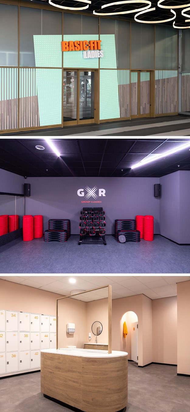
Basic-Fit Ladies
Global hospitality and retail design agency UXUS collaborated with European fitness brand Basic-Fit to create a female-only gym which provides comfortable and supportive experience where women can work out on their own terms. The new brand Basic-Fit Ladies, launched initially in Almere, The Netherlands, offers three different fitness models: guided, semi-guided and self led and accompanies Basic-Fit existing mixed-gender gyms. The brand offers an experience that combines the comfort of home with state-of-the-art equipment. Members are made to feel at ease through domestic touches in a warm environment. The first pillar of the gym ‘Domestic Essenstials’ informs the design aesthetic, which combines domestic sensibilities with a simplistic approach to create a warm and supportive environment. To achieve this, calming and neutral materials are used with soft backgrounds like natural woods and pastel colours. The second pillar, ‘Supportive Motivation’ ensures that while designed to be calming, the gym is still a place for clients to push their limits and strive for their best. UXUS designed punchy and encouraging text-based graphics to sit within the neutral interior, include quotes like ‘work it like a boss’, which creates a motivational and social atmosphere, open to all. The third pillar, ‘Intuitive Guidance’ places emphasis on the customer journey within the space and ensures that clients are able to intuitively navigate the gym and self-direct their workouts. This was created through zoning principles and wayfinding that encourage exploration and ensure customers felt welcome, and motivated.
“When Basic-Fit approached us with a view to creating a women's only space, they also came with the vision of creating an interior which was aspirational whilst still maintaining the sense of simplicity that runs through the Basic-Fit brand. Our brief was to create a pleasant and motivational atmosphere for women which would complement the inclusive brand ethos of Basic-Fit,” says CEO at UXUS, Queenie Lo.
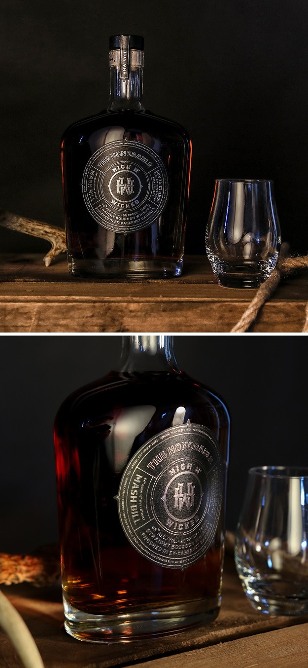
High N' Wicked
Premium spirits brand High N’ Wicked launched its first singular limited release ‘The Honourable,’ a straight bourbon whiskey found in a seductive, curved bottle, exuding quality, balanced with a solid refinement. The premium nature of the liquid is reflected in the particulars that are integrated into the front label design (from the mash bill to the age statement), which allows spirit enthusiast to dig into the details of the contents right away. The heavy and dark black label placed in the centre of the bottle emphasises the brand story of western rode and balances with he delicate lines inferring quality. The name High N’ Wicked was inspired by the life of the western cowboy that mirrors incomparable American whiskies and other oak aged distillates the brand will offer. The monogram is detailed with western inflections and the typography evokes vintage rodeo posters. The back of the bottle contains new brand elements further developing the brand story while maintaining circular surround and spurt details. The rodeo horse, illustrated mid-air, rearing up yet unbroken, is aggressive and strong but also wild and beautiful. The overall brand identity is wild and western but with a refined quality that renders High N’ Wicked a premium whiskey, suitable only for connoisseurs.
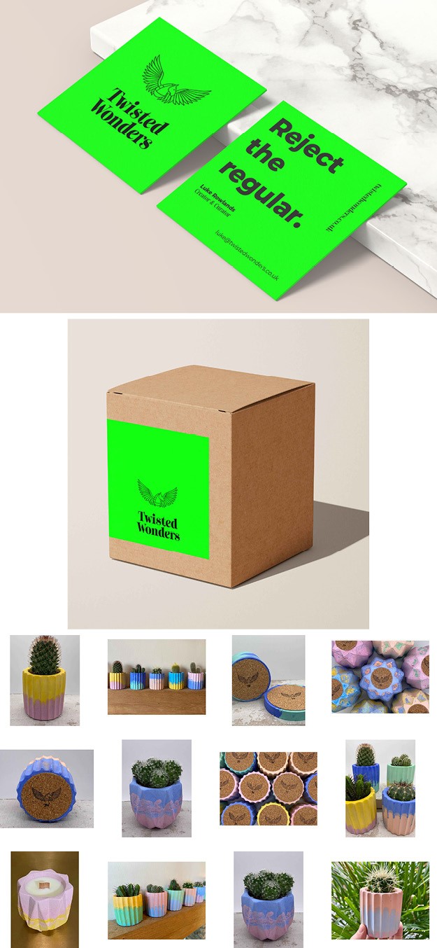
Twisted wonders
Integrated creative agency Perq Studio worked with artist and entrepreneur Luke Rowlands to launch Twisted Wonders, an artisan brand of ‘luxury handcrafted oddities.’ Rowland sought to create a brand that reflected his personality and unique artistic style, as well as a flexible social strategy to help his creations stand out in a crowded marketplace. The social strategy puts Rowland’s personality and talent at the heart of the creative proposition, encouraging audiences to ‘reject the regular.’ Perq Studio took Rowland’s love of rave culture and mythological creatures and infused it with elegant, high-fashion typography which highlights their premium feel and luxury background. The logo itself reflects the luxury and hand-crafted candles in the brand’s pipeline.
“We decided that ‘handmade’ doesn’t have to mean boring. Luke said he wanted his brand to feel like a ‘punch in the d***’, and that’s when we knew we had complete freedom to reject the brown paper and string aesthetic of so many artisan brands in favour of something punchy and truly different. We think, with Twisted Wonders, we’ve created a brand that encapsulates Luke’s personality and beautiful designs,” says Laura Gliffard, founder and MD of Perq Studio.


