#NewBrandMonday: 24 August
Here are this week's selection of newly launched brands from around the world. For more from #NewBrandMonday, follow @Transformsays on Twitter.
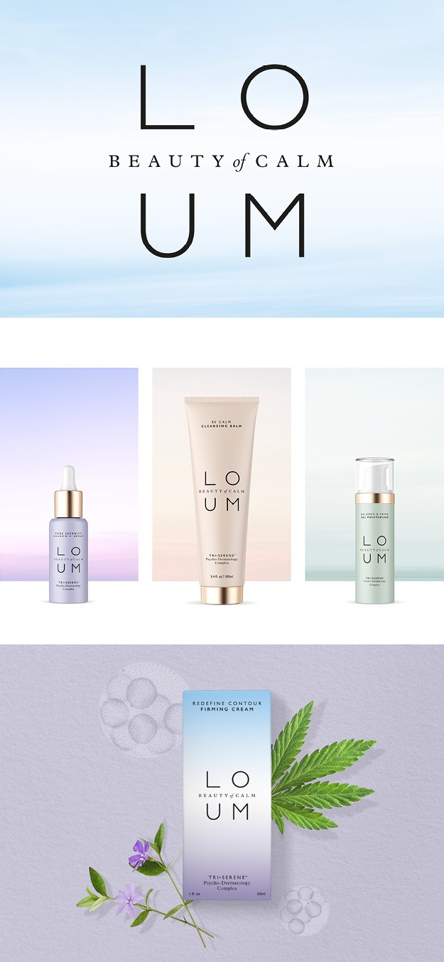
Loum
London design branding agency Free The Birds worked with new premium clean skincare brand Loum, founded by former senior executives from the worlds of beauty and wellness. The brand, which works to undo the effects of stress on skin, focuses its visual identity around the ‘science of calm’ by embedding scientifically-calming cues in the peaceful colour palette and gradients. The design palette of gradient soft shades brings calm to what are already established category codes for the various benefit platforms. The strapline ‘Beauty of calm’ devised by Free The Birds is weaved throughout the site and airy logo. The sense of conscious calm, or in Loum’s words ‘where there is stress we will bring calm’ is further emphasised by the models featured in the photographs, who were art-directed to have their eyes-closed in a meditative state.
“This concept has the huge benefit of being authentic: When you are calm you are even more beautiful, and the brand identity we have devised for Loum products communicates this in a number of ways. It was a fantastic brief, allowing a truly holistic approach which went so far beyond packaging and a logo design; effectively giving birth to a DTC brand – and one which feels particularly timely right now,” says Nick Vaus, partner and creative director of Free The Birds.
Free The Birds also devised guidelines for the website design look and feel, typography, packaging and social media direction.
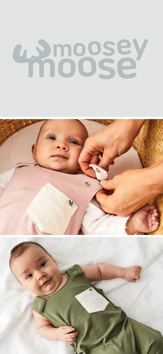
Moosey Moose
Australian design company Electric & Analog created a new identity and packaging for extendable children’s clothing line Moosey Moose. The idea behind the sustainability brand is to eliminate fast fashion for kids by creating pieces that last longer than other regular clothing items. The brand is easily identifiable, fun and playful, just like its audience and the idea behind it, something which is further emphasised by the logo typography: from left to right, each letter grows by 2.7pt size representing the product growth from 0 to 3 years of age. The soft yet cheerful light pink colour palette, found in both the website and merchandise, encloses the on-trend and unique essence of the brand