Bison icon brings strength, recognition to US coffee chain
A rebrand by Carpenter Collective has brought US-based PT’s Coffee back to its Midwestern American roots. PT’s Coffee’s new logo and packaging is slick, allowing the brand to move away from its previously dated identity.
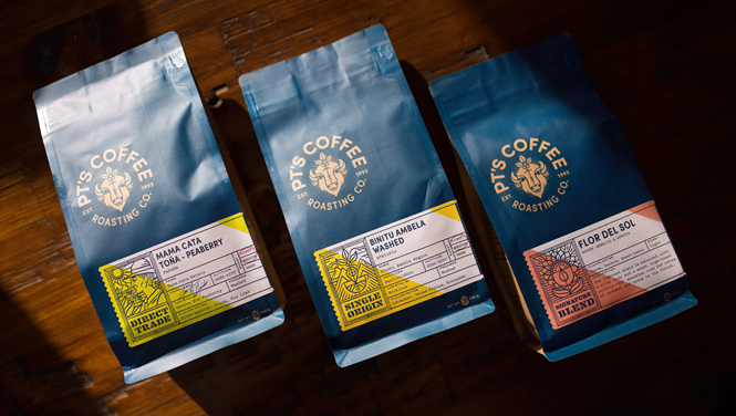
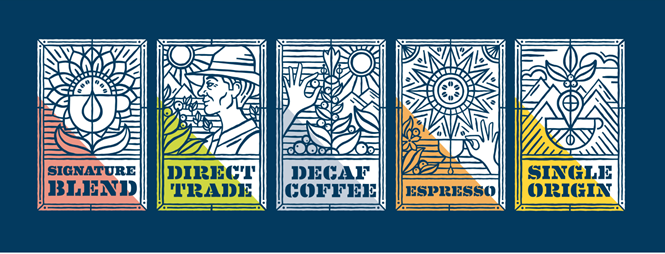
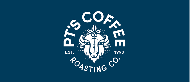
Its new logomark features a bison, representing strength, unity and abundance, and is representative of the region in which bisons once roamed free. Carpenter Collective says, “The design style reinforces the hand-crafted nature of PT’s products—making their brand more approachable and memorable in the market.” The blue colour on the packaging provides the brand with a fresh touch and applies well with the new identity PT’s Coffee gained from the rebrand.
Branding is essential when competing on a crowded market like coffee and often produces exceptional brand work. Coffee roasters like Counter Culture Coffee are also keeping their identities fresh with a new rebrand, as has Vertical Coffee which is a Swiss coffee roaster company. It was recently rebranded by design agency Kaffikaze.
On its new branding work by Carpenter Collective, Jeff Taylor, PT’s Coffee Roasting Co.’s CEO says, “Their talents are endless and their execution brought us to a place in our brand development we could not have dreamed.” PT’s Coffee’s headquarters is in Topeka, Kansas.


