#TransformTuesday: 9 October

Every week, Transform examines recent rebrands and updated visual identities. This week's picks are below. For more from #TransformTuesday, follow @Transformsays.
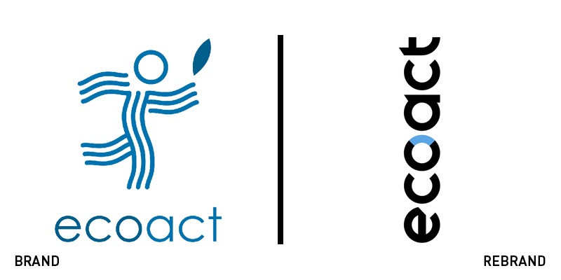
EcoAct
International climate change consultancy EcoAct, has introduced a new brand identity led by creative and digital agency Mr B & Friends. The new visual identity has been created to help organisations and regions manage the climate change impacts they experience, providing simple and clear solutions to their problems. After acquiring Carbon Clear in 2017, it will now fall under the EcoAct banner. The merger of the two companies has resulted in EcoAct becoming the leading provider of climate change solutions across Europe, USA and Africa. Kate Gorringe, creative director at Mr B & Friends, says, “The passion from everyone at EcoAct shone through during the brand workshop we undertook, and gave us a clear direction for the brand; one built on positivity, expertise, simplicity and confidence.”
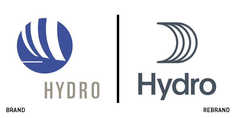
Hydro
Following the acquisition of aluminium producer Sapa by Norwegian aluminium and renewable energy company Hydro in 2017, the company has ascended to the top of the global aluminium industry, growing in terms of numbers and influence. To reflect that, Snøhetta’s brand design demonstrates Hydro’s new global market position, while also uniting its employees across the world. To develop the new brand, Snøhetta hosted conceptual workshops, where over 100 employees from all levels of the Hydro organisation took part. From the workshops, the concept ‘Unite’ was born, which tells the story of how people come together for a common purpose, as well as how Hydro unites aluminium with other metals. The new visual identity has the symbol for unity, the circle, at its centre, while the colour palette of grey, red and blue brings the company’s essential elements of metal and water together.
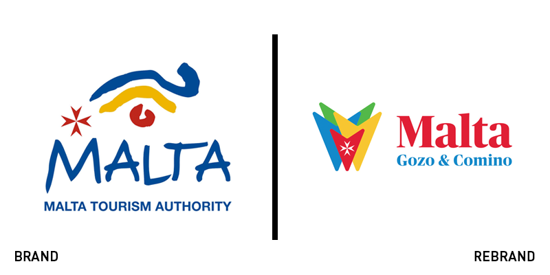
Malta
Malta, the southern European island nation consisting of an archipelago in the Mediterranean Sea, has revealed a new visual identity, designed by Irish branding agency, Oliver. For the new logo, Oliver drew inspiration from the Maltese Cross, Malta's civil ensign and used the colours red, yellow, blue and green, inspired by Malta’s traditional fishing boat, called a luzzu. The colours further represent the sun, sand, sea and land, while the three points of the arrow-like illustration each represent Malta and its famous islands, Gozo and Comino. Each island has its own colour, with red at the centre, a clear reference to Malta’s flag. The new logo features a simple and clear typeface that can be easily adapted into Malta’s digital touchpoints, a big departure from its previous handwritten font.
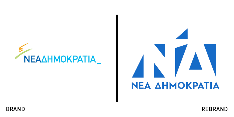
Nea Dimokratia
Nea Dimokratia, one of Greece’s leading political parties, has unveiled a new visual identity, trying to cover corruption with a deep shade of royal blue. The party is working to disassociate itself from the numerous scandals it has been involved in the previous years – such as the economic scandal of Siemens – to attract voters for the upcoming elections. The reveal took place during a recent speech by Kyriakos Mitsotakis, president of the party, on the occasion of the party’s 44th anniversary. The new logo is designed by a volunteer, with the elements of flexibility and adaptability as the main areas of focus, thus the lack of an outline. The new logo includes seven triangles, which form the initials ‘N’ and ‘D’ with the iconic pyrsus, that has accompanied the party throughout its existence, in the middle. Nea Dimokratia’s new visual identity is contemporary, abstract and minimalist, while at the same time the colour palette of white and blue, the colours of the Greek flag, help it connect to its heritage.
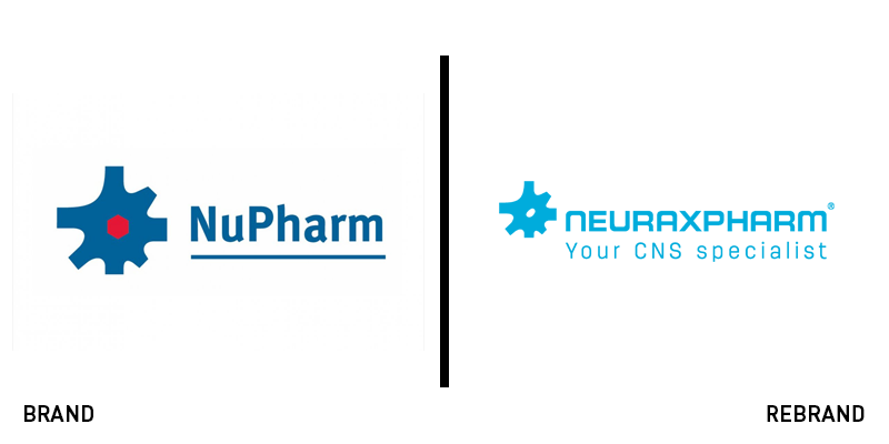
Neuraxpharm
NuPharm Group, a leading European specialty pharmaceutical company, has rebranded to Neuraxpharm, sporting an updated visual identity. The rebrand positions Neuraxpharm as a unique CNS-oriented firm within the European pharmaceutical industry. The new logo has kept the illustration of the mechanical cog, the typeface is slightly switched to a sharper and simpler font, while the underline has been dropped in the altar of better digital translation. Dr. Jörg-Thomas Dierks, chief executive officer at Neuraxpharm, says, “[It] is the existing name of our German affiliate, which has been a major player in the CNS market since 1985, and so rebranding our European affiliates within the next months under this name leverages this important history and excellent reputation, while also uniting all our companies together under a shared name and vision.”
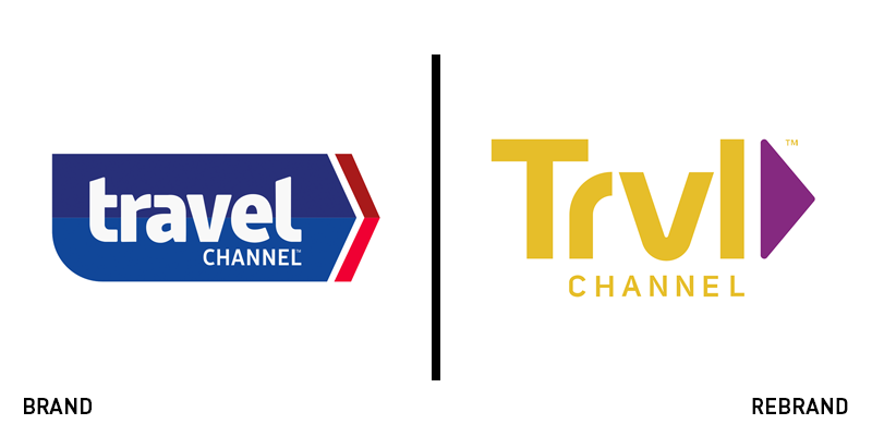
Travel Channel
Travel Channel has unveiled a redesign of its logo, updating its visual identity to better suit its contemporary character. The network has not changed its name, it has however, put out an abbreviated handle, ‘Trvl,’ in a modernised typeface and a subtler colour palette. The website has also been revamped, with new graphic illustrations an overall updated image, which has been designed to offer visitors easier navigation and make it more reader-friendly. Apart from the improvements in the website’s functionality, Travel Channel’s makeover – and the lack of vowels in the new logo – is an obvious effort to address the new generation of viewers with a trendy, youth-oriented aesthetic.


