#TransformTuesday: 31 July
Every week, Transform examines recent rebrands and updated visual identities. This week, it's a packaging design special. For more from #TransformTuesday, follow @Transformsays
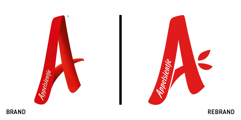
Appelsientje
Appelsientje, a fruit juice brand based in the Netherlands, has revealed a new visual identity led by branding agency Millford Brand Identity. The brand’s logo displaying a capital A is a stable in all Dutch supermarkets. To refresh the look of the brand without losing recognisability, Millford Brand Identity introduced a simpler and cleaner version of the letter A. Furthermore, the size of the letter was minimised, giving place to tree illustrations, highlighting Appelsientje’s natural ingredients. The 3D effect the previous logo sported was also dropped, improving its on-screen translation in all digital touchpoints.
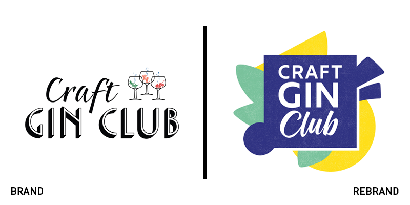
Craft Gin Club
UK drinks subscription company, Craft Gin Club, has partnered with international design agency BrandOpus for the rebrand of its visual identity. Due to the brand’s rapid growth and the competitiveness of the industry, Craft Gin Club needed a new identity that would reflect the brand’s values and ambitions, while maintaining a friendly profile. Drawing inspiration from the monthly subscription boxes, BrandOpus shifted the focus of the brand from the product to the box itself and the emotions of excitement that are associate with the opening of present. The new brand identity is colourful, with a vibrant colour palette of electric blue and yellow and graphic elements that reflect the brand’s playfulness and makes it stand out from its competitors.
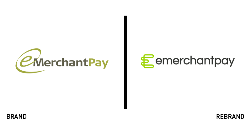
Emerchantpay
Struggling to keep up with its competitors, with an outdated brand identity that was inconsistent across its touchpoints, Emerchantpay, an online, mobile and POS payment service provider, appointed creative design agency Faculty to create a new, refreshed brand that would reflect the brand’s personality in a contemporary way. In an effort to differentiate the Emerchantpay from rest of the brands in the industry, Faculty focus on making the new identity flexible, an element most payment providers were lacking. The new visual language is sharp yet simple, easily adaptable in both print and digital materials. Faculty also created custom iconography, as well as a variety of online and offline marketing collateral, helping the brand evolve and grow.
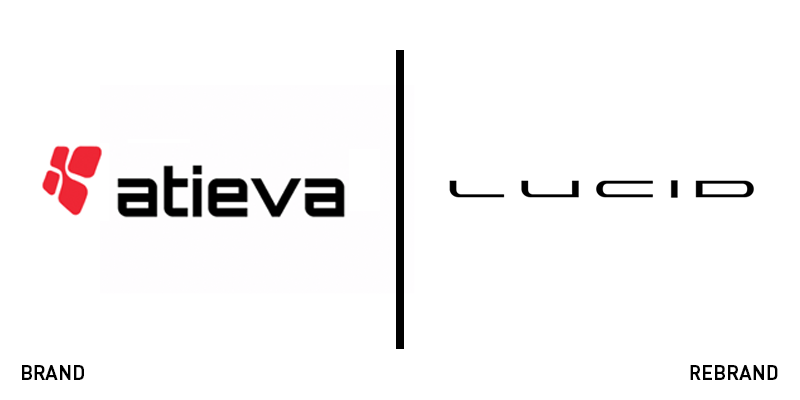
Lucid Motors
California-based automotive company, Lucid Motors, has collaborated with Tolleson, a creative agency based in San Fransisco to create new visual identity that will stand out to its audience. In the framework of its rebrand, Lucid Motors, formerly known as Atieva, was renamed by Lexicon, a creative agency that specialises in brand naming and brand architecture. Getting established in the car industry is a big challenge. That’s why Tolleson was tasked with developing a visual identity that would amaze the customers and demonstrate the brand’s luxurious feel. The new logo reflects the qualities of the car: drawn-out, modern, smooth and futuristic. Additionally, four complementary fonts were used to both the technical side of Lucid Motors and the experience its vehicle offers.
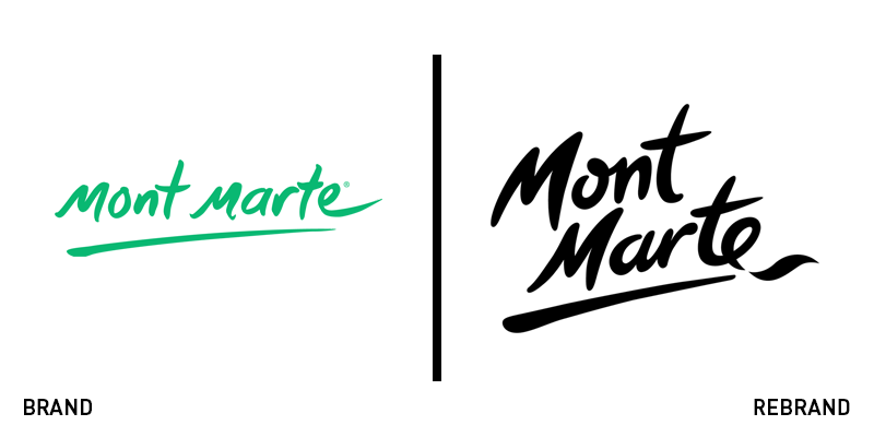
Mont Marte
Australian arts supplier Mont Marte has revealed a renovated brand identity, created by Hulsbosch, following its substantial growth. Starting from the new tagline "I Can Create!", the new identity aims to appeal to a global audience. Hulsbosch collaborated closely with Mont Marte to understand its audience, its market, the positioning of the brand and its offerings. The new logo has swapped the playful mint colour for a sharp and bold black, while the typeface has changed only slightly, sporting a more sophisticated look and getting rid of the 3D feel of the previous logo. Carol Kent, director at Mont Marte says, “What we love about the Hulsbosch identity is its ability to start a dialogue with customers in a fun and friendly way so that art is accessible and let’s everyone enjoy art. Also it’s renewed our communications for potential new markets.”

Social Mobility Foundation
The Social Mobility Foundation (SMF) is a charity which aims to improve social mobility for young people from low-income backgrounds. With a diverse demographic and over 1,500 young people to support a year, the brand needed a rebrand that would allow the charity to be simple to execute across key touchpoints. SMF partnered with international independent creative agency Jones Knowles Ritchie, to design a new identity that would meet SMF’s requirements. The new logo uses the name of the organisation in a creative and original way, with a simple font and an abstract approach. Sean Thomas, executive creative director at Jones Knowles Ritchie, says,“Social mobility is ultimately defined by free movement between different levels in society, which we captured in a visual metaphor of the travelling ‘o’ in the animation. We also really made use of the fact that the Social Mobility Foundation is all about filling in the blanks and letting young people’s talent do the rest.”


