#TransformTuesday: 3 April

Every week, Transform examines recent rebrands and updated visual identities. This week’s picks are below. For more from #TransformTuesday, follow @Transformsays
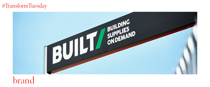
BUILT/
Building supplies company BUILT/ has revealed a new brand identity designed by creative agency Our Design Agency (ODA). ODA has also developed service proposals including ‘Lock and load,’ where after ordering digitally, customers arrive in their own vehicles where staff wait with their purchases, ready to lock and load. BUILT/’s use of the slash on its name, makes the brand immediately recognisable among other digital brands, while the image can work equally well in both an analogue and digital environment. The bold font as well as the primary colours of red and blue helps make the brand memorable. In order for the customers to adapt to BUILT/’s digital offering, the stores display a similar aesthetic.
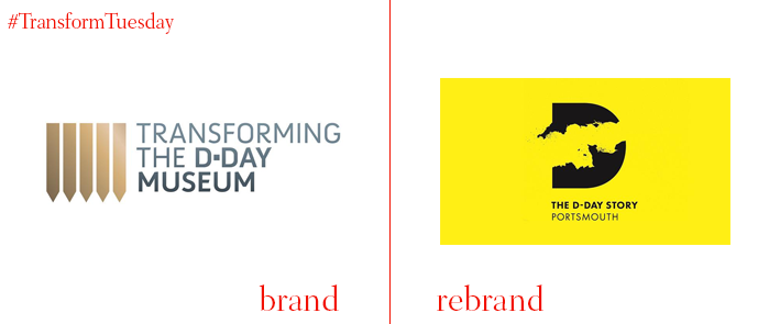
D-Day Story
The Portsmouth, UK-based D-Day Story museum is dedicated to the Allied forces’ invasion of Normandy during the second world war, which resulted in a large part of Europe being freed from Nazi control, consequently playing a key role in the Allied forces’ victory. Portsmouth City Council appointed Edinburgh-based consultancy StudioLR, in collaboration with brand strategist Scott Sherrard, to create a new identity for the museum which includes the renaming to D-Day Story. In the context of D-Day’s 75th anniversary in 2019, the museum has been awarded £4.5m by the Heritage Lottery Fund to renovate its exhibition spaces and revamp its activities and events programme. The rebrand’s goal is to reach a wider audience including both older and younger individuals, including switching the focus of D-Day Story from general military history to personal stories, too.
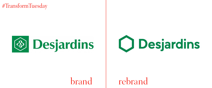
Desjardins Group
Canadian financial services company Desjardins has changed its logo in order to improve its on-screen quality. The company’s new logo has kept its signature green colour and cell design in attempt to modernise it without changing it drastically. Brigitte Roberge, senior director of Desjardins Group, says, "Today we use much of our digital platforms. The last major transformation dates back 40 years to the print era. We needed a fresh wind.” The bee that used to be featured on the previous logo has been replaced due to people not being able to recognise the not digital-friendly design. The change came after a year of consideration, research and surveys conducted with the advertising agency LG2.
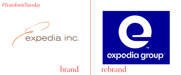
Expedia Group
Expedia Group, the brand that owns online travel businesses such as Expedia, Hotels.com and Trivago, has rebranded with independent design consultancy Pentagram. With Paula Scher as the head designer, the rebrand took place in an effort to better unite all companies under the brand. The existing ‘e’ logo was redesigned and the handwritten letters have given their place to a more modern and ‘aerodynamic’ lowercase that allows the logo to be instantly recognised on all advertising and marketing resources. The main colour palette of brown has been swapped for bright blue and black and in the framework of the rebrand, a new custom typeface has been developed by type designer Jeremy Mickel, named Expedia Group Display. As a secondary typeface, Sans-serif Neuzeit Grotesk has been chosen.
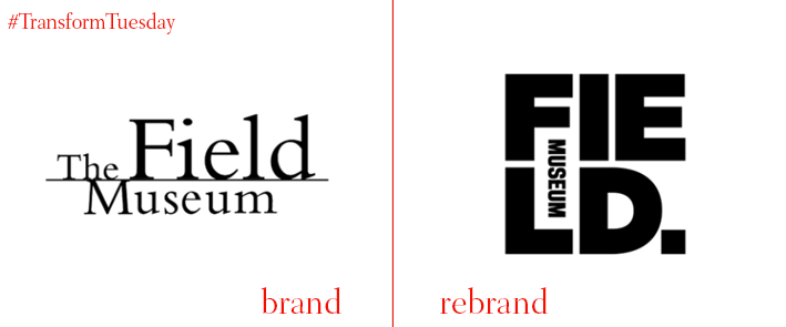
Field Museum
Field Museum, one of the world’s largest natural history museums based in Chicago, launched a new identity designed by Chicago-based branding and graphic design studio, Leo Burnett Department of Design. According to Leo Burnett, “This year, the museum’s 125th anniversary, is a galvanising moment to clarify who we are, what we do and what we stand for.” The colour palette that has been chosen is blue, in order to inspire positivity and resemble the colour of the earth. The logo has been revamped and features two squares. “The small square represents the fraction of the museum’s collection on display, while the large square, the logo itself, represents the museum’s massive collection as a whole,” says the design studio. The boldness of the new logo and its new trendy colour is a big departure for the museum's previous one, achieving a fresh and modern brand image.
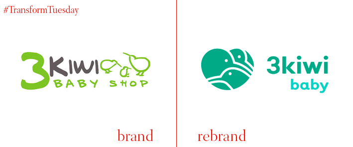
3 Kiwi Baby
Wroclaw, Poland-based design studio Nuo is responsible for Polish baby clothes and equipment company 3 Kiwi Baby’s new logo and identity. The rebrand has kept the gender- neutral green as its main colour, switching it to a more mint shade. The birds displayed on the logo are designed in a more modern and minimalist way, while they have been arranged to fit into a subtle heart shape. The fonts have also been altered to a more modern and simple looking font that makes it more digitally friendly, suitable not only for its online shop but also its on-screen readability, especially on social media.


