#TransformTuesday: 27 November

Every week, Transform examines recent rebrands and updated visual identities. This week's picks are below. For more from #TransformTuesday, follow @Transformsays.
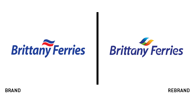
Brittany Ferries
Ferry operator and holiday company Brittany Ferries has introduced an updated brand, following extensive customer research. With the new visual identity featuring a vibrant colour palette of shades of blue, orange and green and the new design including a fresh and clean typeface, Brittany Ferries has managed to give a contemporary look to its 40 year-old brand that fits into the digital age. The new visual identity resulted from a multimillion euro investment aiming to bring Brittany Ferries into the future. Florence Gourdon, marketing director at Brittany Ferries, says, “We last evolved our logo 15 years ago and so much has changed in that time – for example we now live in a digital world. And while the previous logo fully communicated the reliability and trustworthiness of our ferry service, it didn’t fully embody the emotional side of travelling and holidaying with Brittany Ferries and the discoveries inherent in the fabulous destinations we serve.”
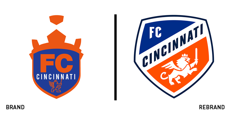
FC Cincinnati
Following last season’s success, Major League Soccer team FC Cincinnati has revealed a new visual identity, led by global brand consultancy Interbrand. The new logo is full of symbolism, with the illustration of the new crest referring to the city’s German heritage, while infusing modern elements. The illustration of the lion’s crown is a direct reference to Cincinnati’s nickname, ‘Queen City,’ with its tale forming the letter ‘C,” while the seven points of its mane, each symbolise one of the seven hills of Cincinnati. An FC Cincinnati statement says, “The club’s new secondary mark is the stylised FCC from the full wordmark, while standalone tertiary elements will eventually include the full lion from the crest, the lion’s head and mane, and the crown. Those elements will be introduced more prominently in future years as the brand gains traction in the marketplace.”

Green City
Brand experience studio Blackspace worked with Green City, a multiagency initiative that looks into cities’ quality of life and sustainability to release a new brand identity for the latter. With the simple and straightforward strapline of ‘We are the energy of a green city,’ Green City clarifies its commitment to political and economic issues related to the sustainability of cities.. Alexander Gialouris, design director at Blackspace, says, ”Clean air and less traffic, that's what we all want – and Green City offers many smart solutions here. We have been working for the automotive sector for years, but we also want to contribute to changing the city as a living space for the better.” Blackspace was tasked with creating a new umbrella brand for the multifaceted organisation that unites all its sub-brands in a consistent visual identity. The new wordmark uses an abstract aesthetic, incorporating urban structures into the letters, while using the brand’s signature colour green. A new typeface was also built in partnership with Swiss type foundry Lineto and the Berlin Type Engineers.

Morris+Company
London-based architecture practice, formerly known as Duggan Morris Architects, has changed its name to Morris+Company, following a brand makeover that took place in July to correspond to the brand’s growth and evolution. The new name brings together the founder of the company, Joe Morris, and his team, highlighting the importance of teamwork and signifying the compound of individual talent with a collective mindset with the plus symbol. The new brand identity was designed through collaborations with graphic designer BOB, copywriter Emma Keyte, founder of Free, and Morris+Company’s in-house team. The new logo has kept its minimalist aesthetic that consists of a sans-serif wordmark with wide kerning in a simple black colour. The visual identity incorporates a number of textures, colours and patterns that resemble the variety and diversity of the firm’s work and can be found across all of the brand’s touchpoints and collateral marketing materials.

Ramada Encore
Wyndham Hotels & Resorts has unveiled a new brand identity for one of its hotel chains, Ramada Encore. In an effort to dominate the hospitality sector and stand out against its competitors, Ramada Encore promises to be, as its strapline suggests, ‘Refreshingly Different.’ The new identity includes a new logo, crafted by London-based marketing agency Octopus Group, as well as as prototype designs for guest rooms and common spaces, designed by hospitality architecture firm Harrison. The new, modernised logo aims to attract the new generation of travellers, sporting a multicoloured ‘E’ letter that looks as if it is in motion, symbolising the definition of the word ‘encore’ which means ‘to return.’ The logo is colourful, vibrant and playful, with Octopus eliminating the wordmark’s previous, bland, black colour, replacing it with an eye-catching shade of bright red. “Whether it’s a business trip or a weekend break, we know that for travellers every minute counts. That’s why we wanted the brand identity for Ramada Encore to reflect its position as a hotel for guests on the go,” says Lisa Checchio, chief marketing officer for Wyndham Hotels & Resorts.
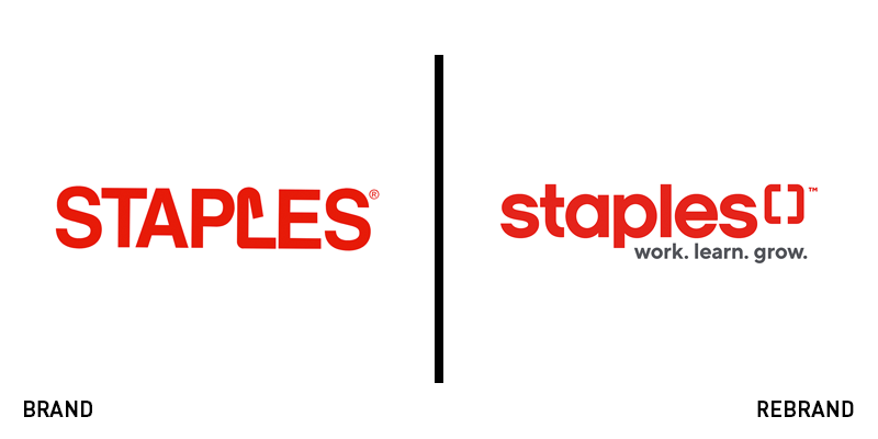
Staples Canada
With the world having undergone drastic changes over the course of its 30 years of existence, Staples Canada has decided to embrace the change and update its brand identity to cater to a new generation and keep up with the new, digital age. The new logo keeps its core elements untouched to ensure consistency and awareness.. Sporting the same shade of red, the new logo has replaced the previous logo’s iconic illustration of the unfolded ’staple’ that replaced the letter ‘L’ for an all lowercase wordmark that includes an illustration of two open staples facing each other at the end of the the company’s name. A strapline has also been introduced reading ‘work.learn.grow.’ A Staples blog post says, “This symbol represents our desire to be your committed resource and sounding board, supporting your success and seeing you thrive.”


