#TransformTuesday: 24 April

Every week, Transform examines recent rebrands and updated visual identities. This week's picks are below. For more from #TransformTuesday, follow @Transformsays

Foreign Exchange Company of Ireland (FEXCO)
FinTech, payments and business solutions firm Fexco has collaborated with brand agency Dynamo to introduce a new brand identity. The rebrand consists of a new logo and renovated website, among others, with a better on-screen translation, helping the brand stay current. Garrett Reil, ECD of Dynamo says, “To begin, we worked with Fexco to move the approach to tone of voice and messaging from technical to a more engaging human place. From a design point of view we wanted to reflect Fexco’s optimism, expansiveness, ingenuity and diversity and we did this through a more dynamic and colourful brand system. It’s been amazing to work with a success story that’s taken on the world from its home in the west of Ireland.” FEXCO’s new brand mark, visual system and imagery promote the notion of a more spread-out, pioneering and people-focused company.
Value cannot be null. Parameter name: source
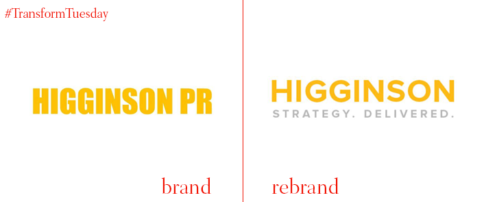
Higginson
London communications agency Higginson changes its name to Higginson Strategy as part of a significant rebrand, reflecting the agency’s goal to expand further than traditional PR.
Since its establishment in 2017, the agency has grown substantially attracting a diverse group of customers, covering media strategy, political campaigning, corporate comms and public affairs. John Higginson, founding partner of Higginson Strategy says, “Higginson was founded on a basic principle. Achieving excellence in communications is all about delivering against a carefully-tailored strategy with measurable outcomes.”
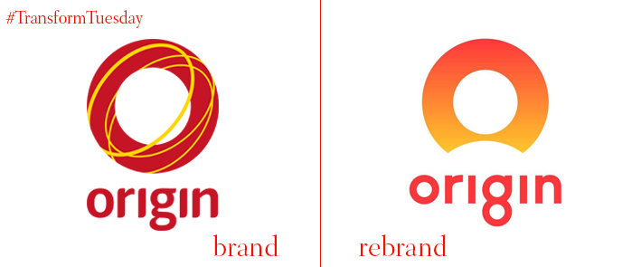
Origin Energy
Australian electricity, gas and lpg retailer Origin Energy has appointed advertising agency TBWA\Melbourne and creative media agency Atomic212 to create a new, fresh and lively visual identity. The new logo is the first major change the company has seen since its establishment 18 years ago and is part of Origin’s ‘Good Energy' campaign across TV, digital, outdoor and PR. A circular ‘o’, which was one of the most recognisable elements of the company’s old logo, has remained as the focal point of the new visual identity in all of Origin Energy’s channels, celebrating the company’s heritage. The circle however has been significantly simplified, giving the logo a more clean and current look, while the colour palette the vibrant red has been swapped for a softer orange gradient.
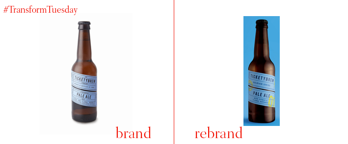
TicketyBrew
British craft beer firm TicketyBrew has unveiled a new identity designed by design studio Carter Wong. The two companies have been collaborating since 2013, with the design studio being responsible for the revamped visual identity following the fast growth of TicketyBrew’s product range. Keri Barton, managing director, TicketyBrew, says, “From day one Carter Wong captured the essence of TicketyBrew with a playful identity that stands out on the bar and shelf. This powerful brand has enabled us to grow rapidly over the past few years but as our flavour range began to expand, so the brand had to work even harder.” Carter Wong gave TicketyBrew a simplified identity that would convey a more modern image. Carter Wong kept the original colour palette on the core range, but reduced the writing on the beers’ labels achieving a cleaner.
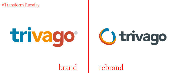
Trivago
Global hotel search engine Trivago has launched a new logo and visual identity that looks fresh while still being recognisable. The new logo keeps the same colour palette of Trivago’s old blue, orange and blue logo. However, the coloured letters have been replaced by a more sophisticated black and puts all of the three colours at the edge of the logo. Created from Trivago’s in-house team, the lowercase sans serif logo features a tri-colour ring called “Wabi” for its corporate outlets which embodies the company’s culture in a digital format. Trivago comments on the rebrand, “Wabi seeks to capture and represent our spirit as a company – fluid and ever-evolving, yet simple, authentic, and imperfect.”
For more from Transform magazine, follow us on Twitter @Transformsays


