#TransformTuesday: 2 October

Every week, Transform examines recent rebrands and updated visual identities. This week's picks are below. For more from #TransformTuesday, follow @Transformsays.
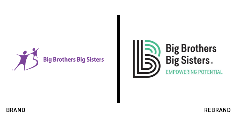
Big Brothers Big Sisters
Big Brothers Big Sisters of America, a non-profit organisation which mentors children, helping them reach their full potential, has unveiled a new logo. Leaving behind an outdated purple icon with clip art-like human silhouettes, the organisation now sports a contemporary green and black linear symbol, which may help it attract more volunteers. The new logo is part of a general rebrand which includes a shift in focus from the importance of mentoring, to the importance of adults supporting children, a shift that aims at emotionally provoking people, encouraging them to become volunteers. In addition to the new logo and mission shift, the organisation will be switching to a nationwide technology system in order to help with the recruitment and training of volunteers.
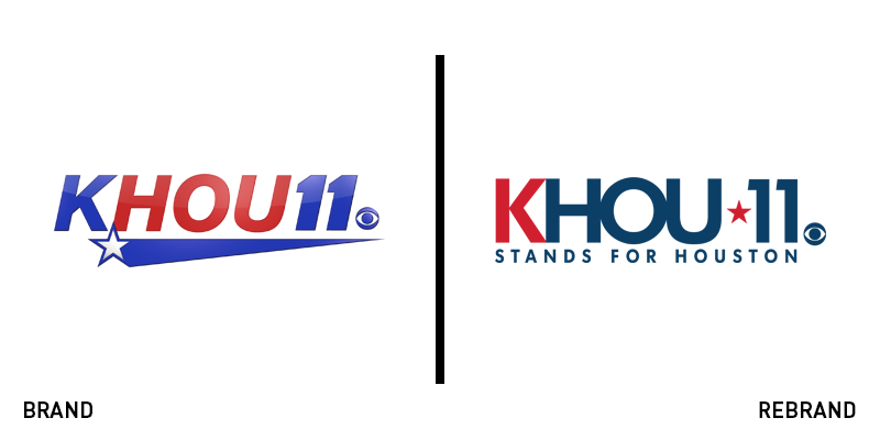
Khou
Television station in Houston, Texas and affiliate to national network CBS, Khou, has revamped its logo. The new logo has kept its iconic Texas star icon, moving it from between the lettering and removing the italics from the number 11. Furthermore, the shooting star that used to sharply underline the wordmark has been dropped, while the kerning in the wordmark has been reduced, resulting in a more compact look. The eye illustration, which is a clear indication of the channel’s relationship with CBS, has been also updated. The colour palette features shades of white, blue and red, the colours of the American flag. With the tagline ‘Stands for Houston,’ the channel has introduced a modern and clean update to its logo that has already rolled out across Khou’s social platforms and is expected to be featured on its website shortly.
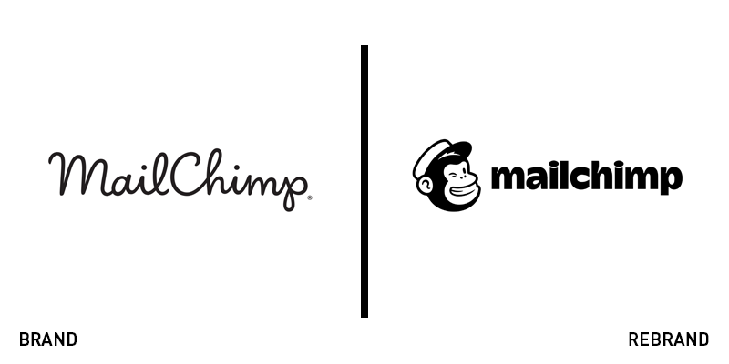
Mailchimp
Marketing automation platform and email marketing service, Mailchimp, has announced the introduction of a new brand identity that consists of a logo, wordmark, typeface, colour palette and imagery. A slight change of the company’s name has also taken place, with ‘MailChimp’ now becoming ‘Mailchimp,’ swapping the uppercase ‘C’ for lowercase. The majority of the changes featured in Mailchimp’s rebrand are for aesthetic reasons while the functionality within Mailchimp’s platform will be largely the same. The need for a brand renovation came from the evolution and growth of the company over the years and its desire to reflect that, while also remaining consistent, unified and enhancing the overall customer experience.
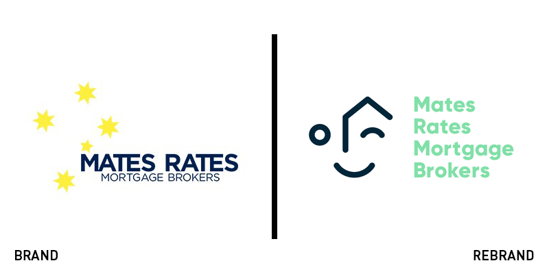
Mates Rates Mortgage Brokers
Celebrating the lucky number 13, Australian mortgage firm Mates Rates Mortgage Brokers has decided to mark its 13th year in existence with the reveal of a new brand identity. Keeping customer relationships at the centre of its brand, Mates Rates Mortgage Brokers has introduced a new visual identity designed by Louise Agency, that focuses on why people should trust in its business. The question is being answered by the strapline, ‘More for your back pocket.’ The new brand personality incorporates subtle hints toward Australian culture, something that also shows up in the company’s new colour palette, which features the Australian national colours of red, blue, green and gold.
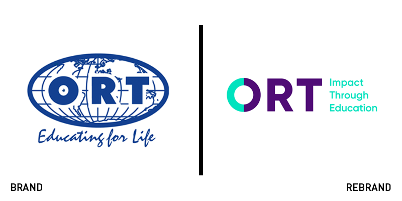
ORT
The world’s largest Jewish education and vocational training non-governmental organisation, ORT, has revamped its brand identity for the first time since its establishment in 1880. The rebrand was designed by Tel Aviv, Israel-based branding agency Firma and aims to bring attention to the core values and goals across all of ORT’s affiliates. The new logo features an illustration of two semicircles coming together to form the letter ‘O.’ The circular shape represents the globe and the connection of people who come together for the greater good. The colour palette of mint green and purple offers a modern alternative to the bland blue that used to dominate the brand. The stripped down, minimalist typeface looks clean and offers optimum digital translation, while the strapline ‘Impact Through Education’ is self-explanatory, capturing the true purpose of the organisation.
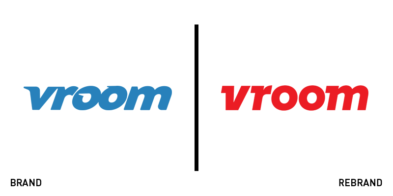
Vroom
Used car site Vroom is trying to build trust in an infamously untrustworthy sector with a rebrand led by independent design consultancy Pentagram. The new brand is designed to portray the process of buying a used car as a fun and glamorous experience. The new, tilted logo refers to the speed of a car, an element that aligns well with the bright red colour that carries associations with premium car brands, such as Ferrari. Taking the focus off salespeople, Vroom’s new brand highlights the excitement of buying a car using the short, but fitting strapline, ‘Get in.’ Contemporary, honest and to the point, the new Vroom brand identity helps make the company likeable.


