#TransformTuesday: 18 September
Every week, Transform examines recent rebrands and updated visual identities. This week's picks are below. For more from #TransformTuesday, follow @Transformsays
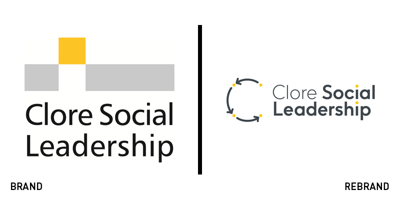
Clore Social Leadership
Clore Social Leadership has partnered with design agency Supple Studio and digital agency Mud, to create a new visual identity that would better portrait the brand’s values. The new brand has a C monogram as its key element, while arrows and dotted lines bring attention to text, linking it to the monogram. The relationship between the text and the monogram symbolises the connection between the brand and its customers, highlighting the brand’s human interaction. The revamped identity has kept the colour palette of yellow and grey, adding new highlight colours. Clore Social Leadership also changed its brand font to Face37, achieving consistency across the brand’s touchpoints. Furthermore, a new website was launched, built by Mud.e.

f.r.a.
Wayfinding consultancy f.r.a. has undergone an in-house rebrand, to reflect the brand’s outlook to design, which integrates classic elements with modern, bold patterns and a borderline mischievous tone of voice. For f.r.a. ’s new logo, the wordmark is seen in formal Nimbus Sans typeface, sporting three geometric full stops, which mirror the brand’s three core values: thinking, feeling, doing. The new visual identity’s strict, monochrome colour that uses colour only for project work, contrasts with the brand’s new tone of voice that encourages the use of puns and wordplays. Design director, Wesley Meyer, says, “We’re approaching 10 years as a team. The market and our clients want wayfinding and brand that gets the job done but also has a personality and stronger sense of identity.”
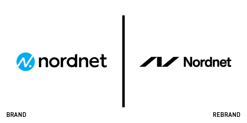
Nordnet
Nordnet, the 12 year-old digital bank, has introduced a new identity. With a minimalist symbol taken from the bank's name, 'N,' the new identity's goal is to showcase Nordnet's simple and timeless, yet strong and powerful personality. The new visual identity uses a flexible colour palette, having a base of white, grey and black. Bright colours can be implemented to highlight important information, visually stimulate the audience and adapt to the different needs of different people within the brand's target group. Drawing inspiration from the finance and infographics industry, Nordnet has incorporated basic geometric shapes, such as the line, the rectangle, the square, the circle and arrows, making them the focal point of the rebrand.
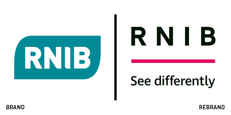
RNIB
The British charity for blind and partially sighted people, RNIB, has rolled out a new visual identity to celebrate its 150th anniversary. The rebrand was led by creative agency, the&Partnership London. Working closely with people suffering from sight loss, RNIB tried to create a brand that caters to its audience the best it can. The rebrand took part in the context of a campaign that aims to raise awareness for the organisation. To come up with a new logo, both RNIB and the&Partnership London worked together, looking at the organisation's history, as well as other big organisations for ideas. However, the inspiration came form road signs and their simplicity. Aiming for a logo that was recognisable and adaptable across all of the organisation's platforms, while also being easy for a partially sighted person to read, the&Partnership created a simple black wordmark in a sans serif typeface with wide spacing between the letters and a coloured underline. A tactile version of the logo was also produced.
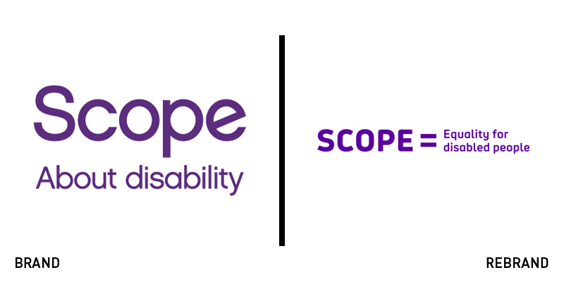
Scope
Disability equality charity, Scope has partnered with brand and communications agency, the Team, to create a new brand expression for the organisation. The Team and Scope took advice from disabled people, getting to know the barriers they face daily, when doing research that focused on colour, typography, layout and imagery. From the results of the research, a new brand identity emerged, rid of common myths and misunderstandings around disabilities. The new brand identity consists of a bespoke font, Hargreaves, named after Bill Hargreaves, who was the first disabled person to enter Scope's council. The font is designed for optimal legibility. The same focus on accessibility can be seen throughout the rebrand, from the logo to the colour palette, which incorporates the bright primary colours of purple, yellow and off-white, The new logo consists of a wordmark with the organisation's name, along with the tag line 'equality for disabled people.’
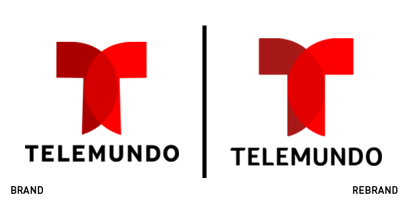
Telemundo
Brand agency Red Bee announced the launch of a new brand identity for American Spanish-language television network, Telemundo. With the tagline 'Together Unstoppable' as the starting point, the brand was built to unify all of Telemundo's sub-brands and genre brands. Going back to Telemundo's roots, Red Bee came up with a concept that shows 'two worlds coming together,' referencing its American and Hispanic identities. A new logotype and brand font, Foco, were introduced, along with a colour palette that has retained the signature red colour, but made it bolder and brighter. Charlie Mawer, executive creative director at Red Bee, says, “Every design element originates from the new brand position of an ‘unstoppable momentum.’”


