#TransformTuesday: 16 October

Every week, Transform examines recent rebrands and updated visual identities. This week's picks are below. For more from #TransformTuesday, follow @Transformsays.
Dieline
Online design and branding resource, Dieline has updated its creative platform and revealed an overall rebrand, led by global brand design agency Jones Knowles Ritchie (JKR). To create the new brand identity, JKR drew inspiration from the art of package design, coming up with a new name, logo and custom typography designed by Letters From Sweden. The rebrand is set to roll out across all of Dieline’s touchpoints, from its website and social media platforms, to its awards and conference merchandise. Andrew Gibbs, CEO of Dieline, says, “This isn't merely a redesign; instead it’s a complete overhaul, focusing on the design community and the brands we all love and cherish.”
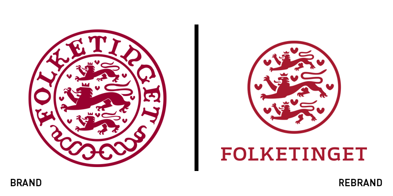
Folketinget
The 169 year-old parliament of Denmark, Folketinget has entered a new legislative period with an updated visual identity. The new identity was carried out by Copenhagen-based design agency Kontrapunkt, under the leadership of Mikkel Lemvig, with the objective of a better on-screen translation and overall digital adaptation that doesn’t sacrifice the parliament’s heritage. Folketinget's new logo has gotten rid of the outer ring of its wordmark, making the classic illustrations of lions and hearts more crisp, clear and contemporary. A new wordmark, written in a bespoke typeface inspired by the kingdom's 1915 constitution, which gave women the right to vote, is also featured, as well as a set of patterns inspired by the parliament’s building, Christiansborg Palace. The colour palette of dark red and white remains, and is inspired by the floral frieze found in Christiansborg’s Walking Hall.

Lyreco
Lyreco Group, the international distributor of workplace solutions for business, has announced a new brand. The new visual identity supports the brand’s mission, which is to deliver for its employees, suppliers and partners. Retaining the brand’s key features, the new logo sees only slight changes, with a lengthened ellipsis in the logo. The colour palette has been switched to green, referencing Lyreco’s effort for sustainability. Additionally, the France-based worldwide brand sports a new strapline, ‘Working together for tomorrow,’ written in English to make the brand accessible to all of the audiences, that highlights Lyreco's ambition to develop long term relationships with its stakeholders.
Nelonen
Creative agency CapeRock has designed a modern, bold and colourful brand identity for Finnish commercial TV channel, Nelonen, to change its perception across Finland and reintroduce itself to viewers. Inspired by the natural phenomenon of the northern lights, visible across much of Finland, CapeRock introduced a new logo and visual system including on-air packaging, idents, sound design, print and digital touchpoints. The new identity consists of a flexible colour palette, with multiple gradients that are used across all the brand’s channels. The brand’s graphic language is strong and powerful, accompanied by complementary imagery. Heini Häyrinen, senior vice president marketing at Nelonen, says, “The new design of Nelonen has a fresh and contemporary look. It includes some subtle nods towards our VOD service Ruutu, as the brands now appear and work in unison. The graphical identity is based on the notion of light and its glow; some might see spotlights, or maybe something else, but the warmth of the glow is almost a tangible element.”
North Dakota
The US state of North Dakota has released a new brand identity and strapline, ‘Be legendary,’ helping it reach a wider and younger audience. As the strapline suggests, the refreshed brand for North Dakota builds on the idea of the ‘legendary’ brand the state has been trying to push for over 15 years. The rebrand includes a new logo, typeface and visual identity that features an updated colour palette of vibrant red – replacing, for the most part, bland black look – as well as striking photography and a more casual, conversational brand language. Douglas Burgum, governor of North Dakota, says, “As we undertook this important brand refresh project, it was essential that our brand maintain its legendary roots while giving us a cohesive way to connect with all of our audiences.”
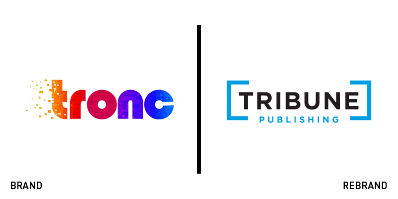
Tribune Publishing
American newspaper print and online media publishing company, Tribune Publishing, which in 2016 changed its name to Tronc in an effort to position itself as a contemporary, digitally focused brand, has rebranded again, going back to its original name. Two years after the name change, Tribune realised that taking the word ‘publishing’ out of its name didn’t automatically make it more forward thinking, but rather removed its existing band equity. The new brand looks like a modernised version of the original identity , using the same colour palette of black and light blue, as well as a more minimalist typography that offers a contemporary and clean-looking image, a big departure from the busy and colourful visual identity of Tronc.


