#TransformTuesday: 10 July
Every week, Transform examines recent rebrands and updated visual identities. This week's picks are below. For more from #TransformTuesday, follow @Transformsays
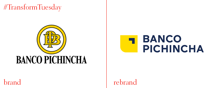
Banco Pichincha
The largest private bank in Ecuador, Banco Pichincha, has introduced a new visual identity designed by Madrid-based branding and digital agency Erretres. The new logo features a symbol that reflects the relationship between the bank and its customers. The curved rectangle represents a safe space within which an abstract arrow signifies the customers who can thrive in it. A custom logotype was also created using an uppercase sans serif typeface. The rounded edges give the logo a contemporary look and exude an approachable and friendly vibe. The existing bright yellow colour remained as the main colour, honouring the bank’s heritage, while the black was swapped for a navy blue, making a clear reference to the Ecuadorian flag. Because of the strong graphic elements of the new logo, it is adaptable in every format and application, both digital and in print.
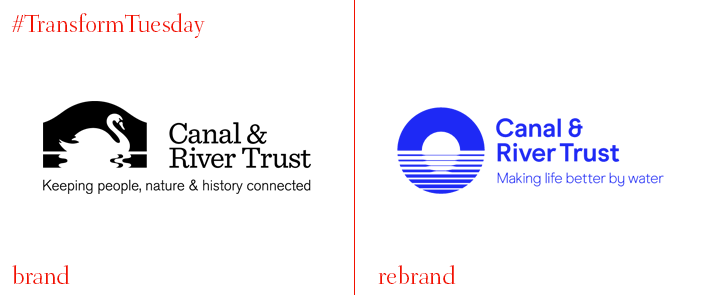
Canal and River Trust
Brand design consultancy Studio Blackburn worked with the Canal and River Trust, a charity that maintains and regenerates waterways across England and Wales for the design of its new brand identity. The new identity features a circular symbol which fades from a solid colour to stripes. The symbol represents the reflection of a bridge on a canal, as well as a general transition from old to new. The new identity also sports a new colour palette of blue and green, colour of nature, while a palette of orange and yellow has also been used across communications. Studio Blackburn has used a sans serif typeface in a size that ensures legibility across all touchpoints, such as posters, signage, merchandise, uniforms, internal print documents, charity vans and across the website and social media.
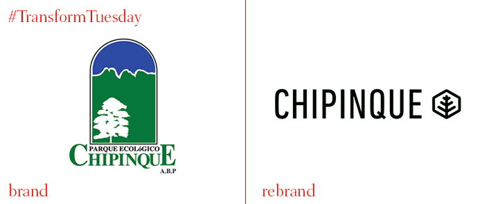
Chipinque Ecological Park
Chipinque Ecological Park is a protected natural area of 1,791 hectares in Mexico. The park has now been rebranded by Mexican advertising agency Brands & People. The rebrand coincides with the park’s 25th anniversary and aims to modernise its identity, attract more visitors and involve the community. The new identity Brands & People created features a modern typography inspired by the topology of the mountain. Furthermore, the colour palette of mint, black and dark grey is easy on the eyes and has a calming effect. The new identity is consistent but at the same time flexible, giving the brand the ability to adapt to every touchpoint, both digital and in print, from stationery to social media.
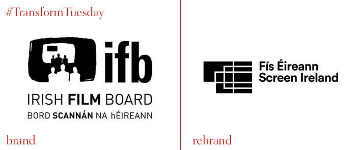
Screen Ireland
The Irish film board has revealed a rebrand consisting of a new visual identity and a name change. From now on, the Irish Film Board will be called Screen Ireland, creating a wider platform for a dynamic film and screen content production sector in the country. Screen Ireland will also give the chance for Irish talent to express itself on screen by funding the creation, production and distribution of digital content. The way in which audiences see and hear stories on screen has evolved rapidly over the last number of years and Screen Ireland’s new logo reflects just that. The minimalist illustration of multiple screens in different shapes and sizes that come together to form a unique shape indicates the variety of digital platforms on which Irish stories are represented.
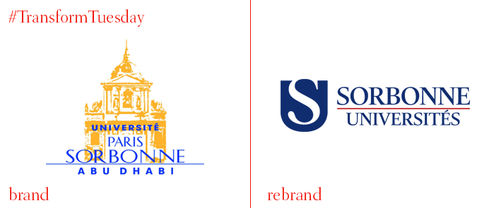
Sorbonne University
One of the most respected institutions in France, Sorbonne University has updated its visual identity, introducing a logo that departs from its previous iteration’s outdated and intricate illustrations. The new logo includes the university’s signature building in a more simple and contemporary way, enclosed at the top of the capital S, in a minimalist, almost abstract design, using the red, white and blue of the French flag. The typography has changed and now features a sans serif font. The new typeface increases adaptability across digital platforms allowing for better on-screen translation and legibility. With the new visual identity, Sorbonne University displays a friendlier image without compromising its status, reaching the student’s by appealing to their contemporary aesthetic.
For more from Transform magazine, follow us on Twitter @Transformsays.


