Rice and religion converge in packaging design
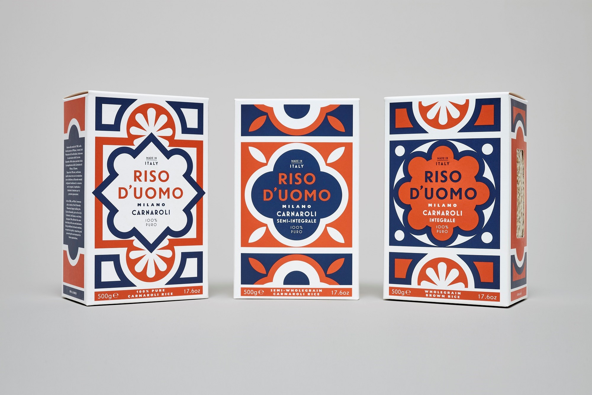
A food that is known to have been consumed since the times of ancient Greece ὄρυζα (oreza), meaning rice, needs all the help it can get to stay up to date. Taking it back to its roots, and name, Here Design has helped Riso D’uomo further develop its corporate identity through the visual enhancement of the packaging on its well-known Carnaroli rice.
The variety found when walking down the aisles of a supermarket can be arguably overwhelming and the obvious, and more often than not correct, answer to the question of how a brand can stand out and lure the customer in, is its packaging. In an industry where the biggest competitors, such as the colossus that is Uncle Ben’s, seem to maintain a fairly basic packaging, the only way smaller companies can set themselves apart and catch customer’s attention is by introducing bright, creative and fun packaging, a bandwagon Riso D’uomo has clearly jumped on.
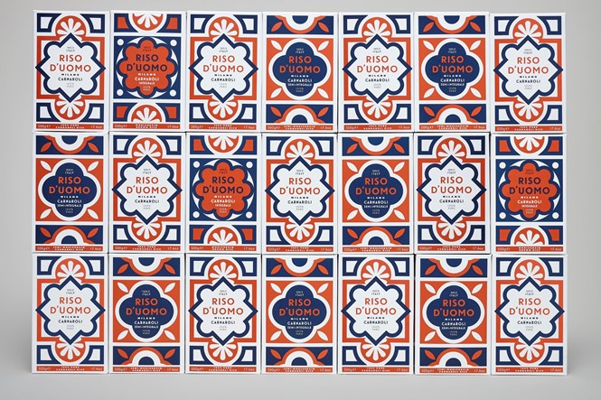
Gone are the days when brands used solely a plain logo, a primary colour and called it a day. Now, in order to stay relevant, noticeable and therefore profitable, brands go so far as to reflect real art on their packets. With that in mind, the creative agency responsible for the rebrand, Here Design, cleverly made a play of the Italian word ‘duomo,’ meaning both the region where the rice comes from in Milan and the ‘House of God,’ the Italian Church. With that, Here Design manages the seemingly impossible task of associating the consumption of rice with that of a religious experience.
Imitating the marble floor tiles of the cathedral by using earthy tones of terracotta and luscious navy blue, the brand new packaging of Riso D’uomo manages to both be easy on the eye as well as being able to catch it, a task crucial in the survival of a brand.
For more from Transform magazine, follow us on Twitter @Transformsays