New brand strategy, architecture and visual identity for natural sports nutrition brand Tribe
Despite sport nutrition brand Tribe being founded just three years ago, its rapid evolution made a rebrand necessary to better reflect its core values and better serve the brand’s community. For that reason, Tribe turned to brand design agency Pearlfisher for the renovation and update of its portfolio and visual identity.
Molly Rowan Hamilton, strategist at Pearlfisher, says, “We conducted in-depth research which informed our key insight that the majority of consumers believe that sports nutrition products need to be synthetic to be effective. We needed an inspiring brand idea to challenge this notion of synthetic and an emotive idea that stated that natural products can be just as powerful in helping athletes of any level achieve their goals.”
Following the research, Pearlfisher came up with ‘The force of nature’ as the brand concept, basing its strategic approach on that tagline, which represents the relationship between the effectiveness of the product and the blissful feeling the outdoors offer, as well as the awe-inspiring power of nature. With ‘The force of nature’ as a starting point, Pearfisher managed to achieve consistency and unity across the brand. Tribe’s tone of voice and communication strategy were revamped, while customers were encouraged to push their physical boundaries.
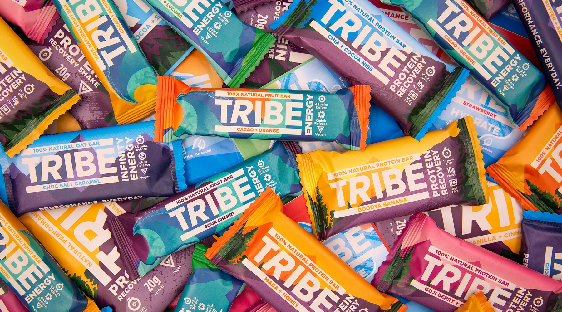
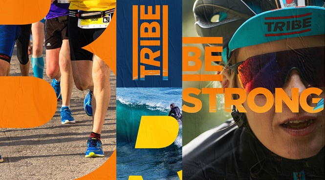
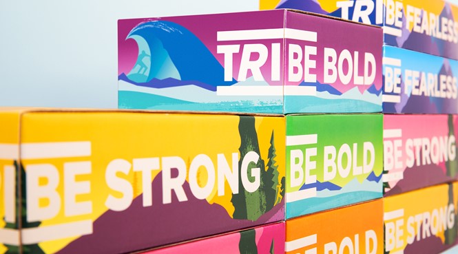
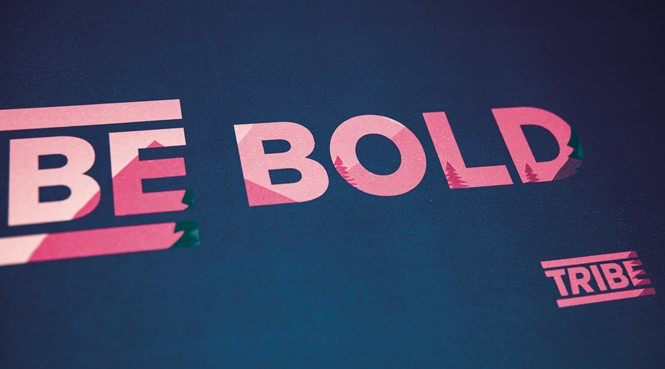
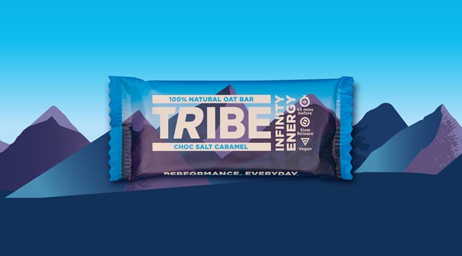
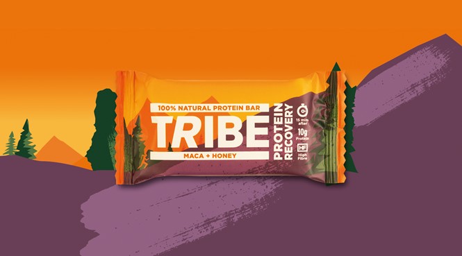
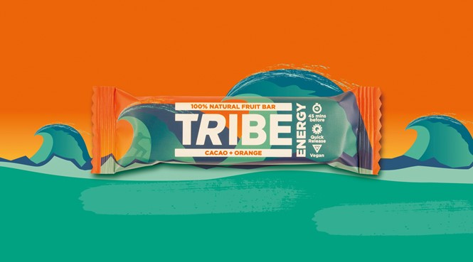
Jon Vallance, associate creative director at Pearlfisher, says, “Reflecting the idea that Tribe truly empowers its communities, we’ve cropped into the ‘be’ of the identity to suggest what you can become through Tribe - bold, adventurous and powerful. Using a bright and energetic colour palette, we brought ‘The force of nature’ ethos to life with abstract illustrations of our natural environment at its most impressive. This bold new visual identity system is communicated across all of the brand’s touch points including print collateral, community materials, posters, website and packaging design.”
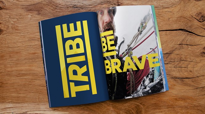
In the context of the rebrand, Pearlfisher has also produced collateral material, designed in a new style guide, consisting of a Tribe book and new posters, which are going to be released later in the year.
Tom Stancliffe, co-founder of Tribe, says, “It’s exciting to now have such a powerful brand mission statement and idea for us, and our followers, that strengthens and symbolises our belief in inspiring Everyday Discovery and our range of offers. It’s powerful, modern and elemental and will not just help us drive the new initiatives and activity we have planned for the coming months but propel us forward with our plans to reach new audiences and secure the market position we are aiming for.”
For more from Transform magazine, follow us on Twitter @Transformsays
