Interbrand brings consistency and localism to IGA rebrand
Most people have a favourite supermarket. From Target in the US to Tesco in the UK to Carrefore in France, many are household names and have become integral parts of their local economies. In fact, this local aspect is often what sets supermarket chains apart from other retailers.
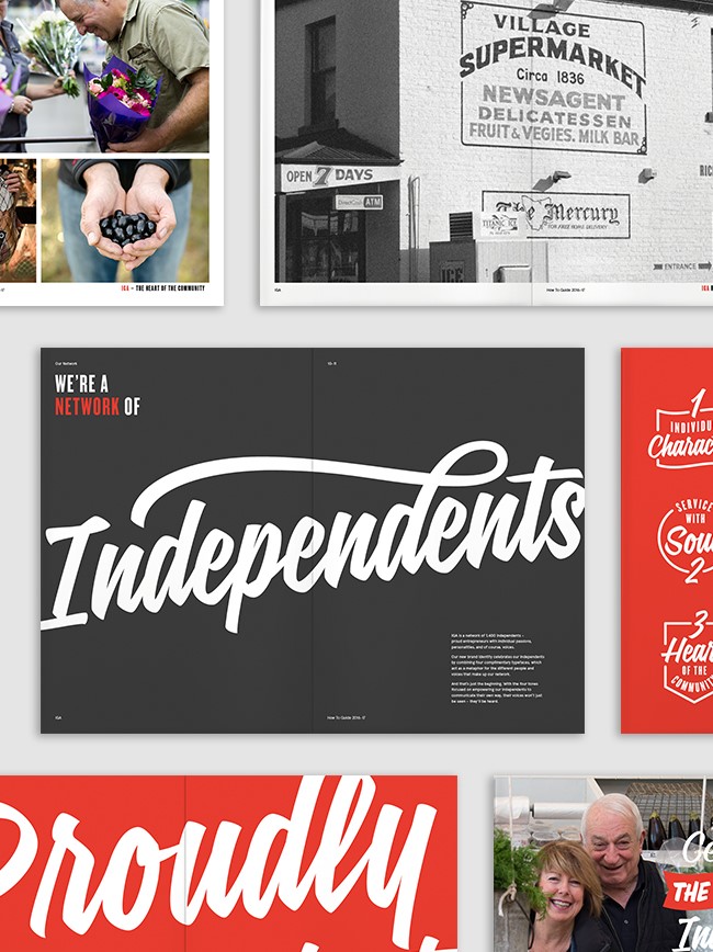
For Australian supermarket brand Independent Grocers of Australia (IGA), consistent localisation and customer-centred experience is the thread running throughout its historic brand.
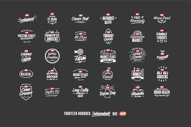
Recently delivered of its inconsistent sub-brand designs and outdated brand image by global design group Interbrand, the IGA brand has repositioned itself as Australia’s truly localised regional grocer. With a refined identity based on signwriting and focusing on each store’s unique logo, the local element to a national brand is retained. However, |Interbrand’s input ensures a more consistent finish for IGA.
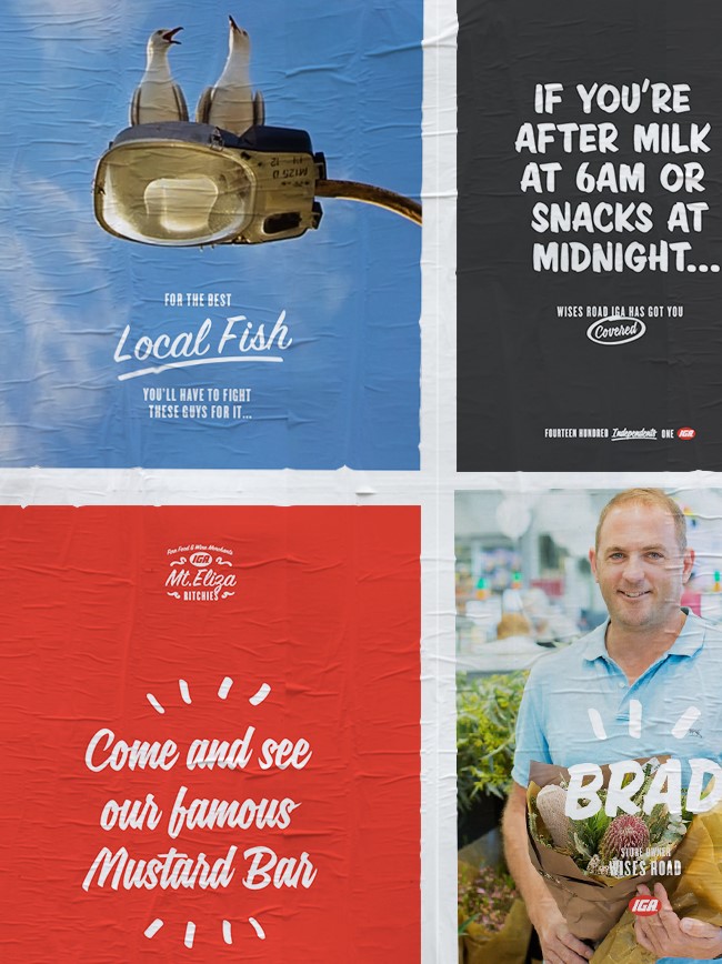
“Based on signwriting – the warm, personal, hand-crafted art form that’s been part of local store DNA from the very beginning – the identity represents IGA’s mission to bring the heart and soul back into grocery shopping,” says the Interbrand project page. “The typeface is supported by an illustration toolkit. Adaptable and accessible, it empowers every store owner to create their own designs, messages and yes, even logos, without making the IGA brand suffer.”
Another key part of the IGA brand is its flexibility, which sees each store in each location boast different characteristics. This is what makes IGA a firm favourite among shoppers - a quirk of one shop might not be a quirk of another, and with around 1,400 stores across Australia this makes IGA unique among most supermarket brands. So while each shop retains its independence, the brand system introduced by Pentagram ensures that the differing logos retain an element of IGA consistency.
Without compromising its individual charm, the new direction for IGA is clear in its aesthetics.
"The Interbrand team took the time to truly invest in understanding our model, our retail customers and their stores (all of them!), the shopper and what Australia really needed,” says Madeleine Fitzpatrick, general manager of marketing at IGA. “We’re delighted with the result, it’s a purpose that excites Australians, unites our retailers and has brought meaning to those of us that work to strengthen IGA."
For more from Transform magazine, follow us on Twitter @Transformsays
Opinion: Martin Widdowfield, creative director at Leeds-based branding agency Robot Food, discusses Interbrand's new visual direction for IGA

I really like the brand's concept of IGA being unique and no two shops the same, making each feel independent rather than part of a big corporation. This is one of those opportunities for a design agency to create something with depth and playfulness.
When you look at the suite of old logos, they looked more like an 80s computer chip manufacturer. There was no congruence or ownability so you can see why an overhaul was needed. I like the new look. It’s not visually unique, but the approach feels familiar for the right reasons. Convenience stores are the heart of a community and so they have to feel inviting. This new familiarity helps to communicate that ‘everyone is welcome’ and has a sense of pride in location as well as pride in the brand. It feels more foodie as well, with an overall quality that stands up strongly against the emergent hip grocery stores that seem to be popping up a lot.
It’s nicely tied together with the use of a chalkboard grey and simple white chalk-like typography, and finally finished with the familiar pop of the red IGA mark. Looking closer at the logos, the typography is nicely balanced with friendly scripts and condensed san-serifs. Being restrictive in the font styles really helps to hold the collection of logos together and brings cohesiveness to the brand, yet still gives a great amount of uniqueness to each execution.
The addition of supporting graphics, such as the surfboards, mountains and skylines, is a nice touch. Again, this feels proud, ownable and brings out the individual personalities of each store, helping each logo stand up on their own. As a set they add to the eclectic, less formal approach I like to see in brands today.
Overall a good execution that's definitely of the ‘now.’
IGA - Putting the heart and soul back into grocery shopping. from Interbrand Australia on Vimeo.


