Fontsmith collaborates with artists for the launch of three new typefaces
London-based type foundry company Fontsmith has partnered with Atlas design consultancy founder Astrid Stavro and illustrator Jimmy Turrell for the release of FS Sally Triestina and FS Erskine accordingly.
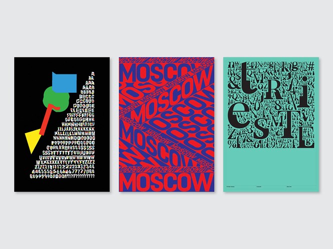
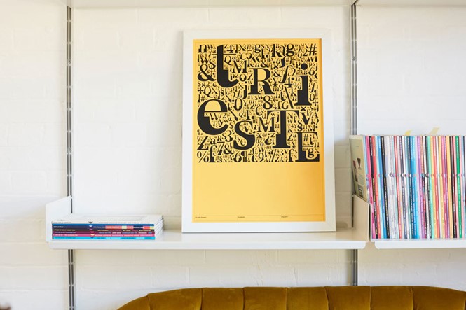
Starting with the existing FS Sally, Stavro changed its regular weight and then enriched it with a bold version around the midline.FS Sally Triestina aims to display the several sides of the city of Trieste in Italy that reflect Stavro’s colorful personality. Furthermore, Stavro, inspired from her memory of a family printing business, uses a design that resembles wooden and metal blocks. FS Sally Triestina has already won platinum in the Graphis Typeface Design competition.
Stavro says, “We had no idea that the project would become so successful. In fact, for such an experimental project I find it quite surprising. It is the first highly experimental typeface that I ever conceptualised, and working with Fontsmith to make it happen (and now commercialised) kind of blows my mind. It is a project close to my heart for obvious reasons: a homage to Trieste, to my legacy and multicultural background. The fact that people will now be able to use the typeface for their own projects makes me very happy.”
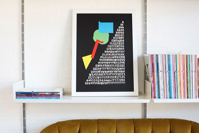
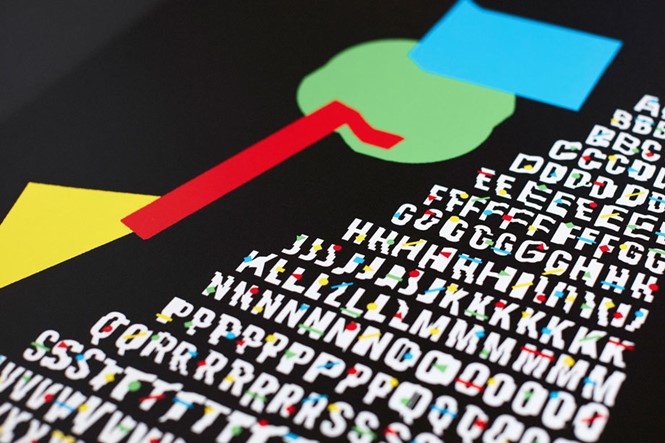
On the other hand, FS Erskine was inspired by Jimmy Turrell’s hometown of Newcastle and specifically by the Byker Wall council estate where Turnell grew up. The contrasting beauty of the estate with its grey walls coming to life with primary colours and geometric shapes led to a playful design that is original and modern.
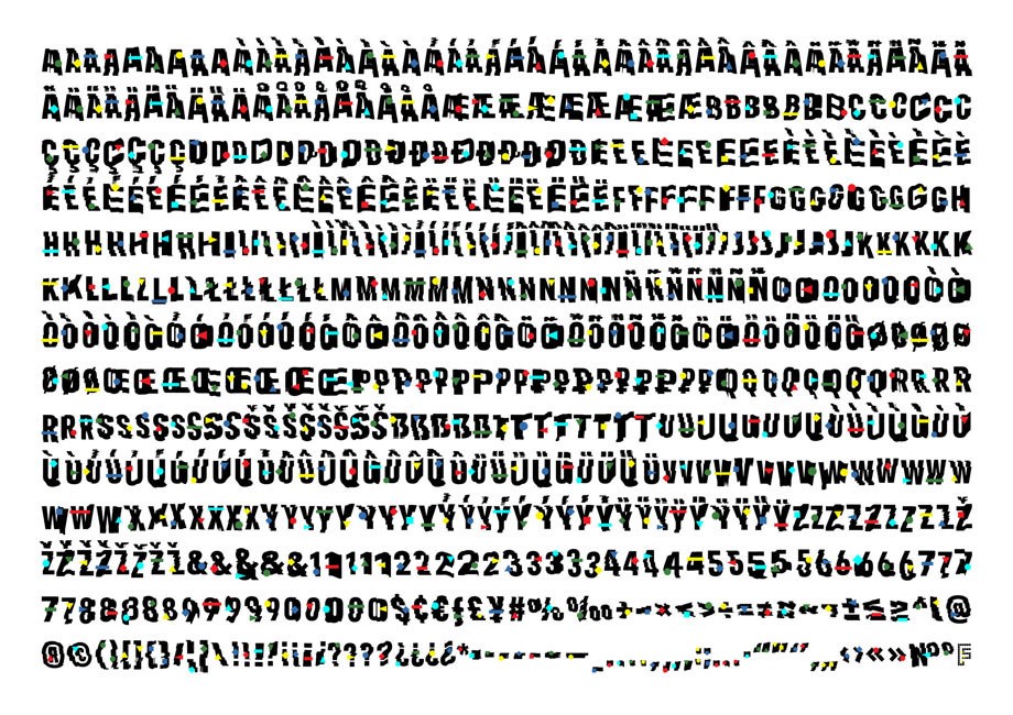
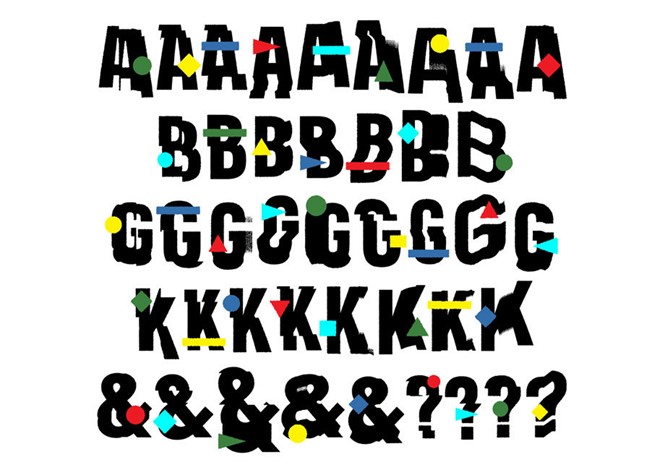
Turrell’s typeface uses all capitals and includes five different designs minimum per each letterform, which are randomly selected. The characters form the first layer and a second layer of geometric shapes can be overlaid. The font also displays a texture that mimics the look of torn paper, giving a casual and laid back aesthetic.
Turrell says, “The spirit of the Byker Wall in one single image. It seemed only natural that the font itself should act as the very building blocks of that structure, particularly the iconic Tom Collins House, probably the most famous part of the Byker Wall.”
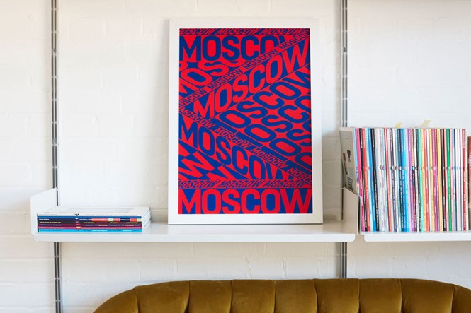
A third designer, Anna Kulachek, used Fontsmith’s existing typeface FS Dillon to create a moving typographic poster inspired by one of her favourite cities, Moscow. In her design, Kulachek tried to translate the vibe of Moscow’s architecture and traffic, while using Russia’s signature colours, red and blue.
Kulachek says, “Everything in Moscow is bold, the buildings, Russian people in particular, they are really direct. This font is a lot closer to the Russian direction and dialect, their honest and straightforward personality.’”
The typefaces were designed in the framework of the Local Characters series in partnership with creative platform It’s Nice That. The Local Characters series shows the helpfulness of Fontsmith’s Brandfont service, which allows brands to create exclusively licensed typefaces. For each typeface a limited-edition screen-printed poster was released.
For more from Transform magazine, follow us on Twitter @Transformsays