Airbnb thinks outside the ‘Cereal’ box

Having over 4m lodging listings in 65,000 cities and 191 countries and having facilitated over 260m stays since its founding in 2008, online marketplace and hospitality service Airbnb has established itself as a leading company in its sector.
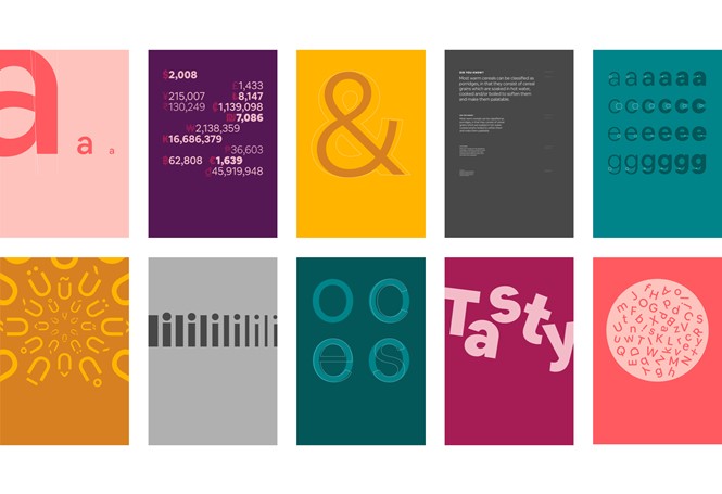
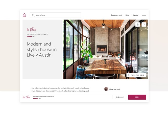
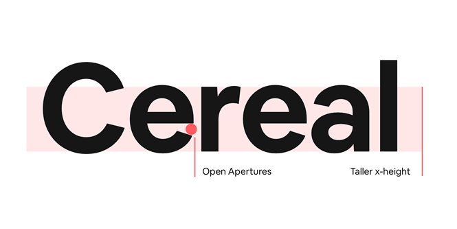
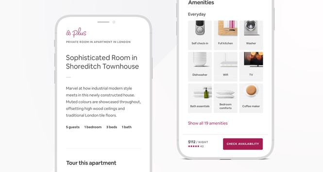
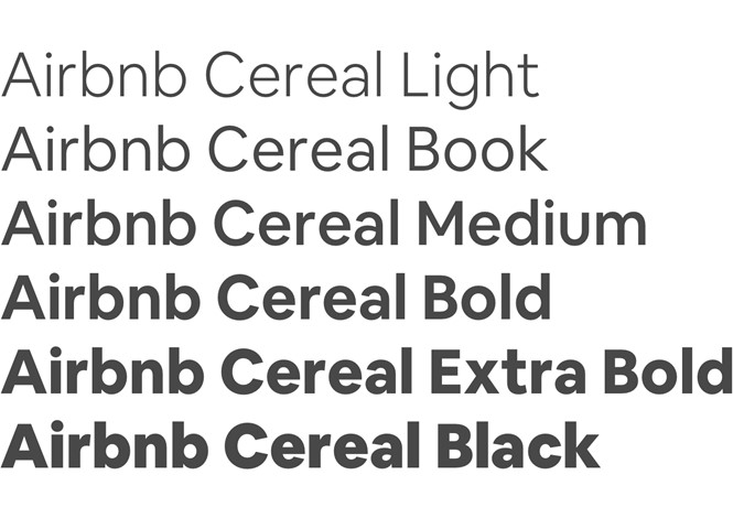
Airbnb has now launched a new font across its entire platform and brand, called Airbnb Cereal. The company’s branding has always paid attention to design and typography, keeping a current and approachable look. But, the new typeface has been designed to be easily adaptable, addressing some of the company’s main business requirements. Cereal combines character, function and scale, giving the brand the ability to work just as well both in small assets and large-scale advertising.
With Airbnb’s platform having the unique feature of enabling offline experiences, scaling online to offline was important as it reflects how people see Airbnb in the real world. Cereal helps Airbnb put forward a unified and consistent look across its whole brand, which translates just as well on-screen and off-screen.
Airbnb also focused on making the brand more accessible. With Cereal’s readability, the company caters to its audience while staying true to its ‘Airbnb for everyone’ tagline.
The name of the new font references an act of entrepreneurship that saved the company in 2008. In the midst of the global recession, Airbnb’s co-founders created collectible Obama O’s and Cap’n McCain branded cereal, taking advantage of the hype around the 2008 United States presidential election, which made money and saved the brand.
Cereal saved the company, proving that thinking outside the box can lead to creative problem solving in a way that once helped form one of Airbnb’s core values.
For more from Transform magazine, follow us on Twitter @Transformsays