#TransformTuesday: 7 November

Every week, Transform examines recent rebrands and updated visual identities. This week's picks are below. For more from #TransformTuesday, follow @Transformsays.
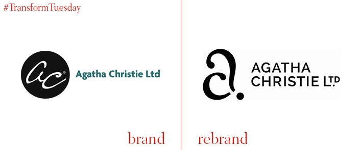
Agatha Christie Ltd
In the first week of November, the latest remake of the classic ‘whodunnit’ mystery Murder on the Orient Express came to cinema screens. Written in 1934 by the incomparable Agatha Christie, the author’s name itself is synonymous with crime fiction – and a brand in its own right. Recently given a new identity, Agatha Christie Ltd was launched by the author in the late 1950s to protect the rights to her numerous works. The rebrand project, led by London-based brand agency Studio Sutherl&, gives the Agatha Christie wordmark a classic literary, monochrome identity while employing a question mark to reflect the nature of Christie’s work. The new logo accompanies a set of stamps to mark the centenary since Christie’s first novel and 40 years since her death.
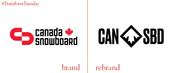
Canada Snowboard
A country renowned for its winter sports, Canada has a tradition of prowess in skiing and snowboarding. Canada Snowboard, the national governing and body which oversees the country’s snowboarding participation, has rebranded to better reflect the passion with which the country views snow sports, as well as the intrinsic part its plays in the nation’s identity. Vancouver, Canada-based design firm Hulse & Durrell designed the new identity, which includes a logo encompassing a snowy mountain, maple leaf and a black diamond. The rebrand also uses a mixture of sans serif font and TT Milks Script for its digital applications, resulting in a bold and daring identity which avoids the cliché of classic Canadian tropes.
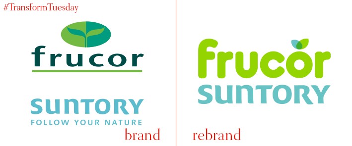
Frucor Suntory
Founded in 1962, the leading Australasian drinks company now known as Frucor Suntory is perhaps best known for its global V energy drink. The current company formed following the acquisition of Frucor Beverages Ltd by Japanese-owned Suntory Beverages and Food Ltd – the company has now rebranded, including merging its names, to better reflect its mission, ‘To make drinks better.’ In a project led by Auckland, New Zealand-based Voice Brand Agency, the company’s branding now aligns the Frucor Suntory current brand purpose with its impressive heritage. Voice says, “Voice’s challenge was to [reflect]… the unique, entrepreneurial spirit which both of these two power houses embody. The green leaf shape in the logo is an evolution of the pre-existing Frucor leaf device, reshaped for the company’s future from the story of its heritage. The blue was used to represent the Suntory brand.”
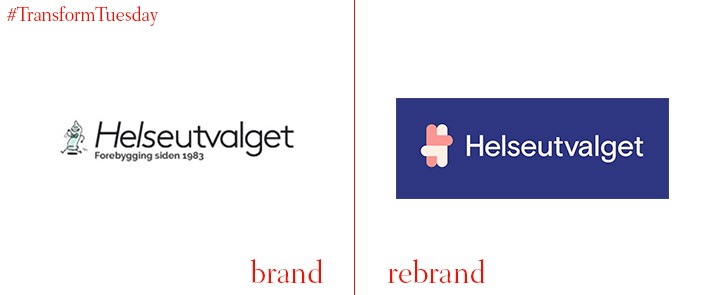
Helseutvalget
Oslo, Norway-based Bielke&Yang has rebranded Norweigan health organisation Helseutvalget. The free and not-for-profit organisation, which is also politically independent, was founded in 1983 and aims to provide health support for those who have sex with members of the same sex. In its rebrand of the organisation, Bielke&Yang has employed a medical aesthetic while communicating the welcoming, non-judgemental nature of the service Helseutvalget provides. The previously unsubtle condom is replaced with a friendlier, more intimate ‘H’ icon, as well as a colour palette dominated by soft pinks, blues and grey. The accompanying visuals were completed by Netherlands-based illustrators Hedof.

OurCreative
The brand identity and packaging design agency previously known as Hornall Anderson has rebranded as OurCreative. The change comes following the company’s split from Hornall Anderson US earlier in 2017 and aims to continue providing unique and high-quality projects for its roster of clients. Managing director Kim Van Elkan says, “OurCreative’s name was born out of a collective team workshop and desire to reflect that at our agency, everyone in our family lives, breathes and eats creative. We are so excited about moving forward with our new identity and letting everyone know who we are.”
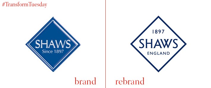
Shaws of Darwen
Earlier in 2017 historic manufacturer Shaws of Darwen, a family business with origins in the late 18th century, rebranded to reflect the company’s 115-year evolution. Based in Lancashire, Shaws of Darwen has created bespoke ceramic sinks and terracotta products since 1897. It recently approached Manchester, UK-based brand agency Truth to help develop the Shaws of Darwen tone of voice and update the company#s brand identity for the contemporary market. Truth says, “Truth was briefed to embark on international research programme to understand both market demand and distributor requirements to consolidate brand efforts across the globe. From this insight Truth has progressed a full brand and value proposition programme, informing the brand identity and consistent tone of voice.”


