#TransformTuesday: 7 March
Every week, Transform examines recent rebrands and updated visual identities. This week's picks are below. For more from #TransformTuesday, follow @Transformsays
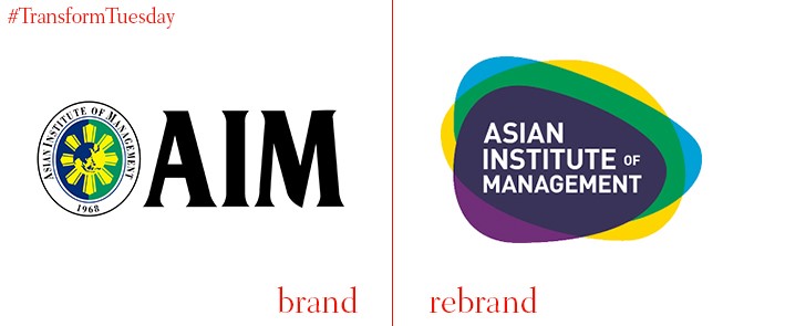
Asian Institute of Management
Based in Makati, the Philippines, the Asian Institute of Management (AIM) will celebrate its 50th birthday in 2018. In anticipation of this milestone, and to reflect the innovative direction of the school’s teaching, AIM has unveiled an update to its visual identity. A main focus of the rebrand is the concept of dynamism, with a colourful logo and flexible identity reflecting the changes occurring at the AIM, and the dynamic relationship between the Philippine government and burgeoning business sector. A press email from the AIM says, “The Nexus, which our new logo is called, embodies and embraces fluidity, given the nature of our times. Yet it remains rooted in the heritage and guiding principles of our founders. As the shape of the shield morphs into the Nexus, AIM continues to serve as a focal point where business, government, and society converge, connect, and synergise.”
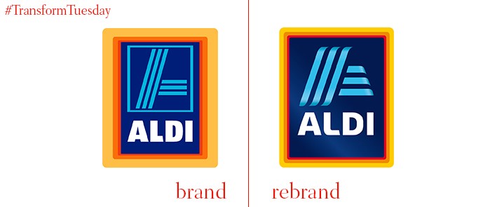
ALDI
International discount supermarket, Aldi, has updated its logo and colour palette with a new gradient-based colour scheme. Aldi has experienced many iterations of its logo since first opening in 1948; the latest, while not straying far from its recognisable design, reflects the supermarket’s place in contemporary society. According to a press release, Aldi enlisted the help of agency illion. Markensocietaet. Kirsten Geß, communication director at Aldi South, says, “For our customers, this will be visible, for example, in the ongoing further development of our range, the redesign of our stores, and the upcoming pop-up store 'Meine Weinkwelt.' The fresh visual design of the new logo fits perfectly into Aldi South's current modernisation process."
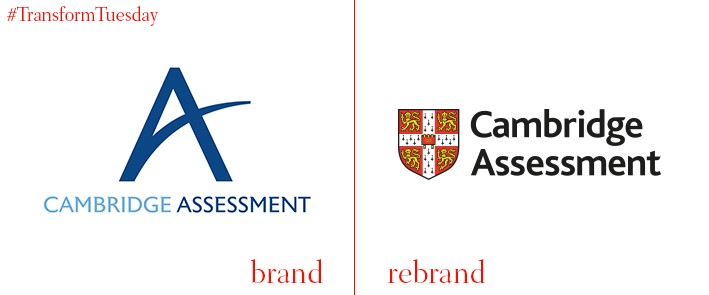
Cambridge Assessment
The assessment agency of the University of Cambridge, Cambridge Assessment is the parent brand of three examining bodies. Until now, each had vastly differing visual identities, despite being aligned with the same company. An update sees Cambridge Assessment take on an identity fitting to its brand architecture. Carried out by London-based business consultancy, BrandCap, the new identity’s three brand values – collaborative, responsible and innovative – is reflected in the vivid colour palette of Cambridge Assessment’s new website. Leo Shapiro, Cambridge Assessment’s group director, says, “Listening to learners, parents, schools and partners, they all told us just how important our connection with the University of Cambridge is to them… we’ve also developed a brand that’s unique to Cambridge Assessment and distinct – and getting that balance was a crucial part of the strategy”.
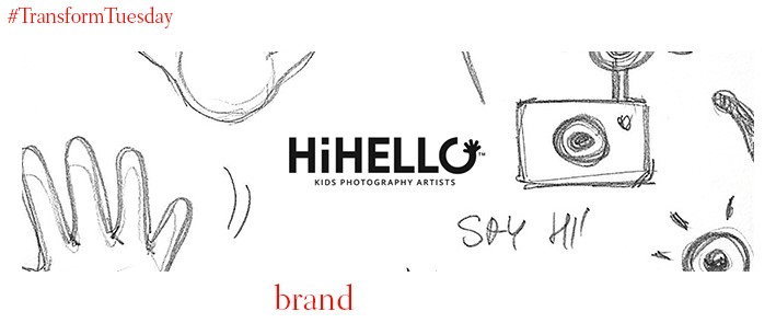
HiHello
Poland-based children’s photography agency, HiHello, is run by Paulina Kania and Piotr Półtorak. The agency’s new strategy, ‘the best shot at bringing out the best in children’ informs HiHello’s latest communication campaign; it was developed into a brand strategy by Poznan-based agency, Minima Advertising People. “Our goal was to express and emphasise the most important aspect of Paulina and Piotr’s everyday work, which is their ability to build wonderful relationships with the little models,” says Anna Szymczak, managing partner at Minima Advertising People. Paulina Kania, founder of HiHello, says, “From the very start, the most important thing for us was turn all our ideas and previous work into an efficient tool we could use in our future projects.”
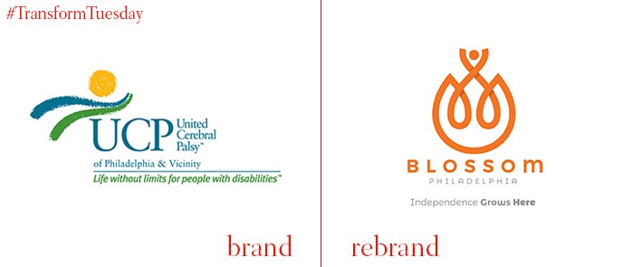
Blossom Philadelphia
For over 70 years, United Cerebral Palsy of Philadelphia has been widely recognised as one of the most celebrated charitable organisations in the US. Yet a new direction, as well as an expansion in the charity's provision and capabilities, paved the way for a renewed visual and verbal identity. Carried out by brand agency DBD International and led by David Brier, the organisation is now known as Blossom Philadelphia – representing the growth of both the charity’s mission and its members. Brier says, “This rebrand involved a new brand story, name development, new brand identity, new slogan and positioning and overall brand hierarchy. The new name grew organically from the core concept of helping each individual – helping them blossom – and the factor of helping them gain a firm foundation for their lives. The last detail was they are based in Philadelphia, the home of independence for America.”
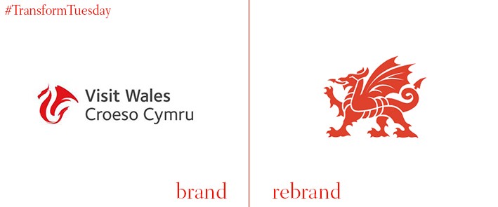
Wales
Despite Wales making up a quarter of the UK’s countries, tourism to Ireland and Scotland is often chosen over Welsh tourist destinations. To remedy this, as well as unify ‘brand Wales’ touchpoints under one visual identity, Cardiff-based brand consultancy Smörgåsbord has created a new nation brand for Wales. To roll out across its tourism, food and drink, and business sectors, Smörgåsbord has created a graphic representation of the traditional Welsh dragon symbol. It is also intended that the Welsh government will use it alongside its own public services branding. Speaking to DesignWeek, co-founder of Smörgåsbord, Dylan Griffith, says, “Our studio mantra was to create something inherently Welsh with a global outlook. We wanted to design a brand that was of the country.”


