#TransformTuesday: 27 June
Every week, Transform examines recent rebrands and updated visual identities. This week's picks are below. For more from #TransformTuesday, follow @Transformsays

Bowel & Cancer Research
UK-based charity, Bowel & Cancer Research, has recently launched a new campaign. I’ve Got Guts aims to generate awareness of bowel cancer, as well as other chronic conditions associated with the bowel, such as Chron’s disease. To coincide with the new awareness drive, Bowel & Cancer Research has developed and released a new brand, including an updated logo developed by Soho, London-based advertising agency Minimart. Carried out in conjunction with Nick Kohn, founder and managing director of social impact-focused brand consultancy, Beyond Aspiration, the rebrand reflects the charity’s strategic position in generating more funding for research into bowel disease
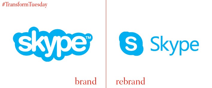
Skype
Leading instant messaging and video call service Skype has rebranded, bringing its identity more in line with its owner, Microsoft. Bought out in 2011 for $8.5bn – £6.7bn – Skype has struggled to retain its position in a competitive market which includes the likes of FaceTime and Facebook Messenger app. The company has also launched an updated website and app offering, with its digital platform offering customisable features and a more personal experience. An entry in the Skype blog says, “Rebuilt from the ground up, the new Skype vastly improves the ways you can connect with your favourite people and, of course, chatting is front and centre. We’ve made group chats more lively, expressive, and – most importantly – personalised.”
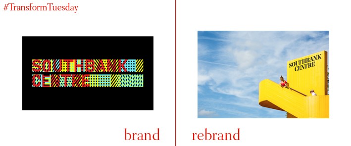
Southbank Centre
London-based brand design agency, North, has released a new visual identity for London-based cultural institution, the Southbank Centre, which last had its branding updated a decade ago in 2007 by Wolff Olins. North has developed a simplified, pared-back logo to replace the original abstract, geometric offering, with its collateral led by a bright yellow shade and focusing on the centre’s variety of cultural events and offerings. Its new, bespoke typeface, inspired by the Southbank Centre’s brutalist architecture, has been developed from existing font Noe Display and created by Berlin- and Helsinki-based type foundry, Schick Toikka.
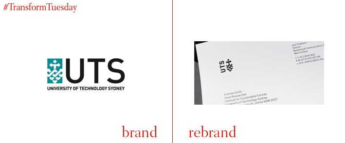
University of Technology Sydney (UTS)
Australian strategic brand agency Houston Group has developed and launched a new identity for the University of Technology Sydney (UTS), a public university with around 40,000 undergraduates. The new logo, derived from the university’s original brandmark, is designed to be more flexible in application and coexists with a new, loud suite of marketing collateral also developed by Houston Group. Bold reds, blues and blacks generate a more modern perception of the institution; the design reflects the fusing of technology and creativity on which UTS prides itself.
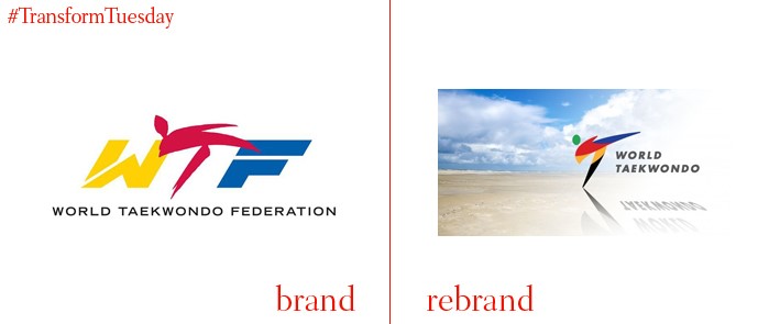
World Taekwondo Federation
On 24 June, the 23rd edition of the World Taekwondo Championships 2017 got underway in Muju, South Korea – the first global taekwondo event since 1973 to drop the ‘World Taekwondo Federation’ moniker. With the original name developed long before the age of social media and internet acronyms, in recent years the World Taekwondo Federation’s initials – WTF – had become the subject of scrutiny. As a result, the federation took the recent decision to rebrand as simply ‘World Taekwondo,’ with the change effective immediately. World Taekwondo president, Choue Chung-won says, “World Taekwondo is distinctive and simple to understand and reinforces the global nature of our sport. Our vision is taekwondo for all and as World Taekwondo we are confident we can build on our success to date and achieve that vision."
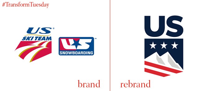
US Ski and Snowboard
Last week, the nation-wide US Ski and Snowboard revealed its new identity and name. Previously known as the US Ski and Snowboard Association, the organisation adopted the new brandmark and brand positioning to unite all participants of snow sports in the US. All organisations which previously came under the USSA badge but held disparate identities now carry the US Ski and Snowboard name. The rebrand effort was led by a plethora of branding experts, including senior strategic advisor for Nike, Jeanne Jackson, chief marketing officer for the United States Olympic Committee, Lisa Baird, Boston-based Harrigan Design Group and San-Diego-based consulting firm, I.d.e.a.


