#TransformTuesday: 25 April
Every week, Transform examines recent rebrands and updated visual identities. This week is a UK special - our picks are below. For more from #TransformTuesday, follow @Transformsays
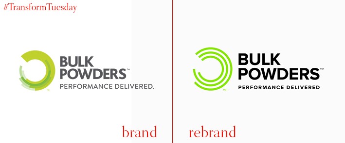
Bulk Powders
In the past few years, the previously separate worlds of fitness and lifestyle have merged into one, interchangeable sphere. Respective of this, Leeds-based branding agency Robot Food has updated the visual identity for leading protein powder range Bulk Powders – after developing the company’s initial branding in 2013. Robot Food has strengthened the Bulk Powder brand’s consistency through streamlining its colour palette to a more uniform green across its brand architecture. Reflecting Bulk Powders’ changing target audience, Robot Food encompasses a more ‘progressive aesthetic’ in its identity, which moves away from serious weight lifters to a more casual lifestyle offering. Mike Johns, senior designer at Robot Food, says, “We also understand modern food, fitness and lifestyle trends and we applied our knowledge to move the brand on so it speaks to a newer, wider, savvier audience – without compromising the existing brand equity.”
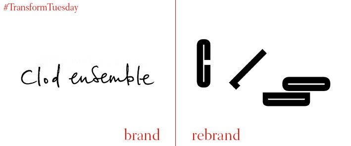
Clod Ensemble
London-based interdisciplinary performance group, Clod Ensemble, has undergone a rebrand strategy to better reflect the three disparate elements of performance – tragedy, melodrama and clown. Inspired by the theories of performance art teacher Jaques Lecoq, London-based design agency the Beautiful Meme created a new identity inspired by Lecoq’s theory of planes – tragedy happens on the vertical plane, melodrama on the diagonal plane and clown on the horizontal plane. The rebrand was built by LMNOP studios, a creative design studio based in Brighton.
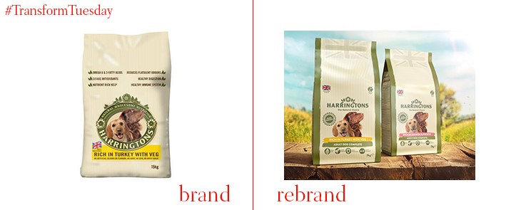
Harringtons
Following the moniker ‘brand evolution, not revolution,’ UK-based premium dog food brand Harringtons has updated its visual identity to emphasise its natural ingredients and reputational provenance. In a brand strategy led by global design agency, Hornall Anderson, Harringtons is repackaged with a paper craft-led design. Along with clarifying its natural ingredients, this taps into the trend of dog-owners being more particular about their dog’s food quality. Dan Reeves, marketing manager at Inspired Pet Nutrition, owner of Harringtons, says, “It is Harringtons’ first pack redesign for a decade and as the range is increasing and entering new categories such as wet pet food, we need to have a consistent approach across the range. The clearer, more contemporary designs make it easier for shoppers to spot the range as they enter the aisle and quickly identify which variant they want.”
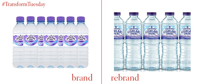
Highland Spring
Packaging design consultancy Touch and creative agency Taxi Studio have updated the packaging offering for historic Scottish mineral water brand, Highland Spring. The natural and organic nature of Highland Spring’s product offers a unique identifier in the bottled water category, with the 3D offering designed by Touch and Taxi Studio mirroring the water’s journey from source to mouth. James Pryor, creative director at Touch, says, “We used the integration of 3D and graphic design to full effect using a transparent label, creating a powerful visual story and helping the new bottle capture people’s attention due to the physically distinctive brand identity.” Jonathan Turner Rogers, associate creative director at Taxi Studio, says, “The design works by seamlessly joining together the bottle and the graphics to create a story of purity and provenance. The bottle captures the rolling Ochil Hills, whilst the transparent label reflects the purity of the water and the clouds above its source.”
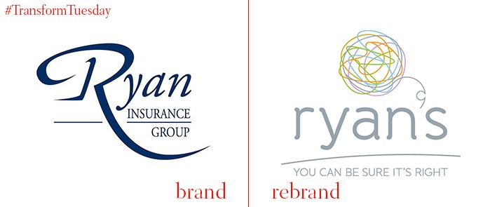
Ryan’s
UK-based digital marketing agency Jacob Bailey, which also has an office in New York, has unveiled its rebrand of Ipswich-based insurance broker, Ryan’s. Despite a strong corporate reputation and loyal following among its customer base, Ryan’s recognised the need to create a more universal brand to attract a younger audience. Business consultancy workshops and management-led overhaul of current operations saw a revitalising of the workforce’s sense of identity to drive performance, an updated visual identity and data capturing mechanisms to better define audiences and improve communications. Tim Ryan, executive chairman at Ryan’s, says, “We wanted to explore a fresh approach to moving our business forward. With Jacob Bailey’s help, and following consultations with customers, staff and suppliers, we now have a progressive brand and culture that matches our business values and has increased profits substantially.”
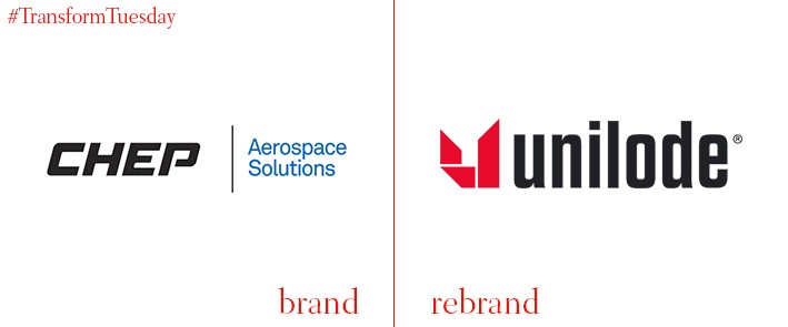
Unilode
In a project led by London-based branding agency, Spinach Design, the company previously known as CHEP Aerospace Solutions has rebranded as Unilode. The project encompasses an entire visual overhaul and name change, stemming from Unilode’s need to clarify its brand offering following an acquisition by EQT Infrastructure. Given the scale of Unilode’s business – 40 airline customers across 450 airports and 48 service centres – Spinach Design was briefed to create an identity with global appeal and pronounceability. Adam Thomas, creative director at Spinach Design, says, “We constructed the picture mark using strong modular elements to reflect the robustness of an airworthy container. The geometric wing shape they combine to create symbolises upward movement and flight and the cut-away references the characteristic shape of the unit load device (ULD).”


