#TransformTuesday: 18 April
Every week, Transform examines recent rebrands and updated visual identities. This week's picks are below. For more from #TransformTuesday, follow @Transformsays
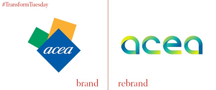
Acea
Leading Italian energy and utilities provider, Acea, has updated its corporate visual identity to better equip its brand offering for a digital platform. The previous Acea corporate logo was unchanged since 2010, during which time the proliferation of brands on social media platforms has led to the optimisation of brand identities from every sector. Despite the drastic design change green, blue and yellow remain as Acea’s leading brand colours, representing the environment, water and energy – the company’s three main business areas. The Acea logo is based on the imagery of map pins. In a press release on the Acea website, the company says of its new corporate logo, “The new company logo was born due to the ACEA and the pin, the pointer that combines the physical world with the digital. A sign now recognised globally as an identifying representation of a place and of a territory [sic].”
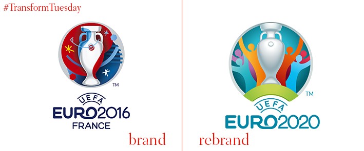
Euro2020
While the previous 15 incarnations of international men’s football tournament, the UEFA European Football Championships, have been based in one country, its 2020 event will for the first time be held at stadiums in multiple cities across Europe. The year marks the 60th birthday of the Euros; its staging across 13 locations is a one-off to commemorate the occasion. Tropes of unity and connection reflect in the visual identity and logo design, which has been developed by Portugal-based agency Y&R Branding Lisbon.
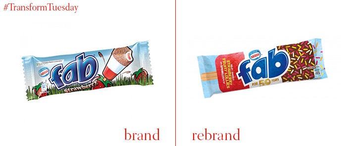
Fab
A classic staple of the British supermarket ice-cream section, the Fab ice lolly sees an update to its visual identity to coincide with its 50th birthday celebration. London-based independent brand and packaging design agency, Springetts, is behind the rebrand which sees Fab return to a more retro aesthetic. With toned-down colours and a packaging design referencing the iconic strawberry, white ice milk and sprinkles-topped chocolate for which Fab is known, Springetts hopes to disassociate the product with artificial colours and additives. The updated packaging also features a new tagline, devised by the daughter of Springetts’ creative director, Paul Williams – ‘milky, choccy, strawberry…with sprinkles on top.’
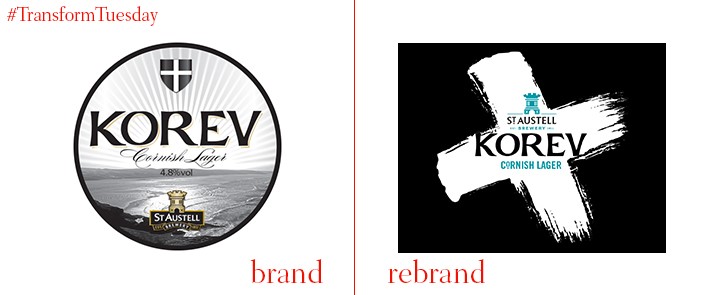
Korev
Brighton-based creative brand agency, CookChick Design, has developed a new label and packaging identity for Korev lager, a product of the Cornwall-based St Austell’s brewing company. While the St Piran's Cornish flag is included in both packaging designs, the redesigned bottles sees it become a standout feature with a striking monochrome design. Speaking to Packaging of the World, director at CookChick Design, Lee Cook, says, “We wanted to encapsulate the energy and distinct spirit that Cornwall owns. The most immediate icon for their fiercely independent attitude is the Saint Piran’s flag. Combining the strength of the black & white flag with the brush stroke energy distilled the Cornish soul down to its simplest mark.”
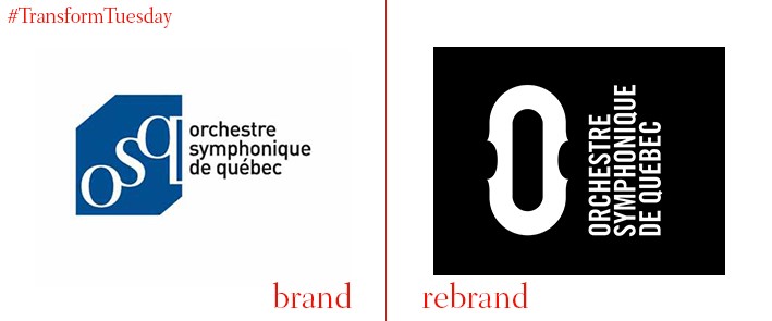
Orchestre Symphonique de Québec
Founded in 1902 as the Société Symphonique de Québec, for 115 years Québec’s symphony orchestra has provided live classical music to the Québec population. Now known as the Orchestre Symphonique de Québec, the orchestra recently re-evaluated its brand offering in a rebranding strategy led by Canada-based branding studio, lg2. Its visual update and business strategy aims to better reflect its mission – ‘To offer a unique symphonic experience.’ The Orchestre Symphonique de Québec’s visual identity is, according to the lg2 project pag, based on its “ A more powerful, timeless personality that resonates with the target. The logo is inspired by the shapes of multiple classical instruments that are strongly associated with a symphonic orchestra.”
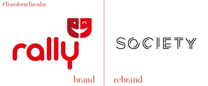
Mediabrands Society
Global agency group IPG Mediabrands has rebranded its Hong Kong-based social media agency, Rally Worldwide, to Mediabrands Society. With a renewed focus on a variety of outlets, including content strategy and planning, community management, social CRM, analysis and reporting and paid social, IPG Mediabrands hope Mediabrands Society will offer a different product, more innovative than those currently available. Kasper Aakerlund, CEO of IPG Mediabrands Hong Kong, says, “The launch of Mediabrands Society in Hong Kong is reflective of the influential social media powerhouse we have grown and nurtured in direct response to our client’s needs, and their progressive shift from traditional to online media spend.”


