#TransformTuesday: 14 November

Every week, Transform examines recent rebrands and updated visual identities. This week's picks are below. For more from #TransformTuesday, follow @Transformsays.
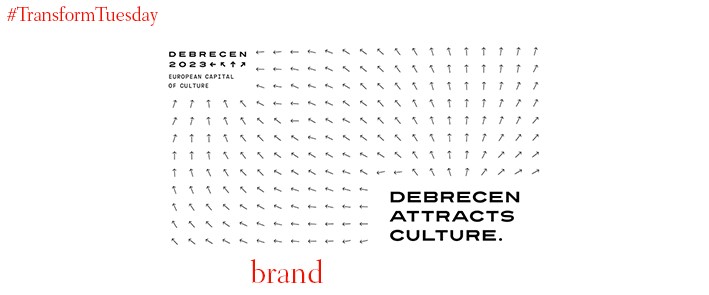
Debrecen
Launched in 1985, the European Capital of Culture is a European Union-led initiative. With a new ‘capital’ chosen each year, the programme sees a European city take the opportunity to showcase its cultural, social and environmental credentials to the wider European community. Applications are currently open for the 2023 iteration, in which the Hungarian city of Debrecen hopes for success. As part of its bid, the city has launched a new place brand identity. Developed in conjunction with Finland- and Hungary-based design team Classmate Studio, which won an open competition to create the identity, the Debrecen place identity is based on the idea of magnetic fields. Arrows lend a kinetic edge to the visual and graphic designs; Classmate Studio also launched two bespoke typefaces, Debrecen Sans Regular and Debrecen Sans Bold.
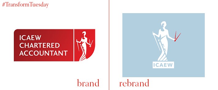
ICAEW
The Institute of Chartered Accounts in England and Wales (ICAEW) was established in 1880 by royal charter. However, while a historic institution, its branding was becoming a little outdated and needed an update to successfully compete with the growing number of institutions offering a similar service. In a rebrand project led by London-based design firm The Partners, the female symbol of Economia was reimagined for the contemporary, digital-first age. A new brand narrative formed which puts the ICAEW members at the brand’s heart. “Taking symbolic elements from the organisation’s history, we have created a modern, flexible system that is fitting for ICAEW’s diverse range of roles and activities. We developed the brand to work online, in literature, in sponsorship and in environments,” says The Partners.
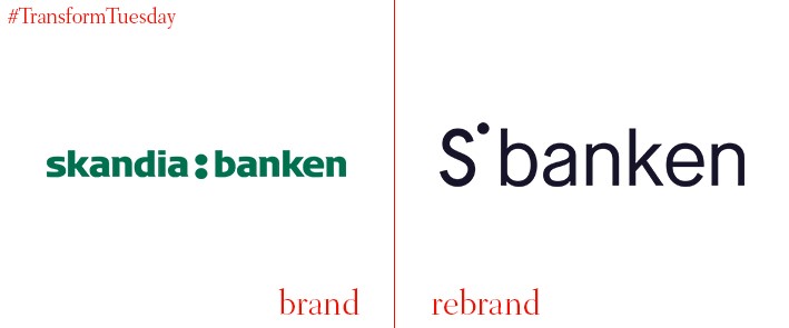
Sbanken
Previously named Skandiabanken, the Norway-based predominantly digital bank was part of the Swedish banking group from which it got its name. However, following a break from Skandiabanken, the Norway branch has rebranded and changed its name in a project led by independent design consultancy Bleed. Its new moniker, Sbanken, is a shortened version of its previous identity and the new logo has a distinctly arty feel, avoiding the bright colours and vivid palettes often inherent to other digital-first banking platforms. Bleed says, "Through simplification and visual recognition, the new name continues the bank's existing brand associations. At the same time, the new visual expression further underlines the openness and simplicity, and stands out in a uniform industry."
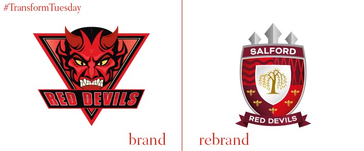
Salford Red Devils
A rugby league club based in the north of England in Salford, Greater Manchester, the Salford Red Devils has a legacy stretching back 1873. Winners of six championships and one Challenge Cup, the side recently unveiled a rebrand intended to inject energy back into a club marred by recent changes. Led by Fogg, a UK-based creative firm located equidistant between Liverpool and Manchester, research was undertaking to determine what fans expected from the new Salford Red Devils brand. The new crest includes tropes significant to the club and the Manchester area, including a willow tree, ship canal, the Millennium Bridge, worker bees and the trident. Fogg says, “The new identity has given proud Salfordians something that represents who they are. It acknowledges their character, spirit and resilience while importantly representing their club’s rich heritage and optimistic future.”
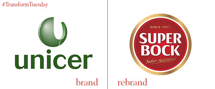
Super Bock
Unicer, the largest beverage company in Portugal, has recently announced a rebrand of its corporate identity. Taking on the name Super Bock, the world’s best-selling Portuguese beer, the rebrand coincides with the 90 years of production being celebrated this year – as well as recent successful expansion to China. Currently active in over 50 markets worldwide, the rebrand should see Super Bock consolidate its strength as a leading global beer while raising awareness of its associated parent company.

TeleMadrid
Part of the wider Radio Television Madrid, autonomous public television station TeleMadrid has evolved its brand identity across its entire brand architecture. Created by the Barcelona office of international design studio Mucho, the TeleMadrid brand identity retains its basic, iconic star shape with the addition of a different icon for each sub-brand. Replacing the previously 2000s tech-esque blocky font is Tiempos, a subtler, more sophisticated offering created by Klim Type Foundry. Mucho’s TeleMadrid project page says, “The challenge was to make TeleMadrid the point of reference for everyone in Madrid. To do this, we identified a series of values that the brand ought to reclaim and make its own. These had to be clearly communicated: openness; community focus; collaboration; interactivity and inviting co-creation.” The bespoke motion graphics were created by Cómodo Screen and the audio brand by Banjo Music.


