#TransformTuesday: 12 December

Every week, Transform examines recent rebrands and updated visual identities. This week's picks are below. For more from #TransformTuesday, follow @Transformsays.
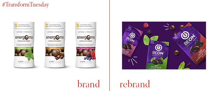
BeOn
The New York office of independent design agency BrandOpus has unveiled a complete packaging rebrand and name for chocolate energy snack brand, BeOn. Previously known as Energems, the brand provides high amounts of caffeine in small amounts of chocolate – perfect, it says, in a culture characterised by convenience. Positioned now as wellness lifestyle brand, the new identity and business model, which includes a subscription service, communicates BeOn’s strong personality. Kimberly Dunphy, creative director at BrandOpus, says, “BeOn needed to shift from its niche position in the supplements aisle to become relevant for the more mainstream ‘on the go’ consumer. The rebrand is single-minded, bold and energetic which is exactly how you feel once you’ve tried BeOn.”
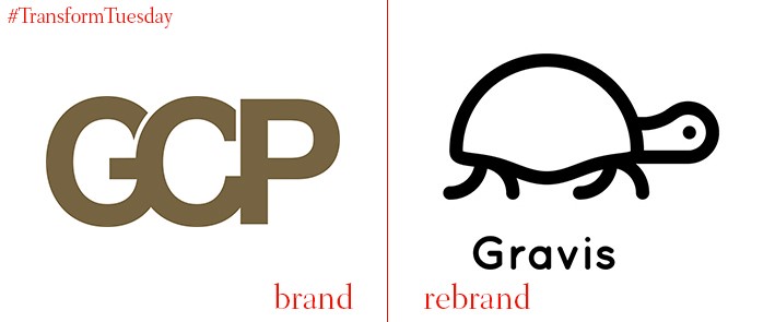
Gravis
London-based design agency That Thing has released a new visual identity for London-based investment house, Gravis, previously known as Gravis Capital Partners (CGP). Along with its new name, Gravis’ new Galapagos tortoise graphic represents the long-term ambitions and commitment of the company to be a steady, dependable investment firm with longevity. That Thing says, “The brand is designed to help the business to grow up and stand out. To show the creativity of the business, but feel steady and dependable. Architecturally. the system also creates a much-needed difference between the fund manager and funds, helping to give managerbrand (Gravis) more freedom, and give the individual funds the status they deserve.”
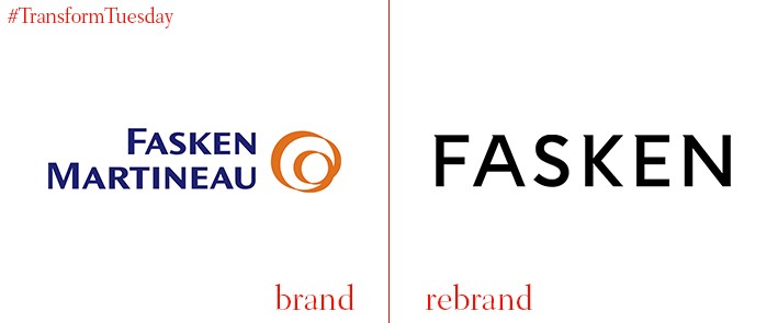
Fasken
One of Canada’s largest and most historic law firms, Fasken Martineau DuMoulin LLP, has shortened its name to, simply, Fasken. The rebrand, carried out inhouse, encompasses a new logo, persimmon colour palette, and a triangular icon reflective of a cursor symbol to reflect Fasken’s dynamism. “We are committed to providing [our clients with] excellent, innovative, practical and cost effective legal services,” says Peter Feldberg, firm managing partner at Fasken. “Our new site ensures a better experience for our clients – making navigation to the information of interest to them quicker and easier.”
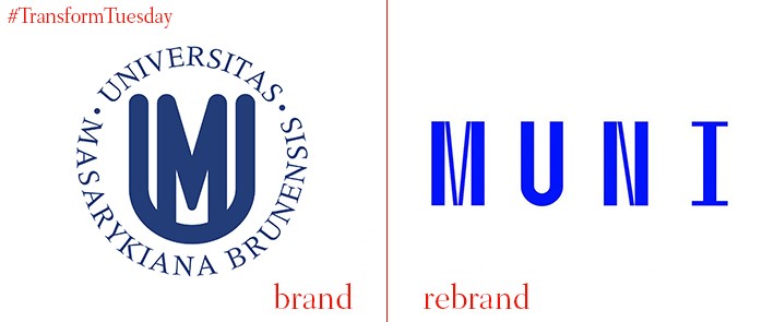
Masaryk University
The second largest university in the Czech Republic, the historic Masaryk University has a student enrolment of almost 45,000. Founded in 1919, the university’s 100th anniversary looms – its new logo and visual identity marks its centenary. Prague, Czech Republic-based Studio Najbrt led the rebrand, which is based on the functionalist tradition of Brno, the city in which Masaryk University is located. Speaking on the university website, rector of Masaryk University Mikuláš Bek, says, “The current logo…is a product of its era... For our centenary celebrations, we need a logo that will represent the modern spirit and nature of our university, the emphasis we place on functionality and efficiency, and also our confidence and courage to look for new solutions.”
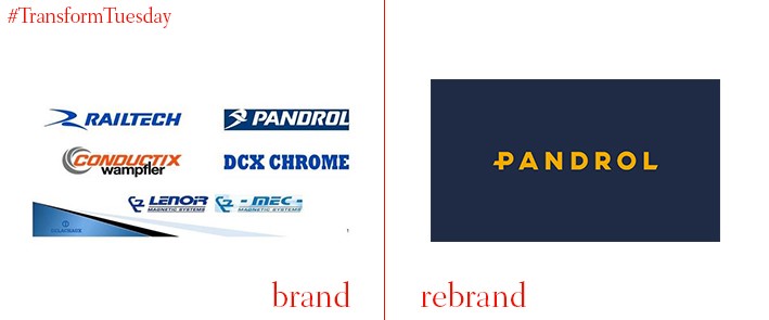
Pandrol
Industrial aesthetic energises the new identity for French rail company the Delachaux Group, which has brought all its businesses together under a single brand. Pandrol, as it is now known, consolidates the Delachaux Group’s wide brand architecture under a more cohesive, recognisable identity. The visual identity was created by Sheffield, UK-based brand agency Born + Raised and reflects Pandrol’s commitment to changing the locomotive landscape. Bew Knox, creative director at Born + Raised, says, “At the core of the brand identity is the logo. The bevelled characters at the start and end give the feeling of forward motion without compromising the strength of the mark. The letter P from the logo is an abstract representation of a Pandrol clip, the industry changing product from which the company takes its name. A subtle nod to their heritage of innovation.”
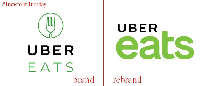
Uber Eats
A brand extension of app-based taxi service Uber, food-based Uber Eats has unveiled a new visual identity. Following a series of controversies surrounding the company, including condemnation by London’s mayor Sadiq Khan and its transport service, Transport for London, Uber is no doubt looking to strengthen its reputation in a market quick to challenge its supply model. The new Uber Eats logo, which also coincides with its two-year anniversary, retains the previous green though in a brighter shade. The brand adopts a flexible typeface more suited to digital application which, according to Uber Eats’ head of research Jeanette Mellinger, reflects “The endless possibilities of food.”


