Rebrands from the tap

The food and beverage sector has seen numerous rebrands over the past few weeks. We look at three global rebrands in the alcoholic drinks sector, from a craft beer in the south of France to the international beer staple Heineken

Heineken
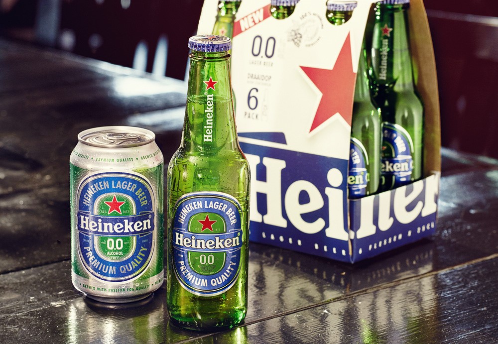
Tapping into an emerging non-alcoholic beer sector, Dutch brand Heineken has launched its first non-alcoholic beer following two years of researching new brewing techniques. Designed by VBAT, an Amsterdam-based design agency, the packaging of the beer is in line with Heineken’s traditional look, however features a new blue colour – a move from the brand’s signature green – to ensure customers can easily differentiate between the brand’s alcoholic and non-alcoholic beer.
David Lette, Heineken premium brands director, hopes that Heineken 0.0 will “bring new drinkers to the category by attracting health-conscious younger consumers who are drinking less or abstaining altogether, by delivering a great-tasting beer from a brand that they’re proud to be seen with,” and adds that initial feedback from consumers has been positive.
Heineken 0.0 will have a global rollout this month and will be available in 330ml cans and bottles, as well as multipack options. A £2.5m marketing campaign will support its launch along with an advertising campaign in July.

Peau de L’Ours
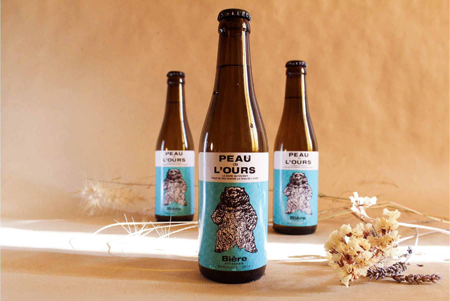
Peau de L’Ours, an artisanal beer from the south of France, has been redesigned by WHA-T, a design studio based in Paris. The beer’s packaging centres on a playful illustration of a bear, derived from the brand’s name ‘bearskin,’ and features a simple geometric background denoting the oats used in the production of the homemade beverage.
Below the logo is the French language strapline which directly translates to ‘Bearskin, the beer we drink to not sell the bear skin,’ in reference to a famous French proverb. WHA-T introduced a unique turquoise colour and clean typography to the label in creating an overall modern identity for the brand, while appreciating the traditional quality of the beer itself.
“Peau de l’Ours is a beer that asserts its will to be singular without being casual,” says Yannick Martin, designer at WHA-T studio.

Tuborg
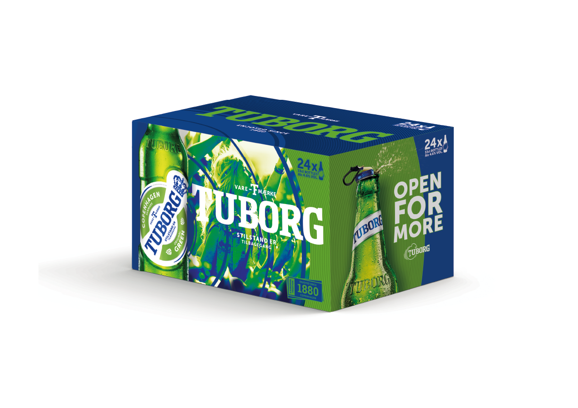
Danish lager brand Tuborg has launched a refreshed visual identity and packaging designed by Turner Duckworth, a London and US-based brand consultancy. The youthful rebrand targets younger adult drinkers in key growth markets, including Eastern Europe, Russia and Asia and builds on the brand through its connection to music.
The new logo sees a blue colour replacing the traditional green; blue rings circle the logo and are designed to look like a ‘power pulse,’ in reference to Tuborg’s partnership with music festivals.
“There are so many green beers, so we had to work on colour,” says Bruce Duckworth, Turner Duckworth joint chief creative officer and CEO. “The electric blue really came from Tuborg’s equity in music. It’s a very energetic colour, and it’s very distinctive.”
The new packaging design will roll out globally this month along with a new ‘the beat through time’ marketing campaign and film created by Happiness Brussels.


