Bringing own label to the table
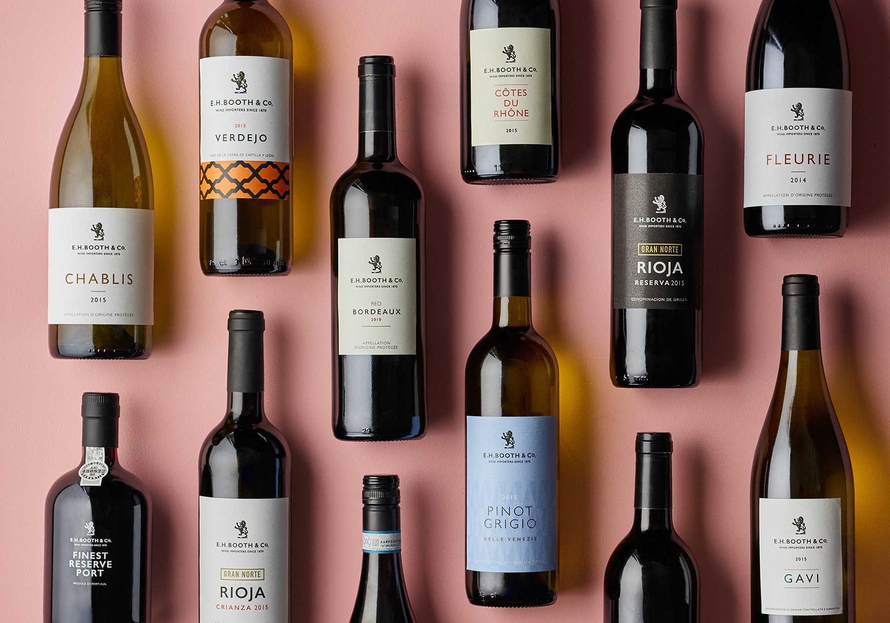
Almost 170 years ago, in June 1847, tea-dealer and resident of Blackpool, UK, Edwin Henry Booth, opened a shop named The China House and began trading under the E.H. Booth & Co. Ltd. When, 16 years later in 1863, Booth added the sale of wine to his shop’s repertoire – and began importing it in 1870 – the Booth’s brand synonymy with high-quality wine stuck. To cement this historic legacy and continue its reputation as a purveyor of exemplary goods, the northern UK supermarket has updated the packaging for much of its own-brand food range – including its selection of quality table wines.
Attracting a middle-class clientele, Booth’s has been dubbed by some publications as ‘the Waitrose of the north.’ Its own-label wine packaging rebrand therefore aims to dispel the myth that own-brand supermarket wine is suspect and requires little imagination. On the contrary, Booths’ redesign, carried out by creative branding agency Smith&+Village, highlights the inventive with which supermarkets can approach their own label. Debrah Smith, creative director at Smith&+Village, says, “From a design and visual point of view, supermarkets tend to go for a derivative, cookie cutter look. We chose packaging design which would make it stand out from the competition.”
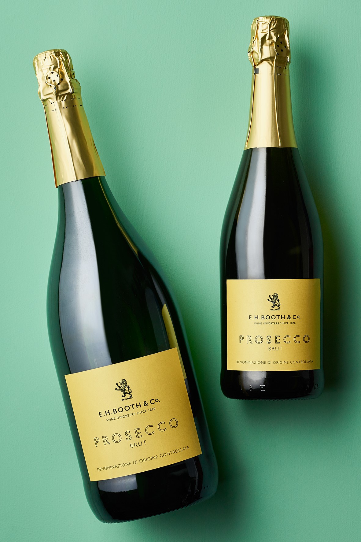
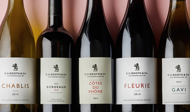
The historic Booths crest is the main cue in the retailer’s new visual identity; Smith&+Village was able to reposition Booths’ wine as products of a wine merchant, rather than as a supermarket essential. Smith&+Village’s update also included the original E.H. Booth & Co name. While seemingly a simple solution, reference to its previous merchant identity creates a connection between its local customers and the brand’s northern roots.
And, as the rebrand rolled out during the 2016 Christmas period, figures emerged which highlight the positive impact of design change on Booths. A 4.3% increase in sales for all the retailer’s wines was recorded, including a 440% rise in sales of its 50cl Port. This is as well as a 147% increase in sales for rioja and uptake across all its own-brand food.
This, says Richard Village, director of Smith&+Village, shows how design must play on the connection people make between supermarket brands and own-label products. Village says, “Whatever supermarkets do to counter it, there is still some stigma in customer minds about putting supermarket wine on the table at a dinner party. We’ve got around that by playing on Booths’ heritage as a wine merchant.”
Village continues, “[Booths has] imported wine since 1870 and for the most part work with smaller, independent wine makers who are often family businesses like them. Playing with this and putting the brand mark centre stage on the front of the bottle makes it exude confidence.”
So successful has the heritage rebrand been that Smith&+Village won gold for its work on the overall overhaul of Booths own label, as well as silver for its Booths bags for life design, at the DBA Design Effectiveness Awards 2017. About this accolade, Smith and Village say, “We are absolutely delighted to have our work with Booths recognised at such a high level. Our awards, and the rest of the winners at the DBA Design Effectiveness Awards, are a testament to the power of design as a marketing tool.”