Be, recharged by PB Creative
Up until recently, there would be nowhere else to visit on a post-work Friday evening than the local pub. Recent trends in keeping fit, alternative exercise and ‘clean’ eating have, however, led to a paradigmatic shift to how many young people – not just fitness fanatics – spend their time. With going to the gym, rather than for a beer, now popular among people of all sporting ability, the need to create brands which cater for a less serious, yet still enthusiastic, approach, is paramount.
Crucial for the workout outcome of many is the use of supplements, such as protein powder or capsules. However, the choice of brands for gentle or less regular gym-goers has, up until recently, been stark; aiming to tap into this market is recently released lifestyle brand Be. Owned by nutritional products supplier, Lifeplus, the company approached London-based brand design agency PB Creative to develop the brand identity for its new, friendlier range of health supplements. With a brief specifying to avoid the usual design tropes usually appealing to serious body builders, PB Creative took a new approach.
Pete Hayes, co-founder and director at PB Creative, says, “Growth in the sports nutrition market is being driven by consumers who see staying fit and healthy as the ‘new normal.’ We wanted to ensure that ‘Be’ reflected the attitude and lifestyle of these consumers and de-coded the complexity of choosing the right brand and product to support their choice of exercise.”
And, for Hayes, a contemporary product design for Be was a natural progression from the aestheticisation of sports and wellbeing seen across social media and most digital platforms. “We are living in a world where following health and fitness gurus like Joe Wicks, Deliciously Ella and Clean Eating Alice on social media and ‘Instagramming’ our own health and fitness routines is commonplace,” explains Hayes. “So, design has a massive role to play in feeding this trend while creating clarity for consumers.”
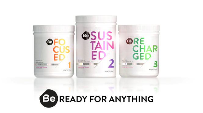
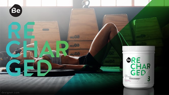
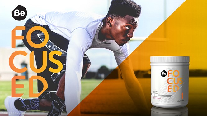
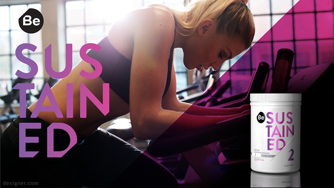
PB Creative has developed a unisex, future-facing visual identity in Be, with three sub-categories - Be Focused, Be Sustained and Be Recharged. Using ‘Be’ as the driving call-to-action for the nutritional product, PB Creative oriented its three sub-brands around this main design idea; each is a different colour, yet all link back to the parent Lifeplus brand.
And, in terms of wider company satisfaction, the refreshing and unique identity of Be is exactly what the team at Lifeplus needed. Tracy McBride, international marketing director at Lifeplus, says, ““We love what PB has created and we have high expectations for ‘Be’ amongst this new breed of consumers who want support from a high-quality supplement brand that doesn’t confuse or intimidate them.”
With sport, nutrition and wellbeing increasingly high on the agenda of everyone from young professionals to the retired 65+, creating welcoming brands to enable participants to get the best from their routine is important. Through understanding the dynamic market and focusing on sports design’s most important aspects, PB Creative has pioneered a trend undoubtedly set to continue.


