Back to basics
Brands may be able to better reach their audiences by stripping back their identities, or unbranding. Amy Sandys examines those companies for whom unbranding is a successful strategy
During the 1960s, a movement celebrating the merits of the creation of art that acknowledged its own reality gained prominence across the US, in particular New York. Minimalism – as it became known – was said to represent the truth, negating any need for the viewer to discover hidden or deeper meaning, unlike the characteristics of art from previous centuries. Challenging the very structure of what had so far been accepted as art, Minimalism rejected the notion of what art was perceived to be; it spoke volumes through its silence. As American printmaker and painter, Frank Stella, asserts, “What you see is what you see.” Its popularity led to the flourishing constructivist art movement of the later 1960s and 1970s.
And, while artistic movements continue to change and develop over time, stripping art back to its basics is a concept which feeds into many aspects of material culture. While first examination of the concept of branding contradicts the essence of a minimalist approach, ‘returning to basics’ is a technique increasingly used by organisations large and small. Being stripped back to only their bare essentials allows brands to cut through the noise created in a crowded corporate landscape. For some companies, saying only a little is just as valuable as saying a lot.
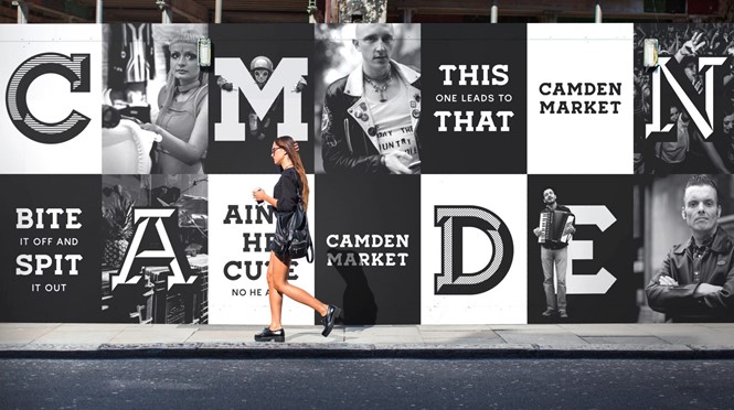
North London’s Camden Market is an example of a place with a rebrand strategy that focuses on ensuring its identity emerges, unscathed, from the clamour of competing voices. For Ragged Edge, the London-based design agency tasked with developing the strategy behind the market’s rebrand, an ‘unbranding’ approach allowed the market’s well-established identity to shine. Max Ottignon, co-founder, creative and strategy director at Ragged Edge, explains how the agency ensured Camden’s unique place identity was at the front and centre of its branding approach. “In terms of the idea of an unbrand, it was quite a scary project because Camden means so much to so many people, says Ottingnon. “We met so many people who’d grown up around Camden and had a really strong view on it. For some reason, in that place, there’s a real ‘Camden-ness’ about Camden that no one can quite put their finger on, but everyone knew what it meant.”
Maintaining the unique vibe of Camden was paramount, which Ottignon says informed an integral part of the Ragged Edge brand strategy. Ragged Edge worked to create a brand that would not compete with the strong identity already owned by Camden Market. “We just wanted that Camden-ness to shine through,” Ottignon says.
The team decided that the market brand did not need a colour palette because of the intensely colourful surroundings of the place itself. It chose black and white to cut through the clutter on wayfinding and signage.
“Black and white, in this whole cacophony of colour really cuts through – but we also thought that the colour needed to come from the content,” Ottignon says. By acknowledging the importance of the influences shaping the market as it’s known today, Ragged Edge has developed an identity befitting of Camden Market’s many stakeholders.
Rob Boon, creative director at Camden Market, says, “The biggest challenge was not in the design process, but in defining the character and personality of the market. What was the punk spirit and what does it mean to us today? Internally and with Ragged Edge, we discussed how the punk spirit should not be defined by a visual cliché, nor a desire to create lo-fi pastiches, but the idea that character should be conveyed over convention, and that contrasts can co-exist here.”
Occasionally, however, the first step to unbranding is through making an addition in order to consolidate the brand. For the consumer arm of global current affairs and natural history magazine, National Geographic, its new tagline ‘Further’ became the sole addition to its brand simplification process. The organisation stripped away
all use of its sub-brand names, for example National Geographic Magazine and National Geographic Channel, to be known simply as National Geographic across all consumer touchpoints. ‘Further’ is now part of the brand recognition integral in the wider uptake of National Geographic’s uniform identity across its consumer-facing assets. Emanuele Madeddu, SVP of global brand strategy and marketing, says, the brand’s iconic yellow border has been the signifier of exploration, science and adventure for many years.

Madeddu says, “We must be simple. National Geographic is a pretty long brand name, and immediacy and simplicity are very important currencies for us. Simplicity and minimalism are characteristics we look at when creating a sophisticated, elevated and contemporary environment for our content.” National Geographic may be the latest global organisation to adopt a more minimalist approach but there is good reasoning behind its new position. Last year, the company consolidated all its digital platforms; simplifying its assets to allow for a heightened recognition of the brand across its various outputs. Madeddu says, “With the partnership between 21 Century Fox and all the for-profit businesses of National Geographic, we had a big opportunity to realign the focus under a positioning. Also, the TV channel was going through a big audacious editorial revamp. We landed on ‘Further’ as a tagline as it conveys to viewers, readers, advertisers, and creators that we embody a relentless pursuit to go deeper, to push boundaries and to be pioneers in everything we do.”
Ensuring an established brand’s identity remains as, if not more, relevant in the digital age is integral for national and regional brands alike. For Ragged Edge, the approach to Camden Market’s new unbranded identity lay in the relationship Camden Market has with the individuals whose input shifts the market’s change and development. Boon agrees, “Camden grew organically – it evolved over time and it has multiple authors. I strongly felt that the ‘consistent inconsistencies’ of Camden Market should be preserved but become united through a shared visual tool kit and tone of voice. The term ‘unbrand’ was used to describe this toolkit – it’s an attitude, not a set of rules.”
And in bringing the market’s new identity under control of its creative audience, the digital approach became yet another springboard for creativity. “The ‘unfollow convention’ approach straight away was let’s do something different, we can’t just create a brand system that has a clear set of rules and has a very clear way of bringing it
to life,” Ottignon says. “It’s got to be a bit of a catalyst for people to express themselves.”
Developing brand strategies which seemingly pursue the opposite of the bold impact required for brand exposure is a concept adopted increasingly by organisations across all manner of industries. But for some brands, a simplified approach to a visual or audio identity has developed iconic brand touchpoints. Multinational corporation and technology company, Intel, has played its five-note sound at the end of commercials for 22 years. Developed by Walter Walsover, its keynote sound is unanimous with the brand, to the extent that it is often recognised before the brand itself. Intel’s association with technology goes some way to explaining why the simplistic notion is so successful, says Colleen Fahey, US managing director for global audio branding and sound design agency, Sixième Son. Fahey says, “Intel was looking for a way to brand without continually changing its processor names, or its chip names. And its brilliance was not merely the idea of creating this wonderful sound, which sounds positive. It’s that it does sound a little bit like what Walter would have recognised as the inside of a computer song, there is a technological sound to it.”
However, says Fahey, despite the Intel tune’s enduring recognisability, over 22 years the composition has changed, “It evolved over the years so it’s not exactly the same as it was before.” But the crux of the simplistic Intel branding process came from its applicability. Such a sound would fit into any advert, heightening brand recognition even beyond Intel’s own brand architecture and marketing campaigns. Fahey adds, “It was the sound that carried them and the partnerships, because essentially what it did was put its little sound in other people’s commercials. It didn’t take a lot of time but they got tons of media, because computer manufacturers who used the chip put it in their commercials as an endorsement.”
Technology, while the crux of Intel’s products, also inspired the simple branding which allows the company to effectively portray its offerings. Matching the strategy to its industry allows even the most minimal branding techniques to achieve uptake in the long run. By catering to the industry, a brand will also cater to the relevant audience.
Unbranding, for all its strategic commercial approaches, succeeds often due to the connection created with the brand’s audience. Fahey says, “Stripping [the brand] down to basics is more appealing for the audience, because audiences are so deluged with promotional material from companies, with words, with pictures, with offers.” Just focusing on the bare essentials of what a brand can offer forges a more personal connection between business and consumers. This, says Fahey, is an invaluable asset for a brand, particularly when it contributes to a shift in the power dynamics of a B2C relationship.
Fahey adds, “Sometimes if you can see it and kind of subtly get it, it’s more like a friend talking to you. They’re that person with their cheeky personality and you’re the one who’s recognising it rather than them shouting your name five times.” For Camden Market and Ragged Edge, developing an idea around which the unbranding process could focus ensures its aim was more effectively communicated and gave the stakeholders working with the brand guidelines something to focus on.
Much like the Minimalists at work during the 1960s, current branding strategy seems geared towards ensuring the audience is not met with something lost to the noise of everyday life. While it may not be the right approach for all brands, stripping a brand back to basics allows insight into the mechanics behind the facets of brand awareness which truly make an audience tick.
As Ottignon acknowledges, there are dangers. He says, “An unbrand, as I see it, takes real skill and bravery by the client to execute it. You haven’t got a set of rules to fall back on, you’ve just got to be sure it feels right and that’s hard.” And how to know if it feels right is truly down to the brand itself.


