A brand supplement
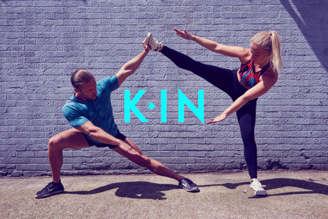
The nutritional supplement industry is thriving as healthy living becomes more than a simple lifestyle choice. Tapping into a market valued in the billions, brands are competing for shelf space and innovative ways to promote their products to consumers. KIN, founded by fitness personality couple Kyle and Kelly Maslen, has recently been rebranded by Sheridan&Co, a retail and brand design agency. The modern look is intended to capture the attention of the health conscious demographic.
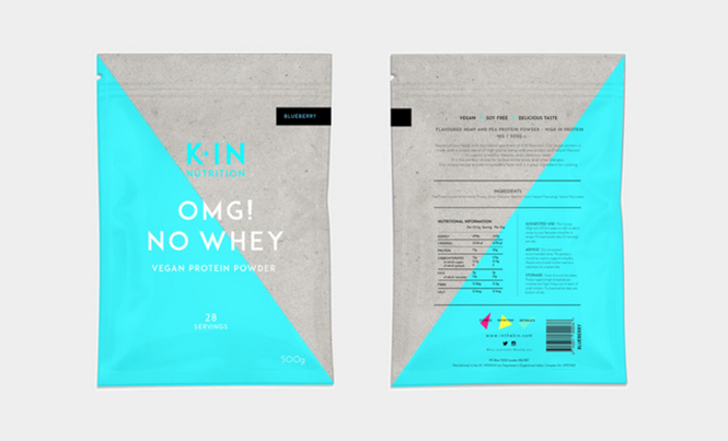
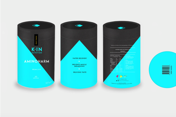
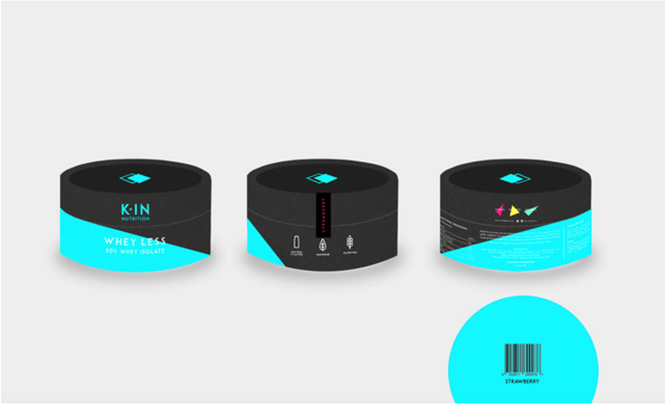
In addition to running fitness retreats in Ibiza, KIN has a line of high performance nutritional supplements, that include protein powders, fish oil capsules and powdered super greens – a division of the company the couple sought to communicate with a strong brand identity. The brand overhaul includes a renamed product line and new logo and product packaging, a visual solution that Sheridan&Co anticipates will convey the two ‘yin and yang’ personalities behind KIN, but also distinguish the brand as a premium seller in an overcrowded market.
Inspired by the familial connection between the founders and their personable approach to training with clients, Sheridan&Co came up with the brand name KIN. Aiming to translate this brand value of kinship into KIN’s visual identity, the agency decided that the brand should depart from the traditional ‘brash’ branding inherent in the industry, and instead incorporate a striking, minimalist aesthetic.
“Brand identity design for nutritional supplements typically have a harsh, perfunctory, does-what-it-says-on-the-tin aesthetic that sets it apart from other food or confectionery products,” says Michael Sheridan, CEO of Sheridan&Co. “The design we developed for KIN goes against the grain. The vibrant abstract design is cleaner and edgier – making it instantly more impactful on shelf.”
The design features a monochrome palette offset by blue Pantone and subtle spatial play, with the ‘K’ separated from the ‘IN’ by a double diamond shape – representing the dual personality of the brand. Three neon triangles are also included in the brand identity, and denote the three arms of KIN: fitness, nutrition and retreats.


