#TransformTuesday: 8 March
Every week, Transform examines recent rebrands and updated visual identities. This week's picks are below. For more from #TransformTuesday, follow @Transformsays
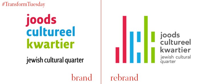
Amsterdam celebrates a unique cultural heritage, largely drawn from the large influx of Jewish migrants the city has welcomed since the sixteenth century. Although today’s Joods Cultureel Kwartier (JCK, or Jewish Cultural Quarter) is less than one square kilometre in size, its inclusion of four heritage sites ensures the area’s popularity with tourists and locals alike is ongoing. The bright colours and geometry of the logo, redesigned by Netherlands-based graphic design agency Koeweiden Postma, means its link to its Jewish legacy may not be immediately obvious. Yet the square design is based on the square tiles found inside the Great Synagogue, built in 1607, and aims to move away from more typical Jewish icons such as the Menorah. Its new typeface, name Avenir, has been set in a charcoal grey, providing a subtle contrast to the abstract colour blocks comprising the ‘JCK’ initials.
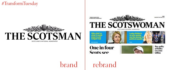
Published in Edinburgh, the Scotsman is a compact daily newspaper which has been in circulation since 1817. In support of International Women’s Day, which occurs annually on 8 March, the paper has – temporarily – rebranded, to be known as the Scotswoman. As well as specially chosen content, from its female staff, focusing on gender equality issues, it will also include editorial content from the three leaders of Scotland’s main political parties, all of whom are female: Nicola Sturgeon (SNP), Kezia Dugdale (Labour), and Ruth Davidson (Conservative). This is the second time the paper has rebranded in support of the occasion, although the last time was in 1995.
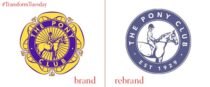
Forgoing its monochrome colour palette and Tudor Rose logo design was the first step taken by the Pony Club, in a bid to become more relevant to members in the modern age. Once considered a twee club confined to the Home Counties, the Pony Club’s latest rebrand, led by London-based brand strategy and design agency Harrison:Fraser, aims to encourage children and young adults, up to age 21 and of all backgrounds, to experience and enjoy horse riding. Its lilac-blue roundel still acknowledges the Pony Club’s rich heritage but has, along with the previously tight, blocky text, been simplified, making the overall theme much clearer and more welcoming. The horse and rider featuring in the original design remain, but have also been updated in an informal style more fitting for the 21st century.
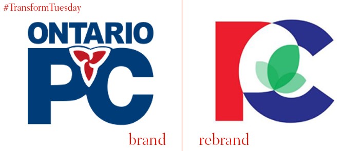
After suffering defeat at the hands of Justin Trudeau’s Liberal Party during the 2015 Canadian general election, the Conservatives are now the official opposition party in the country. Part of the wider party are the Ontario Progressive Conservatives, since 2015 led by Patrick Brown - they have unveiled a new logo in the hope of appealing to a wider spectrum of voters. According to the Toronto Star, the logo’s diverse and welcoming colour palette, which now includes green as well as its traditional red and blue, symbolises “inclusion, renewal, openness and change”. Its more organic, relaxed design also reinforces the party’s credentials as a grassroots organisation. The new visual identity has been received with a mixed response on social media, with some critics saying the mixture of colour creates confusion about the party’s target voters.
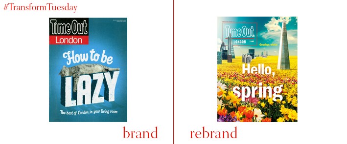
One of London’s most well-known and read freemium publications, Time Out London, has undergone a rebrand to streamline its print and digital channels, as well as to ensure its appearance, editorial content and visual identity are more closely aligned to its New York counterpart. Its iconic logo, in place since 1968, is also slightly different, although retains an identical colour palette. The red block on the bottom half of the design has been forgone in favour of an entirely black background, which can be adapted according to the paper’s background design. This is complete with its new strapline: Discover. Book. Share. The rebrand aims to celebrate the publication’s diverse and local London heritage, while adapting the brand to suit its increasingly international audience. Its redesign was led by London-based communications agency, adam&eveDDB.


