#TransformTuesday: 20 September
Every week, Transform examines recent rebrands and updated visual identities. This week's picks are below. For more from #TransformTuesday, follow @Transformsays
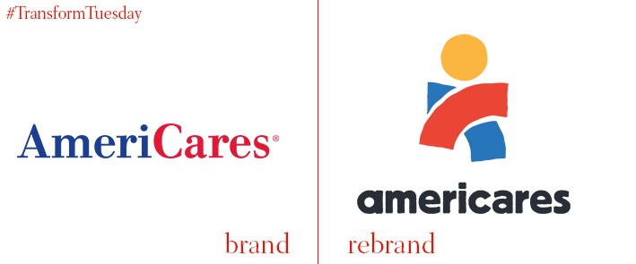
In 1979, Robert Macauley founded AmeriCares, a not-for-profit disaster relief organisation which provides emergency help and aid to afflicted regions in the U.S., and around the world. Apart from a minor update in 2012, its visual identity remained unchanged since 1979. Now, the traditional serif font is replaced by a friendlier, easier-to-read sans serif, and the organisation has a logo for the first time in its history. The rebrand also reflects the charity’s outlook, and celebrates its expansion from one office in the U.S., to a global organisation with multiple brand touchpoints across the world. Michael J. Nyenhuis, president and CEO of AmeriCares, says, “This new logo and icon will take AmeriCares into more places, to improve the health of more people, over the next 40 years.”
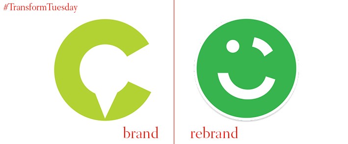
Leading car-share app in the Middle East, the Dubai-based Careem, has announced the launch of a new brand identity to coincide with the company’s four-year anniversary. The Careem brand has been updated to include a new brand logo, which has matured from a non-descript map pointer to a more distinct face, on a brighter green background. The company has seen month-on-month growth since it was first launched in 2012, and now operates across 32 cities from Morocco to Pakistan. With over four million monthly users, Careem rivals Uber for the top spot in app-based transport solution. Mudassir Sheikha, co-founder of Careem, says, “The rebrand represents more than just a brand overhaul. This new branding changes the whole identity and manifestation of Careem.”
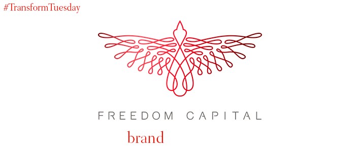
UK-based firm, Freedom Capital, is a private equity funded property investment firm, which specialises in using architectural and constructive vision to realise the potential of land for development. London-based design consultancy, Kimpton Creative, has created a visual identity for the company, using the Freedom Capital name as its main creative focus. The word ‘freedom’ is reflected through the outstretched wings of the bird-like symbol, which forms the basis of the new Freedom Capital identity. The ‘capital’ aspect is generated through the calligraphic style of the bird illustration. Its watermark design can be used on colour backgrounds, and reflects the security mark design found on bank notes.
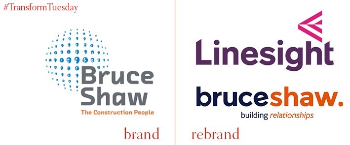
The International Financial Services Centre is a major European financial centre, located in Dublin, Ireland; most of its office blocks were built by the construction brand, Bruceshaw. Following a rebrand, its construction arm will be known as Linesight, in light of the company revenues reaching €60mn in 2016. This growth in profit is a result of the expansion of Linesight into international markets, following the economic downturn of 2007 – it now operates in over 40 markets worldwide, and its change of name allows the company to continue developing under a single unified brand.
The Bruceshaw brand itself has also undergone a strategic review, built on the Bruceshaw philosophy of ‘building relationships’ – a refrain which now forms the company’s tagline. The notion of relationships is also reflected in the updated visual identity, which has a softer aesthetic and warmer, more welcoming colour palette than its previous iteration. Luke Taylor, founder & creative director of Pixeldot Creative, the agency involved with the Bruceshaw rebrand, says, “The standout feedback from clients was the positive way they spoke about Bruceshaw’s people, their skills and the fact they deliver on their promises time and again, this is what sets them apart from their competitors.”
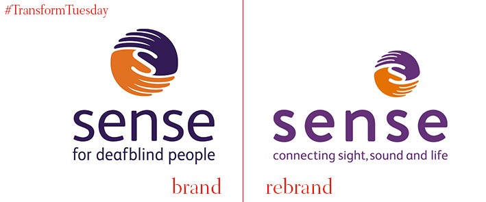
The charity for deafblind people, Sense, has redesigned its visual offering to better reflect what it has to offer those who rely on the charity for support. A rebrand sees a change to the original strapline, ‘For deafblind people,’ which the charity had held since 2010. Along with an updated logo, the renewed strapline now reads, ‘Connecting sight, sound and life’ – to better reflect the charity’s accessibility to users with a wide range of complex needs. In a press release, deputy chief executive of Sense, Richard Kramer, says, “We were set up to support children and adults who are deafblind, but we also provide support for a wider group of people, including those with complex needs. Our refreshed brand reflects that our services, such as short breaks and supported living, are equipped for people with a range of needs.” The rebrand comes as Sense launches its new housing support programme, which offers housing assistance to individuals with complex needs.
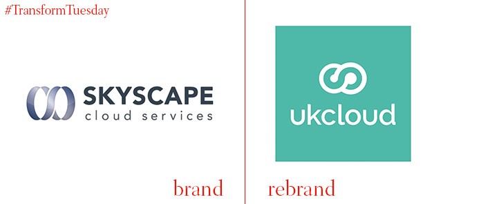
UK-based creative agency, Mr B & Friends, has rebranded the public sector cloud-provider UKCloud, from its former identity, SkyScape. The new identity is intended to be a simple reflection of what UKCloud offers, with bold colours and a cloud instead of server logo shape clarifying the offering to the end user. Its updated name is also a move away from the Sky name, which has become synonymous with the technology sector – as a public service provider, UKCloud needed a distinct identity with a clear brand purpose. This new identity has been rolled out across all UKCloud’s brand propositions, its website and marketing tools. CEO of UKCloud, Simon Hansford says, “Our new name – UKCloud – reflects our unwavering commitment to serving the UK public sector and supporting the digital transformation of citizen-facing services.”
The International Financial Services Centre is a major European financial centre, located in Dublin, Ireland; most of its office blocks were built by the construction brand, Bruceshaw. Following a rebrand, its construction arm will be known as Linesight, in light of the company revenues reaching €60mn in 2016. This growth in profit is a result of the expansion of Linesight into international markets, following the economic downturn of 2007 – it now operates in over 40 markets worldwide, and its change of name allows the company to continue developing under a single unified brand.
The Bruceshaw brand itself has also undergone a strategic review, built on the Bruceshaw philosophy of ‘building relationships’ – a refrain which now forms the company’s tagline. The notion of relationships is also reflected in the updated visual identity, which has a softer aesthetic and warmer, more welcoming colour palette than its previous iteration. Luke Taylor, founder & creative director of Pixeldot Creative, the agency involved with the Bruceshaw rebrand, says, “The standout feedback from clients was the positive way they spoke about Bruceshaw’s people, their skills and the fact they deliver on their promises time and again, this is what sets them apart from their competitors.”


