#TransformTuesday: 16 February
Every week, Transform examines recent rebrands and updated visual identities. This week's picks are below. For more from #TransformTuesday, follow @Transformsays
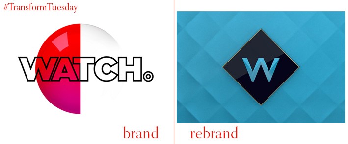
London-based design studio Art&Graft has led the rebrand for UKTV’s Watch channel, which will now be known as, simply, W. With a specific focus to attract female viewers, the rebrand is encapsulated through its new diamond shape which aims to promote a sense of luxury. This also reflects the brand proposition of escapism, by emulating a portal through which viewers can immerse themselves in ‘cutting-edge television’. A new bold and clean visual identity marks a departure from the previously colourful, flamboyant offering; its teal, gold, black and white colour palette compose W’s new, sophisticated visual thematic.
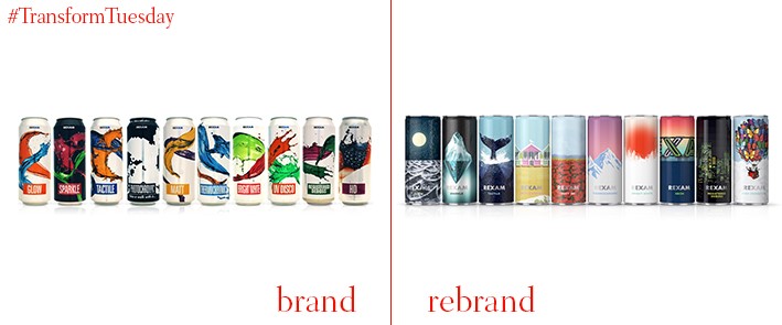
A brand more well-known through its affiliates than for its parent identity, Rexam design the can exteriors for an array of drinks, including Coca-Cola and Heineken. Its brand refresh, led by creative brand agency Dragon Rouge, focuses on emphasising the already strong visuals associated with Rexam and the companies it makes cans for. Using the brand theme ‘new horizons’, natural scenes are interwoven with bright colour and animation to emphasise Rexam’s global reach. A mixture of print and ink technologies also create an engaging visual experience in which the customer can immerse themselves.
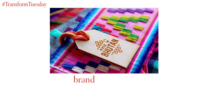
Brand consultancy FutureBrand has created a concept for the country of Bhutan which aims to cement it as a creator and distributor of authentic, Bhutan-made produce. Using the brand expression ‘Made In Bhutan’, the country’s relative lack of resources is overcome by marketing commodities - from chilli sauce to renewable energy. By persuading consumers to invest in a country that for so long has contented with the expansive markets of China and India, Bhutan hopes to increase its major exports - while spreading the Buddhist values of happiness and acceptance which have for so long shaped Bhutanese culture.
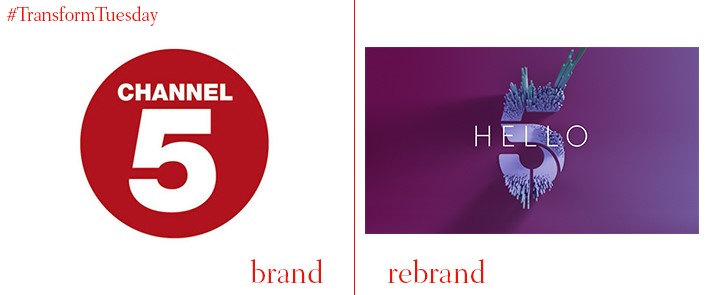
Terrestrial television’s newest channel, Channel 5, has already undergone four rebrands since its inauguration in 1997. Yet this latest offering is not only a change to its visual identity – it also aims to attract a younger audience, and depart from its association as a ‘tabloid’ channel. New York-based agency Gretel, which worked on the rebrand, has included a refreshed colour palette and a logo broken into segments. Similar to the recent Channel 4 rebrand, this animation design aims to capture the mood of the channel and its shift from ‘reject’ shows to a diverse array of entertainment. A series of short films created alongside the rebrand also aim to capture elements of surprise and an underlying theme of entertainment – traits Channel 5 hopes to reflect in its programming.
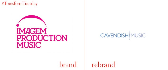
Music production company Imagem Production Music is embracing its heritage and reclaiming the name so synonymous with high-quality music production. Cavendish Music, as the company is now known, has recently been acquired by Canadian rights firm, ole. Eschewing its previous pink logo in favour of a neutral, calming blue, Cavendish has retained the capital lettered typeface – although the new offering is a clearer serif, with wider spacing. Its new logo sits over a single line, perhaps allowing for better application of the brand name on its products.
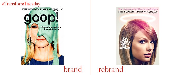
One of Britain’s most iconic Sunday magazine supplements has taken on five new sections and been given a fresh new look, in its biggest visual identity overhaul for several years. Building on its reputation for featuring high-quality articles on food, consumer goods and relationships, among others, The Sunday Times Weekend has hired several new journalists to complements its brand refresh. Colour and vitality are integral components to this identity restoration, with high-quality inserts and use of the digital Motion@Waterloo screen in Waterloo station directly targeting a leisure and commuter audience.


