#TransformTuesday: 15 November

Every week, Transform examines recent rebrands and updated visual identities. This week's picks are below. For more from #TransformTuesday, follow @Transformsays
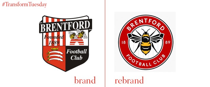
Brentford FC, a Championship football club based in Greater London, has updated its team crest for the first time since 1993. While drawing inspiration from an earlier 1970s roundel and the 1960s Brentford club badge, the new symbol – designed by London-based agency, Article – is much less busy than some previous iterations. In a nod to the club’s heritage, the new design includes the year in which the club was founded, as well as a depiction of the bee to reflect the club’s nickname, the Bees. The bee was drawn by illustrator Peter Horridge and adds to an overall more recognisable and flexible design, which can be used both on and off the pitch.
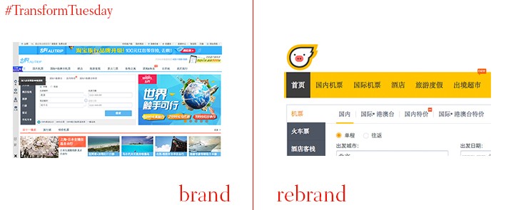
Chinese e-commerce giant, Alibaba, has recently expanded its remit into travel territory. First naming its travel arm Alitrip, the company has in the past week changed its consumer identity to Fliggy. Now Alitrip will be used solely for corporate purposes. Fliggy is a portmanteau of ‘flying piggy’ and translates to ‘Feizhu’ in Chinese. The cartoon style of the website and its animated pig character aims to attract the affluent Chinese millennial market. Fliggy is particularly focused on outward travel; Alibaba has just celebrated two years since its travel arm launch with packages to the UK, Finland, Italy, Switzerland, Czech Republic and the Netherlands. Alitrip president, Shaohua Li, says, “We are seeing a younger generation of Chinese travellers who have greater access to international travel and a greater desire to explore the world. We know that European destinations such Northern Finland and the Northern Lights are things that these Chinese consumers want to experience.”
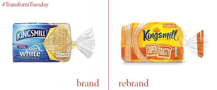
Creative brand design agency, Brand Opus, has redesigned the packaging for all Kingsmill products. Moving away from a focus on its traditional blue, the company has opted for a golden yellow colour across all its products to accentuate the ‘warm’ feeling god-quality breakfast goods can create. The packaging now has a more artisanal feel, with the new work by Brand Opus feeling less corporate than the previous offering it designed 18 months ago. In a bid to reclaim toast as the British breakfast item of choice, one of Kingsmill’s launches also includes ‘Super Toasty.' This, Kingsmill claims, is the ‘best ever toast experience.’
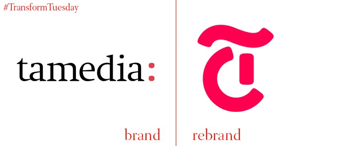
Tamedia is the largest media group in Switzerland. It is heralding the redesign of the corporate Tamedia emblem with a soft launch roll out over the next few months, culminating with a final launch in January 2017. Designed by Zürich-based agency, Made Identity, the simplified logo is based on the same typeface used across Tamedia’s printed publications. The sole T logo, which replaces the overall ‘Tamedia’ name, is designed for digital optimisation. According to the dedicated Tamedia rebrand website, it also “Combines our media, our services and all our employees and stands for our shared values, qualities and goals.”
Safety and security are the top considerations in Romanian poultry company, Transavia’s, new visual identity, with the three business pillars – ‘trust’, ‘care’ and ‘responsibility’ – being the focus. A shield symbol, which makes up the main logo, reflects the family-run orientations of the business. This is as well as the notion of Transavia protecting its customers through stringent safety measures, also shown in its ‘Well made in Romania’ tagline. The update was carried out by Bucharest-based Brandient, an agency that has worked with the Transavia design portfolio for ten years. Brandient also designed a graphic depiction of Transavia’s production and supply chain, with simple illustrations to reflect the simplicity of the product’s journey.
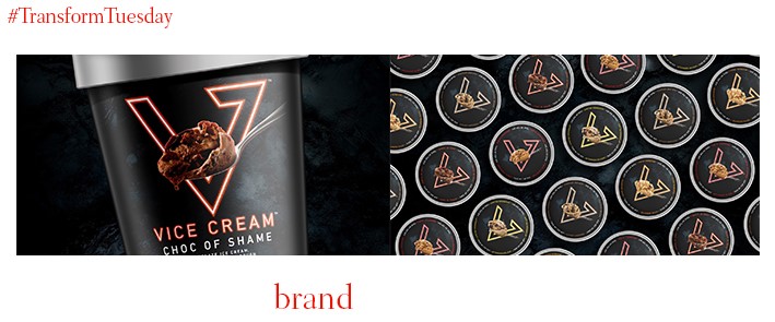
In a world increasingly full of ‘nice cream,’ artisanal offerings and healthy alternatives to traditionally unhealthy foods, Boston-based ice-cream company, Vice Cream, has broken the mould. The company develops purely indulgent ice-cream with no holds barred; Colorado-based design firm, Interact, has designed its packaging. Truly adhering to the notion of a ‘vice’, the ice-cream tubs use bold real-life images of the ice-cream to tempt consumers. Interact says, “Interact partnered with Vice Cream to craft its positioning, branding and design to wake up the stodgy, lifeless, artisanal focused ice-cream category by giving people what they want; bold flavours, bravado and a spoon full of irreverence. Vice Cream’s cheeky flavour names draw inspiration from some of life’s greatest vices: Afternoon Delight, Breakfast in Bed, Bourbon Mash, Choc of Shame and Higher Grounds.”


