Time for change
Time Out is a brand as synonymous with London life as tube trains, red telephone boxes, and the plethora of jellied eel shops once littering the city's East End.
Produced weekly since 1968, the magazine has continuously provided Londoners with an up-to-date cultural diary of the city’s latest events, bars, eateries, shopping, nightlife, and more. Since 2012, it has also been offered free at most of London's transport hubs.
Yet despite its longevity, Time Out is not a static brand. Like many of its journalistic counterparts, it has undergone many image and content changes in its almost 50-year history. This has ensured the brand continues to remain relevant in an ever-changing and ever-more connected city.
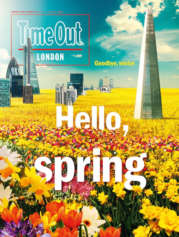
Its latest incarnation sees a simplified magazine design and, says Time Out London editor Caroline McGinn, “A more headfirst approach” to its content style. A cleaner, bolder colour scheme has been adopted, and a visual identity to align its print, digital and app editions has been developed by communications agency Adam&Eve/DBB, which led the rebrand.
The logo, in place for 50 years, was also changed, although care was taken to ensure it remains faithful to its origins. Indeed, heritage has been a major factor in the implementation of Time Out’s new identity.
McGinn says, “For us the challenge is always to keep [the brand] fresh and keep it evolving without removing the DNA – so that was at the heart of it for us really, we wanted to refresh some of the things that we were doing, especially the look and feel of them, but also we wanted to make sure we really preserve the DNA of what Time Out is throughout everything that we’re doing.”
Ensuring Time Out remains a local brand ingrained in local culture, despite its increasingly global reach, has also been a consideration during its redesign. This was particularly pertinent, considering a main aim of the rebrand was to align Time Out London more closely with its Time Out New York counterpart.
Brand creative director at Time Out London, Anthony Huggins, says, “[The rebrand] was part of a bigger project really, a local brand on a global stage. We took this opportunity to have a look at all our products and how they all fit, so we wanted to take this as a big opportunity to consider where our brand is currently used and the consumer touchpoints.”
Huggins continues, “I’m quite conscious that this brand will keep on evolving and adapting, and I think now with this new kind of brand identity and with a new magazine, there’s a flexibility that perhaps was lacking a little bit before.”
London’s jellied eel shops may well have been all but replaced, in favour of wood-panelled coffee joints and pop-up burger restaurants. Yet it seems unlikely that what Time Out can offer has any real competition – the innovative approach to its identity has kept the brand as fresh as London itself.


