Associating with architecture
The Bahrain Association of Banks (BAB), has revealed a rebrand, created by London-based brand consultancy Industry.
Established by the Bahraini government via ministerial decree in 1979, the BAB works closely with the Central Bank of Bahrain. It registered under it in 2010, and assists it with formulating banking regulation and policy.
The move is part of BAB’s plan to appeal to a wider range of consumers, clients and stakeholders from across Bahrain by creating a more modern, approachable and distinguishable image for the corporation. Brand consultancy Industry has undoubtedly helped BAB achieve this with its new design.
Originating from Bahrain, BAB has a unique opportunity to market itself in a different way.
The use of Arabic and English communicates a friendly, international image without compromising perceptions of professionalism, and will undoubtedly bode well in terms of the numbers of customers, clients, and investors linked with the association.
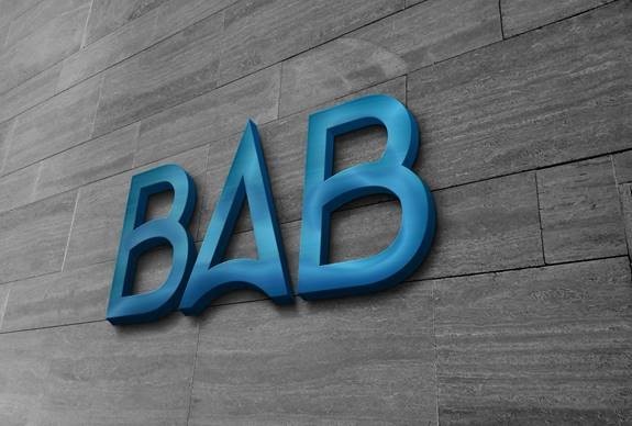
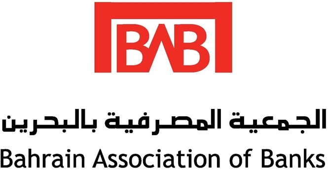
BAB also intends to convey an entrepreneurial and innovative image by opting for navy blue, in contrast to the previously more confrontational red. Its font has been refined from block capitalisation, to a sleeker, curved lettering style.
The ‘A’ of Association mimics Bahrain’s vibrant style of architecture, giving the logo a contemporary feel.
In a press release, CEO of BAB, Dr. Waheed Al-Qassim, comments, “It was a pleasure to work closely with the Industry team. The new BAB brand identity will amplify its role to promote awareness of Bahrain as a major banking centre and hub of financial services, with an investment-friendly jurisdiction, a cost-effective and innovative business environment and a strong and stable regulatory system.”
He continues, “The design and colours of the new logo will entrench BAB’s mission and objectives in the minds of the members and the public.”


