100 years of Johnston font
The London Underground has been the system responsible for transporting Londoners from A to B for around 150 years.
From the world’s first underground railway, constructed between Paddington and Farringdon Street in 1863, to an intricate network of over 11 lines serving over a billion people per year in 2016, the London Underground – or tube, as it is colloquially known – is as synonymous with Britain’s capital as Big Ben or Trafalgar Square.
Yet the distinct signage which we are today so familiar with has not always been in place. 100 years ago, Edward Johnston coined the iconic font which has come to epitomise the London Underground system.
In an event to celebrate the centenary of this iconic brand font, the London Transport Museum depot in Acton opened its doors to the public during the 23-24 April open weekend.
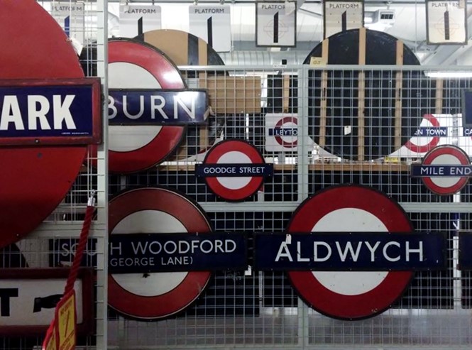
Commissioned by Frank Pick, commercial manager for historic group ‘the Underground Electric Railways Company of London’ to create a distinct corporate identity, in 1913 the first iteration would eventually be rolled out across London’s 270 functioning, and 40 non-functioning, stations.
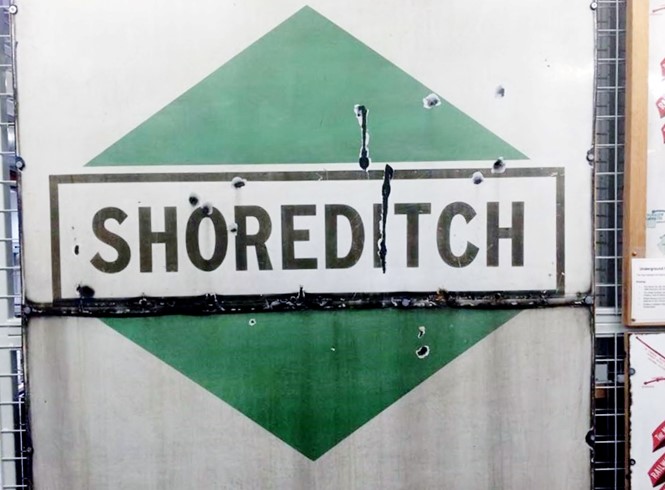
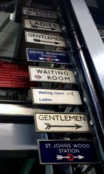
Prior to this, it had been the remit of local authorities to provide signage for local stations. This led to a mixture of styles and interesting font variations across London - many of these, such as the Shoreditch station sign, can be seen at the Acton depot.
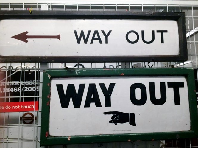
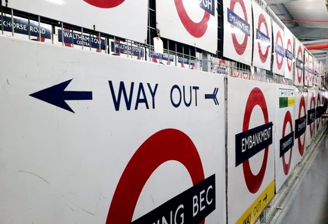
Distributed across place signs, transport maps and station direction signage, the sans serif style of the Johnston font ensures its legibility and clarity across all facets of the tube system. The lack of flicks on the end of letters, such as beaks or tails on letters such as S and Y, means it is one of the easiest fonts to read from a distance.
Although originally designed only to be used for signage in underground stations and for the exterior structures, the Johnston font was quickly appropriated for station names across the map.
The typeface was originally applied with wooden blocks, until 1970 when it was rendered in cold type to preserve the London Underground brand identity. New Johnston, a rendering of the original font, has been in use since 1983 to expand the old Johnston font from its two weights of ‘regular’ and ‘bold’.
New Johnston has eight weights and a lowercase application – it is the exclusive font for Transport for London.
Yet, despite a few changes to ensure its applicability in the modern era, its longevity and heritage means the Johnston font is one of the oldest examples of corporate branding in the world.
Along with the London Underground roundel, nothing is quite as synonymous with travelling across London as the Johnston font.


