#TransformTuesday: 20 October
Every week, Transform examines recent rebrands and updated visual identities. This week's picks are below. For more from #TransformTuesday, follow @Transformsays
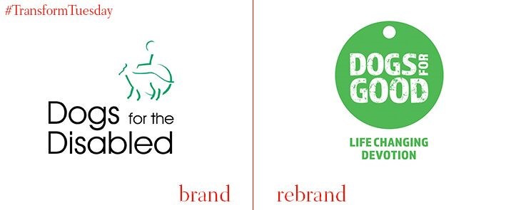
UK charity, Dogs for Good (formerly Dogs for the Disabled), has a new visual style, website, messaging and vision, as well as name. Fishburn created a new brand that focuses on people rather than ‘the disabled’ and positive outcomes, rather than the disability itself.
Dogs for Good hopes that the new identity better reflects the breadth of services it offers and the people it serves. James Beveridge, executive creative director at Fishburn says, “With this project, we were really looking to create a new brand identity that focused on the positivity of the charity’s cause. We think that actually, this is something unique in the not-for-profit sector, focusing on the good it can achieve as opposed to disabilities and conditions themselves.”
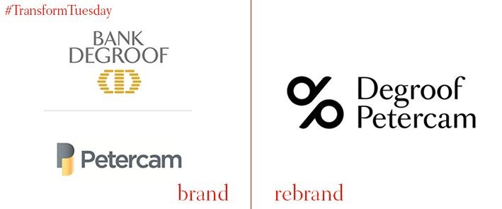
Degroof Petercam is the result of a merger between Bank Degroof, an investment private bank founded in 1871 in Brussels, and Petercam, a financial group founded in 1968. The new identity for the company was designed by the Brussels office of Base.
The new identity, including wordmark and logo, represents the coming together of two companies with very different philosophies. Degroof Petercam promises the best of both, traditional and modern.
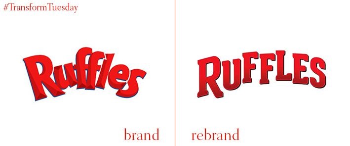
Lay’s potato chip brand, Ruffles, has a new logo and packaging. The packaging has grown-up, marginally – the letters in the wordmark stand out more starkly and the overall design is slightly less cluttered. The Ruffles name and slogan, “RRRuffles Have Ridges!” remain the same.
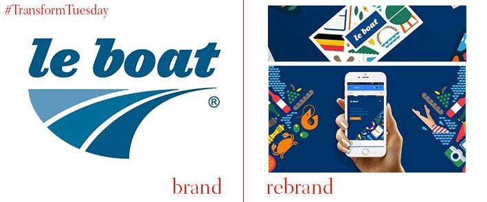
LeBoat, the largest riverboat company in Europe, and part of the TUI Group, has rebranded for the first time in a decade. The new brand, by SomeOne, forgoes typical beach imagery and, instead, includes icons and symbols of a more diverse range of holiday activities.
The diversity of experience that a riverboat holiday offers was felt to be lacking from LeBoat’s previous branding and communications. The new brand illustrates that diversity, but in a cohesive and consistent way.
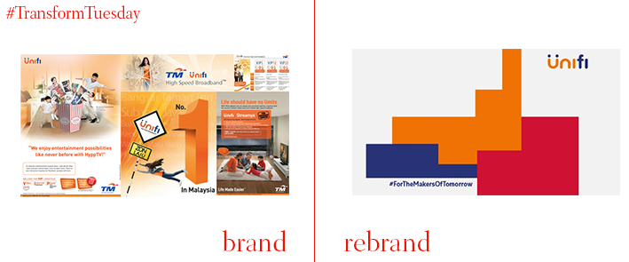
Telekom Malaysia has refreshed the visual identity of its broadband service, UniFi. The new identity, created by Brand Union, puts a young Malaysian audience at the heart of its brand. With a new, multicolour block system, Telekom Malaysia hopes that Unifi will stand-out from its competitors, who tend to own just one colour.

