In shining armour
Security services firm GardaWorld found it had outgrown its brand as it grew globally. Brittany Golobdiscusses the ensuing brand repositioning
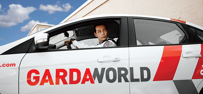
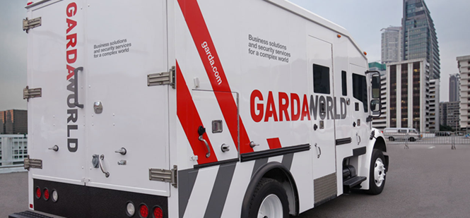
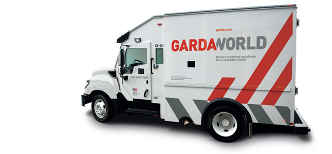
With a global fleet of over 5,000 armoured cars and trucks, security services firm Garda had a veritable force of moving billboards. Brand recognition two years ago, however, was not at its peak due to an unimaginative logo, a confusing brand architecture and a name commonly used in reference to the Irish police.
Garda realised it needed to change. The company was expanding, as it had done in the past, through acquisition. Its driving vision – an entrepreneurial spirit – stemmed from founder and CEO, Stephan Cretier, who established Garda in 1995. Acquisitions, however, meant that the brand’s values were both diffuse and disjointed.
In approaching the new brand, both Garda and Bladonmore, the London-based agency it contracted to carry out the rebrand, alit upon two themes: simple and sophisticated.
These concepts carry through the rebrand and are responsible for many of the changes made to the organisational structure as well as to the visual identity. The first change to be made was to the brand name. Garda, while well-known in its North American home, had become confusing and ineffective in international markets. To emphasise the company’s global outlook and positioning, it became GardaWorld. This simple change was embraced by senior leadership and Cretier and enabled Bladonmore to move forward with the brand repositioning.
“Without the CEO’s buy-in, a man who is the founder and is deeply involved in the evolution of the company, it would not have been possible,” GardaWorld’s Nathalie de Champlain, VP of marketing & communications and chief of staff, office of the CEO, says. “When you work hand-in-hand with a CEO who is the founder of a company and who has this vision of growth and you have to make sure the brand reflects that growth, it was an important step for us to always have his input.”
In order to maintain the entrepreneurial spirit that the organisation was founded upon, GardaWorld and Bladonmore wanted to ensure that the company’s sense of self was strongly embraced by its internal audience. This, for a company comprised of acquired brands, was easier said than done. The biggest challenge was developing a functional, flexible and simple brand architecture to incorporate its sub-brands efficiently.
Nigel Beechey, creative director at Bladonmore, says GardaWorld had expanded to the point at which it was of the top three names in the global risk and security services industry. Its aged brand architecture and indistinctive brand name were no longer suitable. “They needed a brand, a positioning and a visual identity that reflected who they had become,” he says. De Champlain adds that the need for a consistent and coherent brand story motivated many of the changes carried out during the brand transformation process.
Research was undertaken into GardaWorld’s structure and character. Interviews with the leaders of each business arm alongside internal workshops gave Bladonmore a strong understanding of the GardaWorld story. The brand architecture models and visual identities of other companies in the security services sector were also evaluated. “Trying to get to the heart of an organisation, like any form of psychoanalysis, can be a painful process because you’re looking at the things you do not do as well as those you do well. It really exposes a business,” Beechey says.
Beechey and de Champlain settled on a monolithic brand architecture in order to ensure the central GardaWorld identity would remain consistent and clear to internal audiences, stakeholders and clients alike. This move allowed business services – like HR and cash services – to be visually distinct from protective services. It also provides the flexibility necessary to ensure that future acquisitions can be effectively integrated into the GardaWorld brand. “When we showed [the leadership] that the brand would be flexible for future expansions, not only ready for now, but for the future, it reassured them that all of the plans that we have for the future of the company be allowed for in the brand architecture,” de Champlain says.
With over 40 past acquisitions, GardaWorld’s architecture was confusing, but it’s internal culture was also disjointed. De Champlain says the ways in which employees identified themselves were inconsistent and had to be addressed by the rebrand. “It was important for us to ensure that there would be one GardaWorld and one brand that would be embraced by everyone,” she says. Beechey adds that the new brand had to give employees, and the company itself, a way to talk about themselves as part of a major global business.
“Trying to get to the heart of an organisation, like any form of psychoanalysis, can be a painful process. It really exposes a business”
For de Champlain, the rebrand’s success is measured in terms of the internal culture.Its implementation internally was the most comprehensive aspect of the rebrand. For an organisation with 45,000 plus employees – most of them frontline staff – a culture change was no small undertaking. The process involved introducing the new brand to the management of each business arm individually, then turning to line managers to engage with their staffs. The internal process has been going for more than a year and has been, to this point, one of the most successful aspects of the rebrand.
“People are talking in the same ways,” de Champlain says. “They talk about flexibility, agility and a sense of ownership of the entrepreneurial spirit. It’s all in sync and they all understand those words and that spirit.” The internal programme included a flexible brand guidelines document, a brand book distributed to each employee and personal interactions between the employees, de Champlain herself, the CEO and management. Because of the success of this process, employees now embrace the new brand.
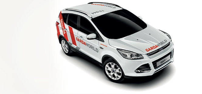
The thousands of employees working for the company are brand advocates, de Champlain points out. Engaging them in the rebrand is one of the most effective means of building brand awareness. However, the company also owns a massive fleet of cars and armoured trucks – numbering at least 5,000 – that are deployed worldwide. This armada of moving billboards were a key part of the brand implementation.
The roll out of branded trucks is still occurring, but when a driver receives a newly-painted vehicle, de Champlain says there is a marked difference in behaviour and attitude toward the brand. “When they drive one of the trucks that has been rebranded, they take care of that truck like its their own car,” she says. Beechey says about 75-80% of the brand assets have been rebranded, with the remainder to be implemented by the end of the year.
The brand itself has been subtly redefined to suit the new business objectives and better represent GardaWorld’s position in the global marketplace. Beechey and Bladonmore immediately noticed that the Garda wordmark was not only bland but it was essentially unprotected. If one had access to the Impact typeface and a word processor, one could replicate the wordmark with ease, Beechey says. This was untenable for brand protection nor did it allow Garda to differentiate itself from the rest of the sector, or for that matter, from the other Garda – the Irish police – particularly through SEO.
After ‘World’ was added to the brand name, the visual identity underwent an evolution. The decision was made to retain the bold red – a symbol of strength and brand heritage – of the Garda wordmark, but refine it so that it was an easier colour to use in application. Beechey says the existing red was easily misprinted to take on a brown or burgundy tint, impeding consistency of brand application. Bladonmore also dropped the old-fashioned black in favour of a bright colour palette and the more sophisticated, humanising grey added to the wordmark. The grey, Beechey says, retains the masculinity of the previous wordmark but allows for the logo to be used flexibly across different sectors. “In branding, what you’re aiming for is a repeatable, consistent look and feel worldwide and across all channels,” Beechey says. Grey also allows GardaWorld to differentiate itself from its competitors as its use is unique in the security services sector.
Bladonmore also introduced one of the more distinctive elements of the rebrand into the new wordmark – a slight overlap between the ‘A’ at the end of ‘Garda’ and the ‘W’ at the start of ‘World.’ “One of the visual elements, the marriage between ‘Garda’ and ‘World’ – with the ‘A’ and the ‘W’ being connected – is very creative, but subtle at the same time. It doesn’t look like we tried something different, so it’s sophisticated in that sense,” de Champlain adds.
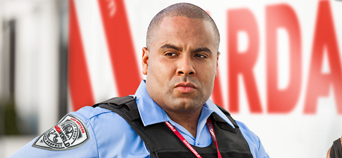
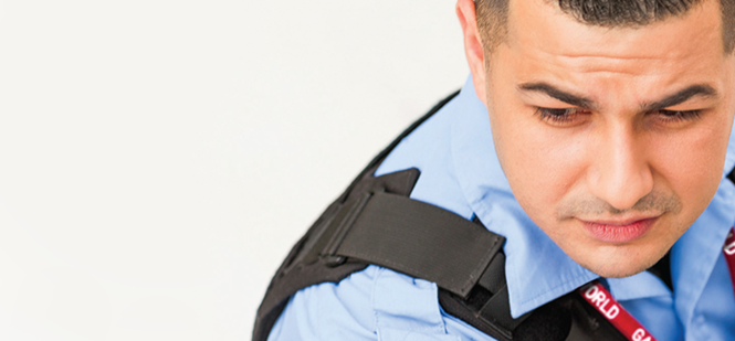
Visually, the brand is also represented through photography. Bladonmore wanted to photograph real moments, lending to the GardaWorld visual identity the sense of authenticity that is apparent in its character. It commissioned photographers in Canada, the U.S. and the Middle East to create images that represented the company’s brand values. “It had to be real,” Beechey says. The photographs feature GardaWorld’s “actual people, their hard assets and their locations.” De Champlain adds, “We looked at the heroes. We’re in a world where people are really proud of what they do everyday. When you carry weapons and you protect assets, there’s a sense of pride and we wanted to show that in the pictures.”
The resulting photographs depict both the brand assets and GardaWorld’s employees in authentic, vivid situations.
The brand implementation is ongoing, though, as it means rolling out the rebrand to 5,000 plus trucks, a global workforce and GardaWorld’s vast digital assets. In the midst of the rebrand project, GardaWorld also acquired a business that had its own fleet of trucks. Integrating those new armoured vehicles into the implementation plan has been a considered and steady process to ensure the employees effectively embrace GardaWorld’s internal culture and marks the first test of the new brand.
Digitally, the company is better able to represent its diverse business arms online, provide clearer information for clients and offer prospective employees the most accurate view of the organisation. Tone of voice was also addressed and redefined. De Champlain says it has been both sophisticated and simplified. The company now talks of itself as the ‘Leading provider of business solutions and security services in the world.’ For de Champlain, knowing that employees have embraced this tone of voice and are identifying themselves using the company’s values, is a mark of the success of the internal culture change.
She says, “We were looking at where we were going and recognising that a rebrand would be essential for us to communicate to our employees and to our clients that story about our brand. Success in the future will be measurable by our ability to integrate new businesses. [The brand implementation] has created quite an extraordinary momentum in the company. People are so proud of the brand.”
The company began in almost 19 years ago, but 2012 marked a turning point for GardaWorld. A rebrand signalled to the global market that it had grown into its stature as a major player in security services. By making the brand architecture, tone of voice, visual identity and internal culture consistent on a global scale, and across numerous internal business arms, GardaWorld is beginning to truly live up to its name.
Peer review
Mark Ringer, ECD, Anthem
The repositioning of the global security services brand has been a simple one, which is why it works. GardaWorld needed to be grounded in necessity, sensibility and safety in order to stay true to its services.
By changing the brand name from Garda to GardaWorld, a simple step has been made to transform the identity of the company immediately to one that not only identifies its global ambitions but to the customer it provides comfort and credibility that they will be looked after.
By championing flexibility in colour palettes for individual business lines the brand is able to stay identifiable at a local level, whilst still having a strong global presence and allowing brand consistency to be upheld. The repositioning succinctly describes the company and clients’ need for their services, clearly conveyed to elevate and amplify the company mission statement in a market where professionalism and trust are key attributes.
Gary Black, creative director at Uffindell
GardaWorld’s new identity reflects universality and strength which support the ambitions of the business. The use of red brings the heritage through from its original identity and red clearly has powerful associations for security.
With regards to the positioning, it is hard to comment on whether this reflects GardaWorld’s ambition and creates differentiation, but it certainly speaks to its over arching strategy: to refocus on the communities it serves and deliver world-class security services. There is clear congruence with the strapline, the logo and the name.


