Healthy competition: The rebranding of PetLab Co.
Many new brands tend to favour functionality as a means of expressing their identity. But in the pet industry things might have taken a wholesome turn. Jack Cousins explores how emotion was used in the rebranding of PetLab Co..
It is often believed brands will struggle should they fail to convey their functional offering. Accordingly, a study by the Association of National Advertisers in 2010 demonstrated that around two-thirds of brands prioritised expressing the ‘rational’ benefit over that of emotion. While a Harvard Business Review study in 2015 has since proven the payoff of connecting with audiences on an emotional level, there still remains scepticism in practice, especially at a time when money and trust are scarce.
But this fear is not always prevalent within every brand design project. “Functionality is the easiest thing to copy or imitate – it’s an arms race. What you cannot duplicate is distinctive emotional storytelling,” says Jon Gibbs, managing partner at design consultancy Derek&Eric. His company recently partnered with Kuba & Friends, a fellow London-based agency, to reimagine the identity of PetLab Co., an American dog supplement supplier.
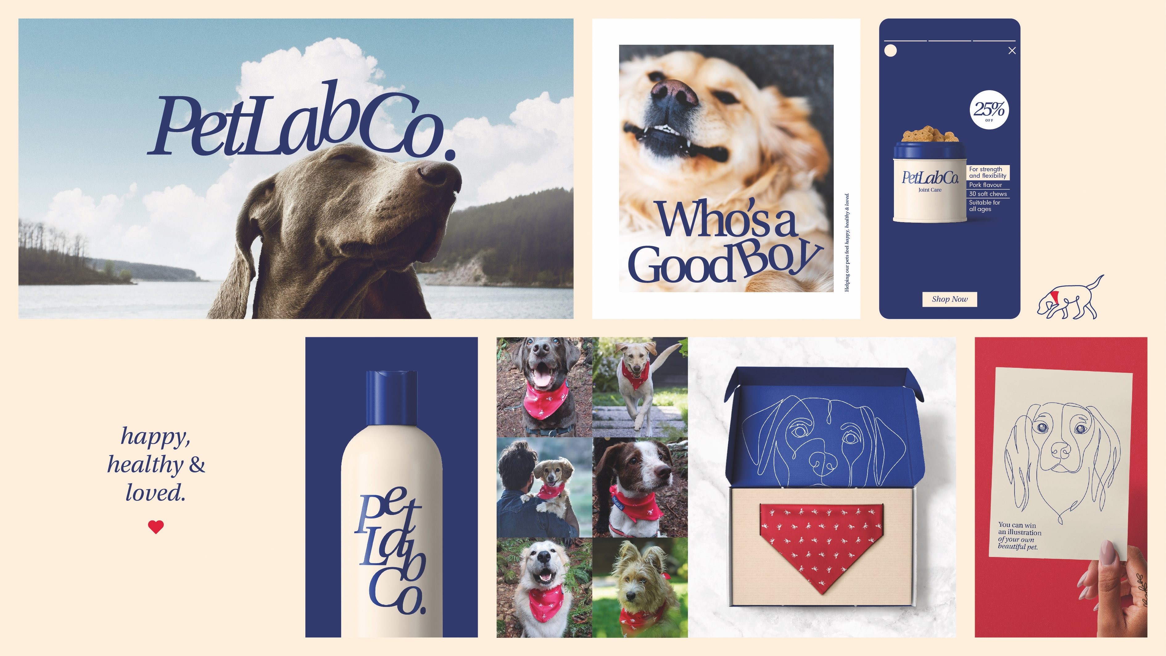
At one time, the brand very much fell into the ‘functional’ category. Its packaging donned somewhat lifeless illustrations of a nondescript dog, vaguely staring into the distance. And while its primary brand colours of navy blue and white had potential, they were paired with rather dull pastel colours. PetLab had become a big success in a short period of time, but its brand was holding the company back, and the owners were perfectly aware of that.
The company was co-founded under sad circumstances in early 2019 by Chris Masanto and Damian Grabarczyk as a direct-to-consumer, digitally native player, and has remained that way ever since. Masanto’s childhood dog and companion for 17 years, Krystal, had to be put down after a long struggle with arthritis. He struggled with the guilt of not doing more to mitigate the suffering of his Labrador Retriever, so built a company with a fellow animal lover to ensure more dogs lead a healthy, happy life. Through clever and incisive digital marketing on Facebook and Google Ads, PetLab quickly rose through the ranks and is now considered a leading US pet supplement supplier.
Despite this success, market share was being ceded to competitors with stronger identities, such as Zesty Paws. This brand was easier to identify than PetLab due to its bright orange primary brand colour, according to Kuba & Friends founder and creative director Kuba Wieczorek. Comparatively, PetLab felt quite commoditised and lacked an emotional hook.
Wieczorek says, “By the founders’ own admission, the brand was lost and you didn't really know what it was. They briefed us and kept using words like ‘iconic’; they wanted something which had some emotion within it.” The key to unlocking the brand’s potential became obvious: Krystal.
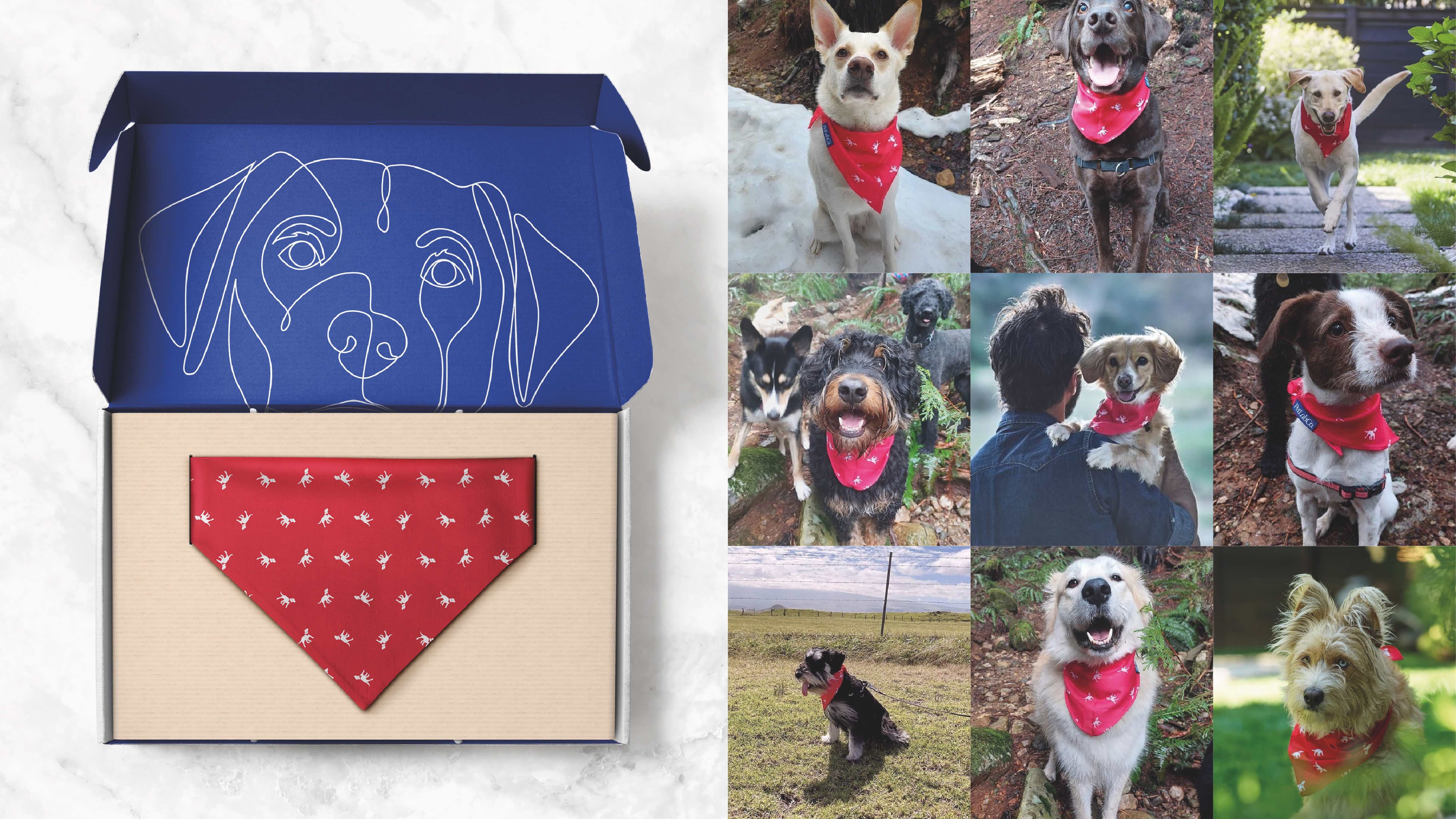
Uncovering the founders’ motives in the research phase, and hearing the bittersweet backstory about Masanto’s beloved dog, opened up a new world of possibilities for the two design agencies. Indeed, Masanto’s recollections of his dog were so warm and powerful that they fuelled much of the project. Things got really interesting when someone noticed Krystal’s signature red neckerchief from old photographs of her and a teenage Masanto playing together. The design teams realised that if they were trying to forge connections with pet owners, then PetLab couldn’t ambiguously be about ‘dogs’, but instead had to be about your dog.
Alexander Stewart, creative partner at Derek&Eric, remembers the creative process fondly. He says, “It just felt like a lovely moment and something we absolutely latched on to in design.” From there, ‘actively loved’ became the key brand idea as an apt way of demonstrating how PetLab products can lead to a healthy, happy life for your canine friend.
Illustrations of Krystal, easily identifiable with her red neckerchief, became a part of the brand identity, mischievously appearing across brand touchpoints in unexpected places. In some instances, she is found inquisitively sniffing at copy and iconography, while at other times she can be found patrolling around the revised wordmark. “It just felt very cohesive,” adds Stewart, “and it gave us a pathway to express individuality and personal connectedness.”
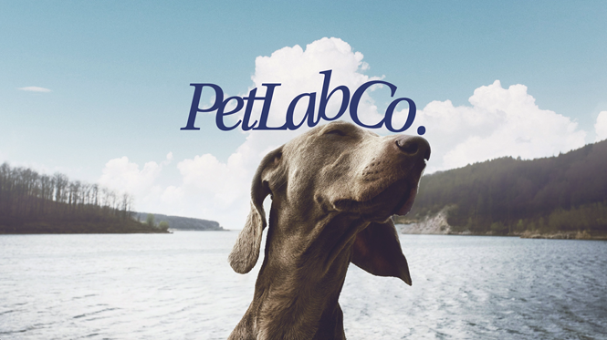
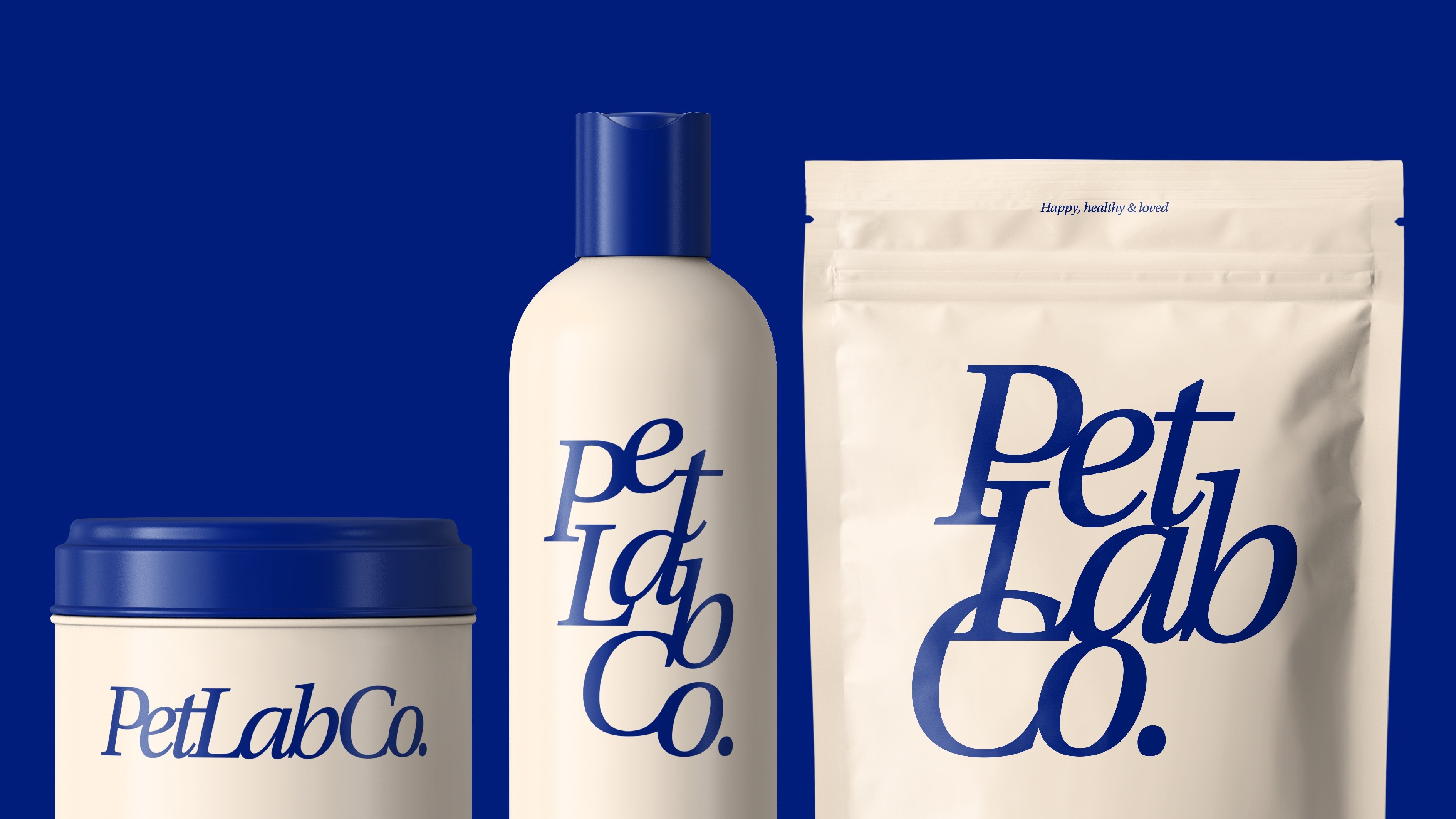
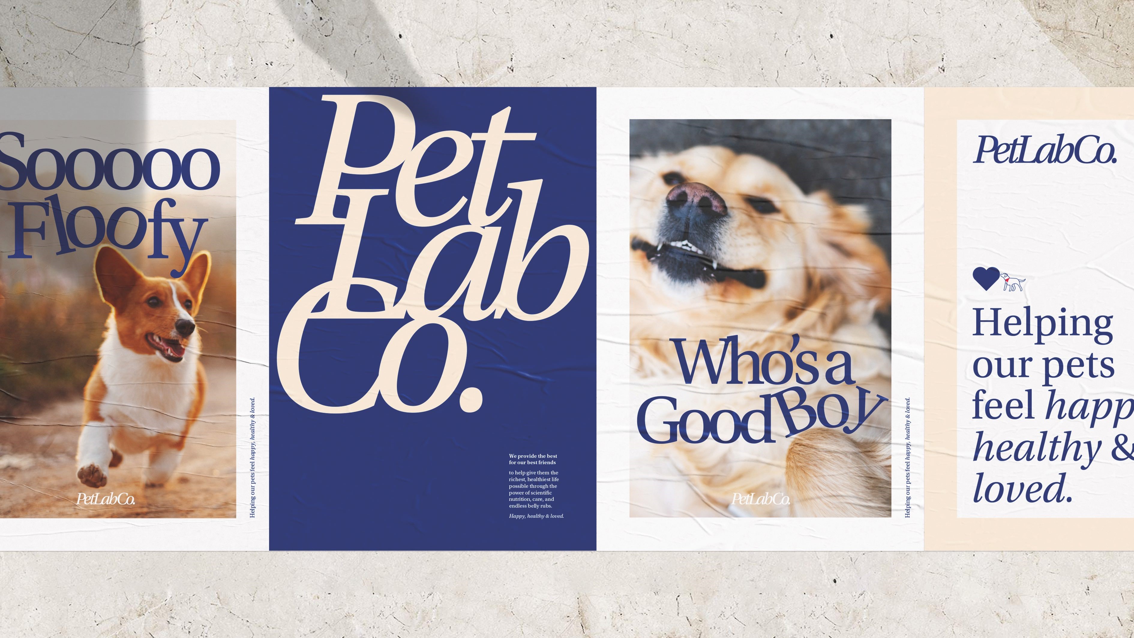
In fact, the new wordmark itself further strengthens the brand’s identity. While the old design was reasonably effective and had a strong sense of gravitas, italicising it helped make it feel more active. Meanwhile, removing all spacing between letters offered a simple visual metaphor of a hug, further evoking the brand’s warmth and passion. In photography, dogs comically nuzzle up with the wordmark. If PetLab once suffered from feeling generic, then that’s certainly no longer a problem.
As for the brand colours and tone of voice, these were parts of the project which decidedly aim to balance the emotion that was introduced with a sense of rationality, or “credibility”, as Stewart describes it. The drab and desaturated blue was ditched for a richer shade that isn’t too dissimilar from the old design. It is still paired with a white, but a creamier white inspired by the colour of a Labrador’s coat, a subtle but wholesome addition.
“The tone of voice springs from that 'actively loved' strategy and just trying to be simple and clear with people,” Stewart explains. “The key line for us when we were working was helping pets feel happy, healthy and loved. But it's not about sugar coating. We needed to talk directly to what people are looking for and need. This isn't a dog treat brand; this is about pet supplements and has to feel like the real deal.”
Comparing their work to competitors, the two agencies feel the revised brand is significantly stronger. Stewart adds, “Zesty Paws has a kind of an emotionality to it, a kind of a cutesiness, which I would say is generic within pet therapy. There's a lot of brands that are just playful and not actually love.” Instead, the ambitious brand world he helped craft holds activity, gravitas and love all at once.
With PetLab’s owners having aimed all along for their fledgling brand to one day become iconic, it will take time for the real merits of the project to be revealed But, as Gibbs says, PetLab has now achieved distinctiveness within the category, extending far beyond a bright colour palette or funny dog photographs. The love Masanto still holds for Krystal is now fully reflected by PetLab, and the resulting brand identity is truly a testament to the relationship between man and his best friend.