Typeface digest
The design and implementation of a typeface informs the way a brand is meant to be experienced and perceived. Two major typeface foundries – Dalton Maag and Monotype – debuted new work this week
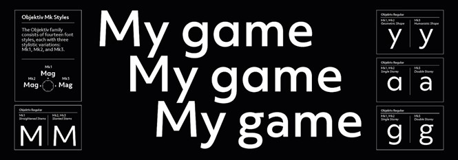
London and Brazil-based type foundry Dalton Maag’s new Objektiv font family is billed as a, “Redefinition of geometric typefaces to meet the needs of modern media.” It has three variants that allow graphic designers some flexibility in the way in which they choose to deploy type. It also gives them the ability to choose more than one variant in the same piece of work, subtly letting type design influence the message.
It has seven weights and can be used in 100 languages that use the Latin alphabet. Bruno Maag, Dalton Maag’s chairman, says, “With Objektiv we address the big problem of geometric fonts – geometry. Type is a living organism that does not like to be constrained by the strict rules of Pythagoras and Euclid. Instead, we have taken their principles and allowed geometry to work for humans. This is not unlike the thinking of the great architect Le Corbusier who believed that the human is at centre of all.”
Geometric type is a classification indicating typefaces designed using layered or distorted geometric shapes. Through Objektiv’s variants, designers are able to expand their range of usage within the category.
Type is a living organism that does not like to be constrained by the strict rules of Pythagoras and Euclid.
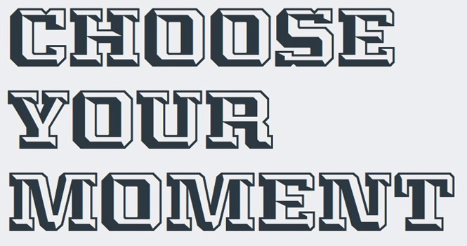
Major American type design firm Monotype released its new Kairos family of fonts as a modern take on American slab serifs that emerged in the 1800s through their usage on metal and wood.
Kairos features a range of 51 weights that leave it open to several key industries such as sports communications, consumer goods and “hipster commerce,” according to the company. Designer Terrance Weinzieri says, “Kairos identifies with today’s resurgence of craftsmanship, along with the do-it-yourself attitude that’s in vogue. Kairos is more of a jersey than a suit or a cutting board instead of a whisk. Certain brands are looking for something more coarse but not dirty. Something that’s not so sleek. Kairos fits that look.”
In addition to the 51 available weights, layering is also a possibility within the Kairos family. The feeling evoked ranges from the blocky, weighted serifs usually seen on sports jerseys through to slim, modern print that wouldn’t be out of place in a hipster-focused small business.
Certain brands are looking for something more coarse but not dirty. Something that’s not so sleek.

