Spotlight on Meals on Wheels
American charity Meals on Wheels found it was perceived as too successful and had poor penetration into Millennial audiences. It sought to reinvigorate its brand and drive change across the organisation. Emily Andrews reports
Rebranding a non-profit can be a sensitive affair. The cause is often close to people’s hearts and the involvement of volunteers makes an organisation’s relationship with its stakeholders much more personal than it would be in a corporate setting. These are challenges, but also opportunities for both the branding agencies and the internal teams involved in a rebrand project. A charity brand has the potential to inspire and to drive real change beyond business results.
That’s what Duffy & Partners hoped to achieve with its recent rebranding of the American household name Meals on Wheels. The new brand is defined by an optimistic outlook and by putting its people at its centre.
Formerly the Meals on Wheels Association of America, and now operating under the name Meals on Wheels America, the organisation delivers meals, safety checks and companionship, to the elderly generation so that they are able to live in their own homes for as long as possible, thus maintaining independence. The brand enjoys widespread recognition across the United States, but it had become tired and there was some lack of understanding around what it was that the charity actually did. Many were under the misapprehension that the organisation was merely a meal delivery service when, in fact, its remit went far beyond that.
Susan Waldman, chief marketing and communications officer at Meals on Wheels, says, “The public had come to know us as a food delivery service only – without the awareness that, beyond the meal, we deliver a comprehensive set of services. The friendly visit and safety check provided by 2m volunteers effectively enable nearly 2.5m seniors every year to remain living in their own homes. That’s what’s really at the heart of the Meals on Wheels movement.”
The rebrand was informed by marketing research and industry insights conducted by Edge Research. Meals on Wheels also worked with the Storybranding Group to develop strategic messaging that was then translated into the new visual identity by Duffy & Partners.
Duffy & Partners, an international branding and design firm based in Minneapolis, identified Meals on Wheels’ key problems. While it had good brand recognition, there were several misconceptions surrounding the organisation. As well as believing it to be solely a food delivery service, many also believed Meals on Wheels to be government funded, at least in part. This was indicative of the biggest challenge; the charity was perceived to be a success to the extent that it no longer needed any more help when, in reality, the number of people who require the service has been rapidly growing due to an ageing population. Meals on Wheels urgently needed to engage new people, attract new members, enlist more volunteers and generate more fundraising to meet demand.
Joseph Duffy, founder and creative director at Duffy & Partners, says, “When people thought of Meals on Wheels America, and all the good that it had done, they just thought that things were going well, that the mission was working and that it basically was a successful organisation doing what it set out to do.” In reality, the ageing population, and the amount of people without food and the resources to stay in their homes and to continue to provide for themselves, was growing.
Meals on Wheels needed to refresh its identity to attract and engage new people without alienating its existing members. In particular, Duffy & Partners wanted to target a young audience where it was currently experiencing a lack of engagement. Duffy says, “When you looked at most of the people involved in the brand, it was definitely on the older spectrum of our society. In order for this thing to really work in the future we had to target a younger audience and get more young people involved. That was the goal that we set out to do, to make sure that Meals on Wheels is something a younger audience can relate to, but without alienating the older audience.” By engaging young people with the cause, Duffy & Partners and Meals on Wheels hoped to secure a whole new group of people who would get involved early, and stay with the organisation for a long time as the general population continues to age.
The work done by Meals on Wheels and its organisations is hugely beneficial for communities, and communicating this optimistic message, rather than by stirring guilt or pity, became the focus of the new brand and identity. All involved agreed that communicating a positive message was the way to go. Words such as ‘joy’ and ‘friendly’ were co-opted; words that focused on the advantages of the services provided by Meals on Wheels and all the organisations that buy into its association.
Duffy says, “It’s about explaining the benefits and why it’s important. Everybody has a loved one or somebody from an older generation in their life, whether it’s a family member or a neighbour. When you think about the cost of putting someone in a nursing home for example, it’s an emotional drain and it’s very expensive. With Meals on Wheels the goal is to keep people in their home for as long as possible and to make sure they’re being checked on.” That personal and people-focused aspect of the Meals on Wheels mission became very important to the new brand. It was built on an ‘Everyperson story’ which relied on the idea that everyone knows, and is close to, someone from the older generation, and so is able to relate to and help, the mission. It also recognises all the people who already make up the movement, from employees to volunteers.
Waldman says, “These individuals feel compassion for the struggles that ageing imposes on their senior neighbours, and they are inspired to stand-up, lift a hand and contribute to ease the pain. They recognise that, together, when we all do our own small part, we make great things happen in our communities. Therefore, the values and characteristics of the Meals on Wheels brand are compassion, commitment, humility, the belief in hard work and the recognition that we’re all in this together.”
“The new brand could only be evaluated as a success if it resonated with their experience and represented
the aspirational hopes of their local community organisations”

The new brand aims to inspire feelings of involvement, inclusion and community, rather than guilt or pity. Duffy says, “There’s so many ways, if you look at it from a broader perspective, that it’s the right thing to do. We don’t want to guilt people into it, we just want to explain it to them and let them make a decision on their own. The whole guilt version just doesn’t work, it’s limited to a one-time only thing. We want people to engage and be active participants.”
The guilt-inducing aspect of charity comms has largely gone out of fashion in recent years and is deemed ineffective by most, particularly for a brand like Meals on Wheels, looking to modernise itself and reach a younger audience. Judging by recent rebrands in the same sector, such as Cancer Research UK, a bright and optimistic visual identity and overarching brand strategy is far more likely to succeed.
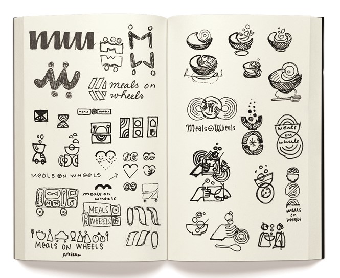
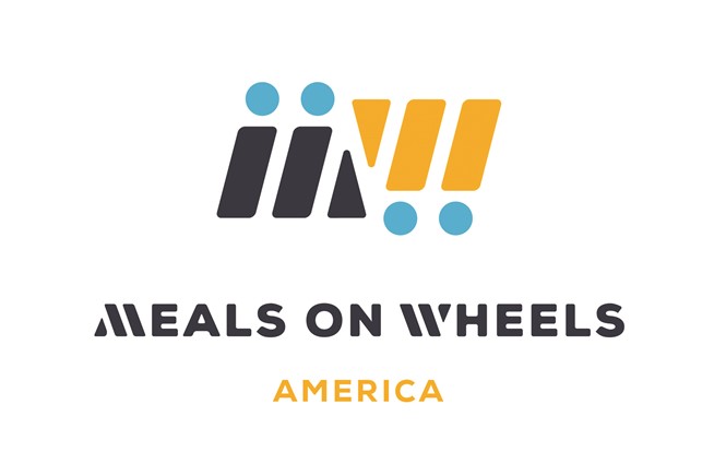
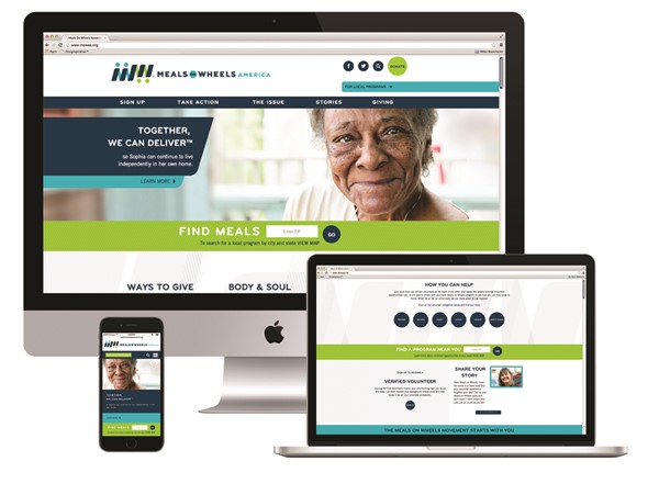
The new Meals on Wheels visual identity reflects that optimism with bright blues and greens and a new logo which combines the ‘M’ and ‘W’ from the name with wheel motifs. A new modern typeface replaces the outdated and clichéd calligraphy font in the previous logo. The new visual identity is intended to contribute towards the forward momentum and call-to-action that the rebrand itself is driving. The new website, which includes photography that supplements the personalised quality of the brand with images of the people who benefit from the charity, was created by AmericanEagle.com.
As with any non-profit rebrand, engaging volunteers and employees with the new brand was a key concern for Meals on Wheels during implementation. The situation posed a particular challenge due to the disparate and wide-ranging nature of the Meals on Wheels network.
Waldman says, “It is challenging to build a brand for a service that has been built from the ground up by teams of people in virtually every community across the country. The new brand could only be evaluated as a success if it resonated with their experience and represented the aspirational hopes of their local community organisations. We tested the brand with a number of our local programs and we hope they will all want to adopt it as their own over time. That is what will give us all the powerful lift that a cohesive, national brand can bring. Thankfully, all indications are that we were able to create a brand that boosts their efforts and represents the strength of the value they have built.”
Before the new website was launched, Meals on Wheels held meetings with its members where it presented the new brand and what it stood for. So far the feedback has been resoundingly positive. The membership rate will reflect the long term success of the rebrand but Duffy says, “As far as adopting the new branding and identity, it’s been overwhelmingly successful. Meals on Wheels did a questionnaire to its membership base, which is hundreds of thousands of people, and asked them what they thought about the new identity and it said it couldn’t believe how positive the response was.”
The seniors served by the programme, the volunteers and the wider community, are recognised in the positive, upbeat new identity. The brand is an attractive prospect for the new, and particularly the young, people that Meals on Wheels hopes to bring into its vast community. The visual identity supports modernity and positivity in its design. An emphasis on cross-generational relationships and dynamism energise the new brand and drive it towards its goals.
Peer review
Simon Manchipp, founder and strategic creative director, SomeOne
Everyone loves a little bitching don’t they? A few snide words from the side – whispered to an old friend or newish colleague. And so it goes with design – we’re now, as a sector, expected to bitch about new work, just as long as we didn’t do it. Everyone with an internet connection is now confronted with the feeling that if an organisation, product or service takes on a new look, a new direction or horrors, a new logo – well, why wasn’t I consulted? This is an abomination! I use that service!/Have heard of the organisation! Might have the product at home! – why didn’t they ask me?
Invariably the reason they didn’t ask you is that they don’t want your opinion or were frankly too busy worrying about their margins, growth and management of their reputation to really bother to ask. Either that or you really are not the customer here. Meals on Wheels is likely to fall into this area. A warmhearted promise of ensuring those unable to easily pop out to do the weekly food shop get what they need delivered.
Few readers of this will work outside the well- fed and well-paid professions of commercial creativity (whisper it: ‘marketing’) – so it’s unlikely you have ever needed their services, or been in contact with the organisation at any time other than to enquire if their marketing spend was going up this year and are they happy with their portfolio of agencies?
I know how hard it must have been to get the client to agree to a radical rebrand like this – ‘Will it alienate our current audience at all?’ ‘Is it readable enough?’ ‘Could you mistake the ribbon for something else?’ ‘Have you tried a different colour system?’ ‘My brother’s just bought a Mac, could we get the files so he can have a go?’
It’s bloody hard to get anything progressive out, harder
still when the likes of blog readerships are let loose on
the results. These comments are read (hard to believe but true); they damage relationships, they hurt feelings, people get fired. They hold back progress. So what’s the responsible thing to do?
Snipe from the sidelines as this article is meant to? Say it’s awful? Compare it to some other mildly similar look from some other designer? Complain? No. We should be, as a sector, standing up and applauding loudly, visibly and with gusto. Great! A rebrand. Not a tweak. Excellent! Someone went for it. They had the courage to change. Not fiddle.
Does it make you shiver with excitement? Who cares...you’re not the audience. The audience will likely be simply delighted that someone has turned up again with their supplies, a smile and a chat. If they register a new logo on the delivery person’s uniform, van or packaging, they’ll probably be delighted to see that their trusted service is seemingly moving with the times.
They won’t gripe over the choice of Gotham, the Pantone selection or the complexity of the mark. They’ll simply probably raise an eyebrow – then get on with living their lives. And so should we. Rather than exclaim ‘Why wasn’t I consulted?’, we should observe what’s been done. Learn from it, then go about our business, hopefully someone will extend the same courtesy to us.

