The Google of tomorrow
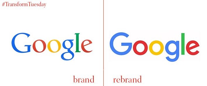
Google’s fun and approachable brand takes another leap forward with its new logo.
The revelation has already, unsurprisingly, received a barrage of comment; some negative, but mostly positive. Irrespective of taste, this critical rebrand project tells us a lot about the future of branding in a world of smartphones, smartwatches, voice command, and mobile video.
Google’s new custom sans-serif font, titled Product Sans, is decidedly childlike, and is accompanied by a gif that begins as a string of coloured dots and reassembles into, first, the wordmark logo, and second, a single ‘G’ logo, which combines all of the Google colours in one letter. The set of identities shows how the brand will adapt across a range of applications.
Jacques De Cock, faculty member at The London School of Marketing said, “Probably a further thinking behind the redesign was to make the typeface irrelevant and to gain recognition for the four primary colours of the logo. Google also aims to make the multicolour 'G' and the four dots an immediate shorthand for its brand, making it able to brand more elements in a very flexible way. It is simple and straightforward, but this simplicity is not simplistic it is a very thought out simplification, strengthening and extension of the brand."
The rebrand was launched with an animated video that shows how the brand has changed over the years. The video shows how Google’s function has also changed with the internet, which supports the new brand by demonstrating how the Google service has always succeeded in staying ahead of the game. Its various brand evolutions have always reflected the changing needs of the public.
The latest logo is neomodern in its lack of embellishment, a style that has become popular due to the proliferation of smart phones and other mobile devices with smaller screens, which make more complicated logos less legible.
Tamar Yehoshua, VP of product management, and Bobby Nath, director of user experience, said on the company's blog, “As you'll see, we've taken the Google logo and branding, which were originally built for a single desktop browser page, and updated them for a world of seamless computing across an endless number of devices and different kinds of inputs (such as tap, type and talk)."
The new design also marks a turning point in the company’s history with the Google brand recently becoming separate from the new parent company, Alphabet, whose wordmark shares the Product Sans typeface.
The brand's leadership team said, “We think we've taken the best of Google (simple, uncluttered, colorful, friendly) and recast it not just for the Google of today, but for the Google of the future."
However, Googles overarching brand principles may yet need redefining. Google originally focused on a brand philosophy of 10 guiding principles, such as "you can make money without doing evil" and "democracy on the web works", principles that were more applicable to the brand’s beginnings as a tech start-up but which are less relevant to the current business. Google co-founder, Larry Page, said to the Financial Times last year that the brand probably did need to adopt a new brand philosophy better suited to what the organisation has become, but since then, no new guiding principles have been revealed. To prepare for the future Google may need to look beyond its visual identity.

